
-
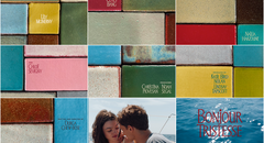
Bonjour Tristesse
The opening tile sequence to Durga Chew-Bose's Bonjour Tristesse is just enough and very much the mood
Jun 7, 2025
-

An Update from the Editor in Chief
An update from Art of the Title's Editor in Chief
Aug 6, 2024
-

Top Five: Chloe Okuno
Director and screenwriter Chloe Okuno discusses her favorite title sequences including horror from the '70s and '90s and how important sound design is for setting tone
Apr 24, 2023
-
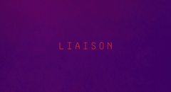
Liaison
We dive into the latest from title designer and Emmy nominee Saskia Marka for sultry thriller Liaison
Apr 14, 2023