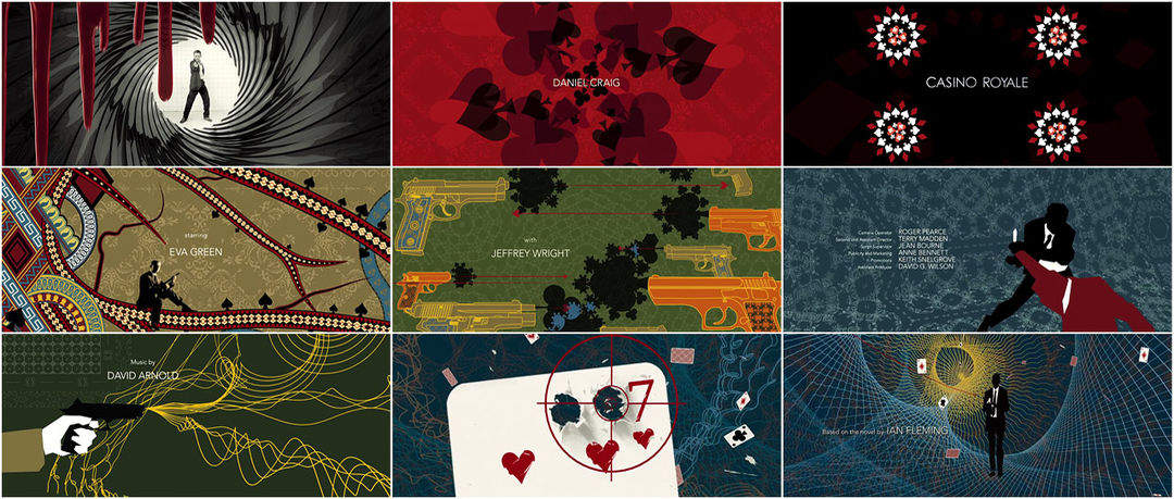


Casino Royale (2006) title card
Title Design Studio: Rattling Stick
Main Title Designed by: Daniel Kleinman
VFX Supervisor: William Bartlett
Title Producer: Johnnie Frankel
Music:
"You Know My Name"
Music by David Arnold
Lyrics by Chris Cornell
Performed by Chris Cornell
End Titles Designer: Pauline Hume
Support Art of the TItle
Related
-
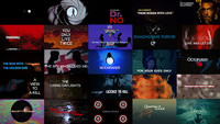
James Bond: 50 Years of Main Title Design
feature
-

Mad Men
interview
-
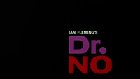
Dr. No
title only
-
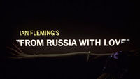
From Russia with Love
title only
-

GoldenEye
interview
-

Quantum of Solace
interview