


Title Designer and Creative Director: Michael Riley
Executive Producer: Peter Frankfurt
Production Studio: Imaginary Forces
Support Art of the TItle
Related
-
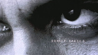
Donnie Brasco
summary
-
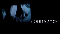
Nightwatch
summary
-
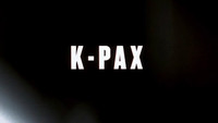
K-PAX
title only
-
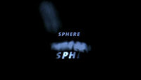
Sphere
summary
-
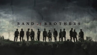
Band of Brothers
title only
-

Kung Fu Panda
summary