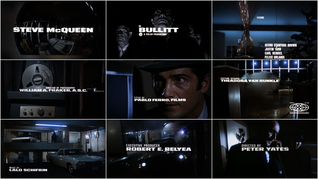


Title Designer: Pablo Ferro
Title Design: Pablo Ferro, Films
Music: Lalo Schifrin
Support Art of the TItle
Related
-
Pablo Ferro: A Career Retrospective, Part 1
feature interview
-
Pablo Ferro: A Career Retrospective, Part 2
feature interview
-
Pablo Ferro: A Career Retrospective, Part 3
feature interview
-
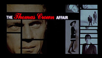
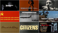
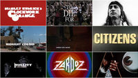
The Thomas Crown Affair
summary
-

Dr. Strangelove or: How I Learned to Stop Worrying and Love the Bomb
interview
-
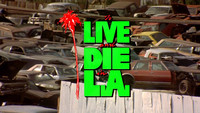
To Live and Die in L.A.
title only