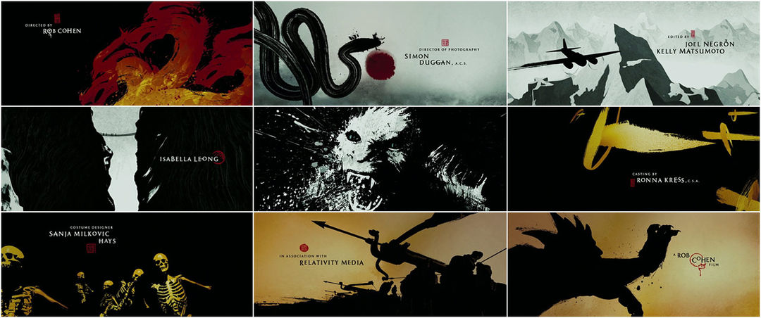


What immediately comes to mind upon viewing these end titles as a stand-alone element is that there is great discipline in the master calligrapher's graceful, yet contrasting, Chinese brush strokes. His magic carpet ride reminds one of Masaki Kobayashi's Hoichi the Earless, only here the Chinese characters – and Kanji, respectively – become life-taking daggers rather than a life-saving shield. I am reminded also of splattered ink at the point of impact and the panning flight of a classic aircraft, both owing debt to El Don, in addition to the 300 main-on-end titles and to Frank Miller.
While some frames seem partially rendered (exploding diamond? the odd alignment and spacing of the trekkers? an uninspired mouth of a cave?), others offer flashes of originality (snake-strokes from a blood sun, lettered mountaintop, inkblot blood of fleshless adversaries, a halved opponent, yetis in profile).
Creative Directors: Karin Fong, Steve Fuller
Production Studio: Imaginary Forces
Directors: Karin Fong, Steve Fuller
Designers: Jeremy Cox, Arisu Kashiwagi, Lauren Hartstone
Executive Producer: Maribeth Phillips
Producer: Kathy Kelehan
Animators: Suzanne Potashnick, Jeremy Cox, Chase Massingill, Gary Tam, Ken Tanabe, Annabel Coleman, Sean Eno
Design Assistant: Andrew Chung
Editor: Corey Weisz
Inferno Artist: Rod Basham
Coordinators: Heather Dennis, Michelle Weinberg, Sabrina Mossberg
Support Art of the TItle
Related
-
Black Sails
interview
-
El Don
summary
-
300
title only
-

Marco Polo
interview
-
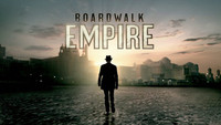
Boardwalk Empire
interview
-
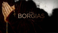
The Borgias
summary