Icon

Les Chevaliers du Ciel

Les Chevaliers du Ciel
Click to Watch

Click to Watch 720p HD Version

If model airplane kits are “the genesis of many aviation careers” then we post in tribute!

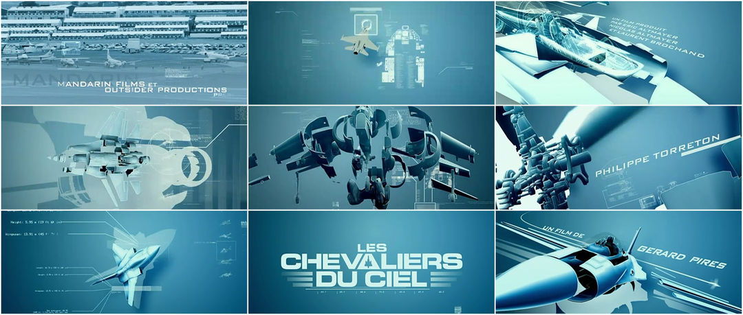
The supersonic opening to Les Chevaliers du Ciel (Sky Fighters) places Dassault Mirage jets center stage, with detail-driven exploded views fusing seamlessly with impressive live-action footage. Blueprinted blades of a tactical helicopter whirring into aerial maneuvers is a nice example of form. The testosterone driven trade show intimacy however telegraphs the Top Gun hangover/love affair felt to this day.

Direct Link | Format: QuickTime H.264, 800×336 | Size: 16 MB | Running Time: 1:51 | Year: 2005
720p HD Version | Format: QuickTime H.264, 1280×544 | Size: 43.2 MB | Running Time: 1:51 | Year: 2005


Created by Laurent Brett

Category: Film

Tagged: ,

7 Responses

  1. MarksVFX says:

    The audio really helps tie together the transitions. I like the idea but I didn’t instantly get the fact that they were going for a blue print look. It makes sense after reading it but I felt you would need to see the plane in outlines or a wireframe style before transitioning to actual 3d planes. I liked this piece a lot though. Again, loved the audio.

  2. All-Fired-Up says:

    I loved the cutaway/breakaway of the aircraft. I agree with MarksVFX, the audio really is key. I love aviation, and I love 3D aircraft modeling, so this piece appeals to me.

  3. Trevor Mack says:

    The transitions were very, very nice. It was perfect how they transitioned from real to 3D. Also stated above, the audio was great and really propelled (hah, get it, propelled *sigh*)

    Great intro.

  4. VMAN says:

    Loved the laid back piano music.. distinct contrast with a more high powered visual.. As far as the Wireframing, I find breaking traditions and finding your own distinct style is the way to go.. So I have to disagree with the above statements.. Definitely sets a tone.. Great Work.

  5. Stephen says:

    Looks like they made stencil versions of Bank Gothic and Eurostile for the type. Suits it well.

  6. Stephen says:

    Though FF Oxide would have been a less obvious choice and perhaps more in line with military lettering.

  7. Mr Brett says:

    Thanx guys ! let me give you informations.
    Yes the font is a Bank gothic reworked. It’s not a military movie, but a buddy friend in a spy context so choosing a military font would be a mistake (I think).
    And the music was made after we finish the title sequence (we worked with a rock track which was originaly choosen by the Director Gerard Pires)
    Anyway, thanx for the interest you show to my designer work !!!

    http://www.laurentbrett.com

Leave a Comment

Interviews

ISO Design on A History of Scotland
Danny Yount on Sherlock Holmes
Gareth Edwards on How We Built Britain
Yellowshed on Cloudy with a Chance of Meatballs
Chic & Artistic on Dan Black's “Symphonies”
Nirvan Mullick on Willard
Sfaustina on Tetro
Kevin Dart, Stephane Coedel and Cyrille Marchesseau on A Kiss From Tokyo
Matteo Manzini on Chéri
Jim Capobianco and Alexander Woo on WALL·E
Edd Kargin on Novaya Zemlya
David Daniels on Freaked
Kyle Cooper on The Incredible Hulk
Garson Yu on Hulk
Zephyr on Wild Style
Howard Nourmand on The Dog Problem
Nina Paley on Sita Sings the Blues
Stephane Coedel on The Amazing Adventures of Kid Cole & Klay
Stefan Bucher on The Fall

Affiliate

Browse

Latest Updates via Twitter

Twitter Updates

    follow us on Twitter

    Master Index

    © 2009 The Art of the Title Sequence. All other names and trademarks appearing on ArtoftheTitle.com are the property of their respective owners. The written content on The Art of the Title Sequence is licensed under an Attribution-Noncommercial-No Derivative Works 3.0 Unported Creative Commons License