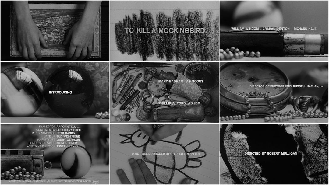
Sep 10, 2008
To Kill A Mockingbird
“Titles that adorn.”
One of the reasons this site exists.
In the first seconds of this dawning glory, Elmer Bernstein’s notes softly dot and fade. A child, our beloved Scout, hums lullaby-like. At the heart of a masterpiece, a cigar box. At the heart of the box, Gregory Peck. A silent pocket watch ticks in remembrance.
Scout lifts a crayon and sets in motion the quiet, unintentional roll of a marble and the wonderment of the examined life found in every moment, of every life.
Art of the Title’s favorite element to Stephen Frankfurt’s opening title sequence for “To Kill A Mockingbird” is the window reflected in the marbles. We get the sense that this lolling calm happens just off screen while, on the other side of that window Atticus -the very embodiment of security- sways thoughtfully on the porch swing.
Our appreciation for Frankfurt’s compositions changes not with each viewing but with each sitting. This is the kind of perfection that rewards anyone in illimitable meditation. This is, in part, a testament to Frankfurt’s masterful macro photography, an innovation that broke the mold upon inception. There are many other instances of extreme close up in film, but used in these opening moments we find a kind of lyricism we recognize as honest.
[The goal was] “to find a way to get into the head of a child,” Frankfurt is quoted as saying. What grips you upon subsequent viewing: the sequence is tonally different than the film while being reflective of it.
A wave, as drawn by Scout, is cross matched with the beaded chain over the silent timepiece. The child draws what can be discerned as dividing lines. And in the tearing of the mockingbird, a chasm.
![]()
Interviews with Producer Alan J. Pakula and Composer Elmer Bernstein on the titles and music.
Opening title sequence commentary with Director Robert Mulligan and Producer Alan J. Pakula.
Audio clip: Adobe Flash Player (version 9 or above) is required to play this audio clip. Download the latest version here. You also need to have JavaScript enabled in your browser.
(From the To Kill a Mockingbird (Collector’s Edition) DVD)
![]()
Cameron Crowe’s homage to To Kill A Mockingbird.
USA • 1962 • Black and White • 1.85:1 • English • Purchase the DVD
Title Designer: Stephen Frankfurt


Everything is framed so beautifully … damn. Odd how you think one would have gone “classic” with the type (eg. Serif), but … damn.
1960s film designers had to use sans-serif for small typography because tiny serifs wouldn’t have held up when composited over picture using an optical printing bench using the film stock available at the time
I remember watching the film when I was in high school, after our class read the book. Watching this now I wonder if my teacher (trying to save some time) just skipped the title sequence altogether.
It’s beautifully done, though. And now I want to watch the movie again.
I am confident in Michael’s information to be true but, when I viewed this sequence for the first time I saw the typeface choice as a statement (I love reading into things)…old, childlike ideals shown against modern realities…yeah it’s a stretch.
At least they new how to set type back then.
btw, can you identify the typeface? It’s very familiar *wink*
First of all… thank you, deeply, for creating this website. Secondly, when I first linked to the website and realized what it was, the first thing that came into my head was a stream of “oh! I wonder if they have _______ up here?” And the first film that came to mind was To Kill a Mockingbird.
Yes I’m a film nut, yes I’m nostalgic and sentimental as a person (often), and with those two admissions I say that watching this title sequence again after maybe almost 10 years brought a tear to the eye. My wife is currently in the other room adding TKaM to our Netflix queue because she has never seen it and the titles just blew her away.
The window reflected in the marble struck me too, this time, and I had never noticed it before. As a life long fan of titles sequences, and an introspective person, I am hard-pressed to think of another sequence that I saw before I saw Mockingbird that made me love titles as much as this one. This I saw in 8th grade—after we had read the book, written a report, delivered an oral report, and then Mr. Fuller showed us the film. Seeing this opening, knowing that it was inside the mind of a child, of Scout… I freaked. I was amazed too, that every 8th grader’s eyes were glued to the screen, and their jaws were in their laps. We were all stunned by it. That’s hard to do to 13-year-olds. We would have thought we would have preferred to have our MTV. Not so, that day.
Major kudos to Mr. Frankfurt, and also to Ian and Alex. How am I going to get any work done now?
Wonderful website. I’m about to launch my career as an English teacher after returning to school at age 43. TKM is my favorite film, and I have always loved the opening sequence. It’s innocence and depth have a powerful impact. When my class reads the novel, I will use this website to study the opening sequence with them. Thank you!
Was the theme song to the Simpsons “inspired” by this!?
what are the symbolic values of 1. The drawing of the bird 2. harmonica 3. pocket watch 4. pearl necklace 5. marbles 6. whistle
This is one of the most tasteful and stylized movie titles EVER!
I saw the movie when it was brand new in theaters. Left me breathless at the time.
Hooray for S. Frankfurt!
It appears that the typeface used is Helvetica, but I’m not entirely convinced. Does anyone know?
The typeface is Akzidenz-Grotesk Bold.
http://new.myfonts.com/fonts/berthold/akzidenz-grotesk-bq/bold/
The typeface is not Akzidenz-Grotesk Bold, but almost AG Old Face BQ-Bold.
I was a teenager when I first saw TKaM. I read the book first and loved it, but the visual impact of the film nearly immobilized me. Its message was profound, and it helped frame the parameters of my own humanity. The message in the book and then the movie was to become a piece of my own personal journey because it reflected so much of my own life. As a child who experienced the effects of living with a schizophrenic mother and then later as the mother of a child with autism, my life has been concerned with intolerance of people like my mother, my daughter, and Boo. I recently purchased the DVD and plan to view it alone knowing that I will again be moved to tears. I am grateful for the brilliance of Harper Lee and all the genius that created a beautiful movie that stayed faithful to the book. Thank you from my heart.
Best title sequence and best first fifteen minutes of any movie ever. The rest is great too, but it has alway struck me that the part from the title sequence to the part where Jem and Scout are talking to each other before they fall asleep is perfect. Perfect…