Oct 10, 2008
Morrison on Morrison
We are but beneficiaries of both the depth of design and the intellectual complexities of Richard Morrison’s body of cinematic title sequences. We rejoice in the work put in to this post. Indeed what better than researching a man whose work is a foregone conclusion in heart and wonderment?
The son of a film editor, Morrison became a master at internalizing a director’s intent and distilling it for the title sequence. From Morrison, “I look for a nuance, a subliminal energy in a film that I can then work into an idea.”
Morrison discusses six of his sequences.

Click to Watch
Brazil
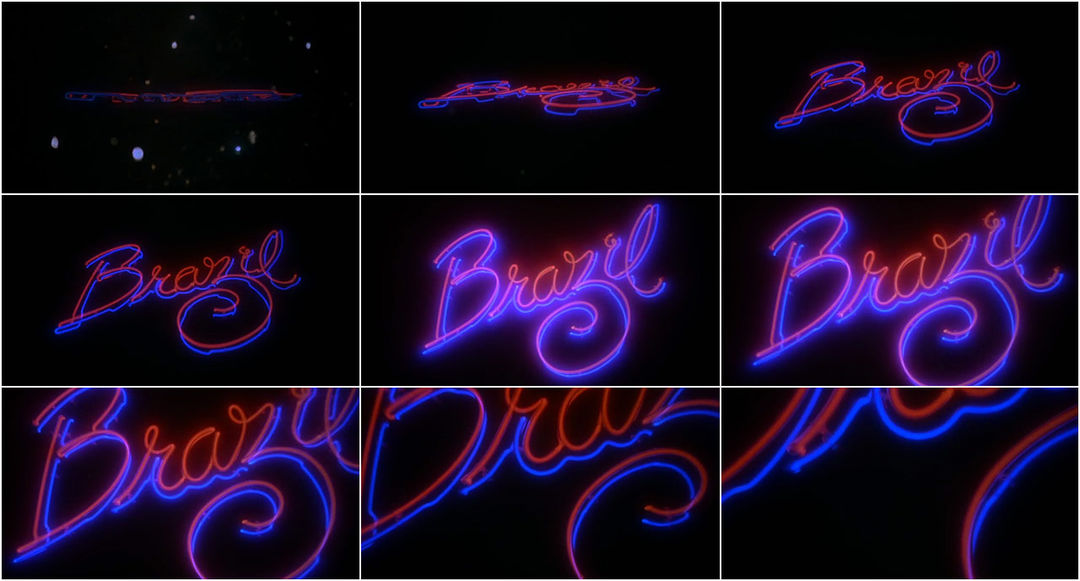
“The optical effects in Brazil have quite a timeless quality to them. I did not consciously set out to create something so lasting. It was more of a serendipitous happening.
Terry Gilliam is a very hands-on director, throwing ideas at you and getting really involved. So, in this case creating the sequence was something of a process. I never quite knew what to expect, until seeing final effect and thinking, yeah that’s it! That’s usually how it all looks when you work with very visually striking directors. They will already have their own ideas and just try to work with me to create them. And so if you work for someone who is visually more inspiring, they tend to give you more rope… It is good experience though because it fuels your creativity and in a weird kind of way turns into something that is ageless, simple and unique. As with Brazil…”
Direct Link | Format: QuickTime H.264, 720×400 | Size: 12.3 MB | Running Time: 1:02 | Year: 1985

Click to Watch
Batman
“The Batman 1989 environment was not that homogenized. In fact, there weren’t many people on the same platform and we were all very individual.
I did not know Tim before so I had to pitch for the project. We just had to make sure what we were about. I sat with him for a few minutes, and then just walked around the set of Gotham city. And that was it, really. I clearly remember I sat back in the car and all of a sudden I knew it.
I knew it had to be something about the classic batman comic logo. I thought, what if we think of that in a 360 degree move, how about if it’s in landscape, how about I make it something you can move around so you don’t quite know what it is. So that was the idea and then I just invented the world around it. Nobody did anything like it before so that’s why it probably retained its timeless feel.”
Direct Link | Format: QuickTime H.264, 720×416 | Size: 26.1 MB | Running Time: 2:38 | Year: 1989

Click to Watch
High Fidelity
“When working on this sequence I kept three notions in mind. Make it original, simple and distinctive enough. I believed simple content would be the answer to a finely tuned piece of work. Hence, the sequence abounds in this somewhat old-fashioned vintage style “brand identity” approach with a titled logotype centrally set in a 3d background movement.
I knew the film would be humorously philosophical. So I thought it was perfectly natural to create some kind of a retro feel to reflect some of the older classic films, but also keep it feeling fresh and contemporary at a time. Understanding where the film sat in its surrounding was absolutely vital. Although it is a short piece the level of difficulty was naturally quite high. Timing being one of the main reasons. Many creatives will tell you short pieces are the most difficult ones because you need to ensure that you make the most of every single second especially graphically and visually.”
Direct Link | Format: QuickTime H.264, 720×384 | Size: 31.1 MB | Running Time: 3:04 | Year: 2000

Click to Watch
The Dreamers
“As a creative I find the idea being always the key. The means to do it is a secondary matter. Because of the nature of the Dreamers, its plot and timing I wanted this sequence to look organic. Just like in the old days. So I just started piecing visual abstractive elements together, like in a puzzle, and decided to completely abandon any complex animation effects. It just did not fit in with the essence of the movie.
To preserve that “old school” feel I worked as if everything was completely optical. You see, in the past you just could not see things in real time. And this had a tremendous impact on your pace of work, accuracy, thought process and the whole approach really. You had to be a better planner…you had to be a master of accuracy… Everything you were doing was in real scale, very physical. You could not just press Delete and start over.
So, creating this sequence in this way I really had a genuine belief that this would actually work. Luckily, it did.
And so the main idea applied was to use the Eiffel Tower as the backgrounder for interaction of the tower’s 3d shapes with graphically explored elements such as typeface and colours. This, combined with the application of a continuous vertical camera pan, produced something of a lasting and very specific effect. I think most people now recognize the Dreamers just by that quite memorable title sequence.”
Direct Link | Format: QuickTime H.264, 720×384 | Size: 16.7 MB | Running Time: 1:34 | Year: 2003

Click to Watch SD | Click to Watch HD
Sweeney Todd: The Demon Barber of Fleet Street
“This industry is very specific and if you do a good job then you tend to be remembered by directors and producers.
What I enjoyed most was coming up with the whole idea. I did not have to pitch to Tim but I turned this project into an internal pitch at th1ng. And so, a few days later, I had a room plenty of some truly outstanding creative work. I took it all to Tim and he just spread them all over the floor and spent around a day or two looking through them. And then he just said: I really like this narrative piece (mine) and those coloured frames (Shay Hamias, director).
Animating blood and its movement became the most crucial and challenging element of the sequence. We had to build special platforms within which we imitated blood movement and filmed it. And we had to give it this comical feel, which worked really well. That was a dream project. We would love to work on something similar.”
Direct Link | Format: QuickTime H.264, 848×480 | Size: 45 MB | Running Time: 2:52 | Year: 2007
720p HD Version | Format: QuickTime H.264, 1280×720 | Size: 102 MB | Running Time: 2:52 | Year: 2007
Vantage Point
“It is an elegant piece. I liked the idea of random elements coming together before our very eyes, and I thought it would be very clever to use the red laser-dot as a motif. It immediately introduced the theme of assassination and threat. Also, I think that the dark-gold palette of these images strikes a chord with the filters used later to film Salamanca—there was this smooth transition between the titles and the first scenes shot from the helicopter. The sequence had to be based around the idea of perspectives. So I graphically tried to create a web of intrigue to give viewers an accurate insight into what they can expect in the movie.”
Direct Link | Format: QuickTime H.264, 853×354 | Size: 14 MB | Running Time: 1:04 | Year: 2008
Video Extra: An Interview with Richard Morrison
Direct Link | Format: QuickTime H.264, 720×400 | Size: 98.5 MB | Running Time: 9:26 | Year: 2007
Related Extra: The Den Of Geek interview: Richard Morrison
Created by Richard Morrison, th1ng

