The Art of the Title Sequence

Mentiras Piadosas

Mentiras Piadosas contact sheetClick to Watch SD | Click to Watch HD

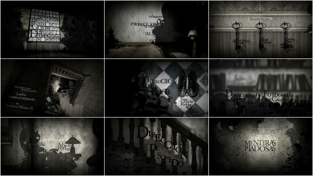
The end title sequence of director Diego Sabanés’ film “Mentiras Piadosas,” a film based on Julio Cortázar’s “black comedy about white lies” short story “La Salud De Los Enfermos,” draws inspiration from shadow sculpture where the shadow, rather than the form, represents the object.

In this execution, title designers Juan Manuel Codó and Julian Martin use the shadow to represent the form by distilling the objects to shadows across wood grain and wallpaper; damask gone velvety like an old theater screen under a scratchy print. Credits, latched to keys, are subsequently spied in amorphous motion blur and bokeh. We are awash in piles of discarded charcoal type, floppy spines and lonely soles, banisters and hat racks and f-holes. All framework for a “portrait of a family capable of betraying what they are, while striving to attain what they aspire to be.”

Art of the Title spoke with Codó:

“We started looking for references, to principally represent ‘the lies’ which center the film. It occurred to us to use volumetric typography to make a disorganized thing that, with the passing light and shadow, would ‘tell the truth’ and show the titles. With director Diego Sabanés, we began adjusting this idea. He insisted on recreating the scenarios of the film so as to maintain the climax. The result is what you see, a mix of textures, parts of the house, and a game of shadows.”

Argentina | 2008 | Color | 1.85:1 | Spanish

Direct Link: 480p SD (QuickTime, 848×480, 18.5 MB, 01:35) + 720p HD (QuickTime, 1280×720, 35.4 MB, 01:35

Extras

Image Extra iconRender Tests and Research Images (836KB Zip Archive)

Mentiras Piadosas Productions Extras thumbnail strip
Credits

Category: Film

Tagged:

8 Responses

  1. Christian Cvek says:

    Fantastic! I am new to After Effects and did find this webbpage from Videocopilot. I must say this is ART!

    Regards

    /C

  2. Nicolas says:

    Excellent work! They create a great climax with all those textures and shadows!
    I want to see more of these designers!

    Clap Clap!

  3. Dave says:

    Great stuff… very effective

  4. VMAN says:

    I love this stuff.. This inspired me, thanks.

  5. chet says:

    Awesome! Love it. Makes me think Burton.

  6. yanangski says:

    wow! very inspiring! :D great job!

  7. Pam says:

    Beautifully executed…I love this one.

  8. Steph says:

    I appreciate the personality that the typography adopts through scale, position, and subtle color shifts. Without knowing the content I am able to extract meaning and through the manipulation of shadows and typography.

Leave a Comment

Advertisement

ADS by FUSION

Categories

  • [+] Companies
  • [+] Designers
  • [+] Features
  • [+] Interviews
  • [+] Site
  • [+] SXSW
  • [+] Titles

Referral

Master Index

© 2010 The Art of the Title Sequence. All other names and trademarks appearing on ArtoftheTitle.com are the property of their respective owners.