The Art of the Title Sequence

Durham County

Durham County contact sheet
Click to Watch SD
| Click to Watch HD | iPod/iPhone

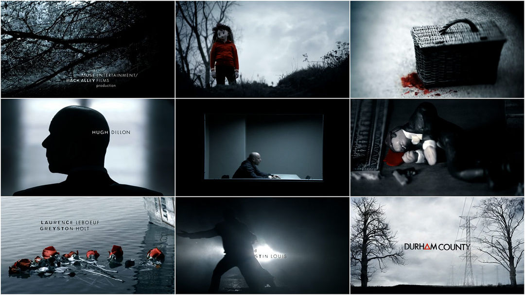
Smokestack pollution and imposing power lines loom in counterpoint or collusion with skeletal trees and a dark wood in the opening sequence for the Canadian series “Durham County.”

Creative Director Kevin Chandoo at Technicolor Creative Services:

“An intuitive editorial approach and the fantastic manipulation of reality led the way to a montage that hints at the disturbing truth about the people of Durham County.”

Canada | 2007 | Color | 1.78:1 | English

Direct Link: 480p (QuickTime, 865×368, 42 MB, 02:27) + 720p (QuickTime, 1280×544, 62 MB, 02:27)

CREDITS

Creative Director: Kevin Chandoo
Producer: Sam Komaromi
Designer: Breck Campbell
VFX Artists: Brent Whitmore, Darren Achim
Editor: Kevin Chandoo
Matte Painters: Jason Snea, Kevin Chandoo
Colorist: Andrew Exworth
Studio: Technicolor | Toronto

Category: TV

Tagged:

4 Responses

  1. Jordan says:

    So rad. That show was spectacular. :D

  2. Thank you so much for posting this and repping us Canadians. The show is a good one, and the titles Stand Out (with music from Tom Third which is always a plus).

    You should also check out the opening titles from ReGenesis, which was produced by the same company as Durham County (and my favourite show of all time… just sayin’). They are absolutely spectacular!

    http://www.youtube.com/watch?v=WF-L7TaQR4A

  3. Dirk says:

    Beautiful, without being overdone.

  4. John V says:

    You don’t have it in the set of screen grabs, but I particularly liked the way the text was organized in line with the smoke stack. Good stuff.

Leave a Comment

Advertisement

ADS by FUSION

Categories

  • [+] Companies
  • [+] Designers
  • [+] Features
  • [+] Interviews
  • [+] Site
  • [+] SXSW
  • [+] Titles

Referral

Master Index

© 2010 The Art of the Title Sequence. All other names and trademarks appearing on ArtoftheTitle.com are the property of their respective owners.