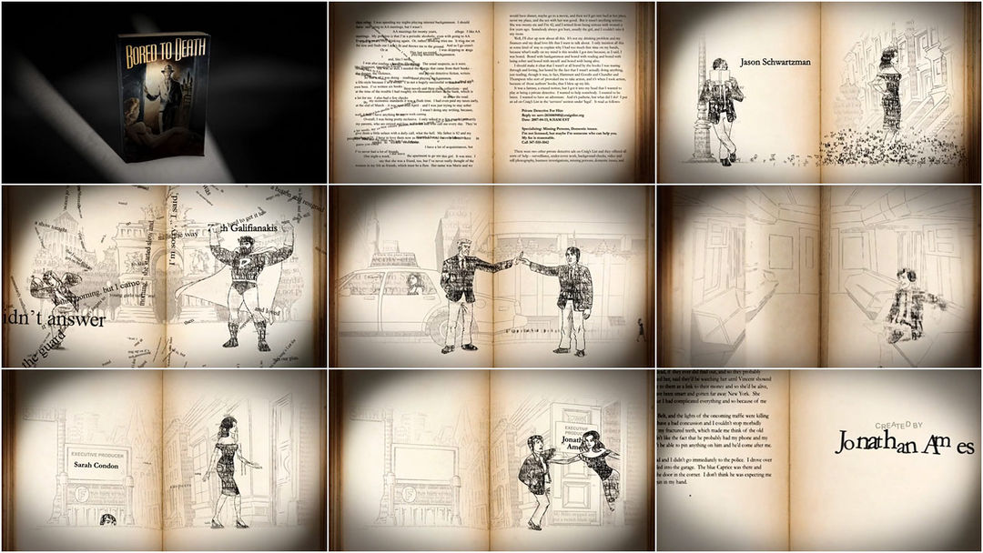


The titular tome spreads its pages to typography set illustrative; the text embroiders the imagery as shapes and labels. With what sounds like the jingle of loose change, the type scatters and lays as lovely a refuse as turned tree leaves. It is Curious Pictures' title design for HBO’s Bored to Death by creator/protagonist/writer/executive producer Jonathan Ames.
Primetime Emmy Award for Outstanding Main Title Design
A discussion with Illustrator DEAN HASPIEL, and title sequence director TOM BARHAM at Curious Pictures.
DEAN HASPIEL - illustrator.
Tell us a little background on yourself?
DH: I grew up loving the characters from the two big franchises in comics (Marvel and DC) and figured that I'd also want to write and draw them one day. I had wanted to do comics starting from when I was 12 years old, but it wasn’t until I was in high school that I started assisting Walter Simonson, Howard Chaykin and Bill Sienkiewicz. Between American Flagg!, Thor, Electra: Assassin, and The New Mutants... the three of those guys were collectively running the gamut for Marvel and indie comics and so I had the good fortune to work in a studio with those guys and learn some chops. Later on, I tried (unsuccessfully) to get gigs with those same companies. In retrospect, it was probably because I just wasn't good enough at the time... that and because I was being influenced by Harvey Pekar's American Splendor and Chester Browns Yummy Fur. I realized that comics could be about anything... not only could I invent my own superheroes... I could also write and draw stories about my own life. That realization made me less of a slave to the Marvel and DC mythology and allowed me to explore my own mythologies.

Character designs
Throughout the following years, I dabbled with franchised comics a little bit , but I was still kind of doing outsider art. I created my own characters - like Billy Dogma from 1995- that I've been revisiting and revamping ever since. Back in 2006, I created (along with seven other founding members) the web comics collective called act-i-vate.com. With that outlet, I decided to take the bull by the balls as it were and write and draw my own stuff. I was still working in corporate comics (what I was doing back then was memoir - working with Harvey Pekar on American Splendor). Then I hooked up with Ted Hope (I'd been an assistant of his) and because I knew that he was a big comics fan, I got he and Harvey together. About a year and a half later, the two of them had an award winning film.
Harvey wanted to do something bigger with me (as a thank you), so we worked together on The Quitter graphic novel for Vertigo and THAT put me on the map. I had also befriended Jonathan Ames (back in 2001) and at the time we had talked about doing a collaboration... I challenged him to write a comic book that I would draw (The Alcoholic). A bunch of stories and essays later, Jonathan wrote a short for McSweeny's called Bored to Death and a producer who read it felt that it could be a basis for a TV show.... low and behold it was sold to HBO.

"Jonathan" character designs
When it came time to create the opening title sequence for Bored to Death, Jonathan told me the concept and I wished him good luck (while thinking to myself that there was no way he'd pull it off). They were working with Curious Pictures to develop what it was going to look like. I saw some of the process of that, and even though their style was pretty good, I think that they eventually made an eleventh hour call and decided that the opening sequence art should match the comic art in the show as closely as possible.
Was the original idea/pitch the same as what you see in the open now?
Oh yes. Jonathan told me that it was going to be animated versions of the characters in the show with those characters coming in and out of the text of the detective novel... that's why I was originally so skeptical. When I was signed on to work on it, I had never done animation or anything like this before. I looked to one of my heroes, a cartoonist named Alex Toth. He was responsible for the “bible” drawings used in animations for Hanna Barbara, Super Friends, and stuff like that. I looked at some of the books I had of his to get a better sense of how to draw a character standing, a character walking, facial expressions etc., because I knew that Curious was going to need that in order to transcend my style and animate it. So with me doing those breakdowns, Curious did the bulk of the actual animation.

I remember that working with Jonathan was very symbiotic process... he would literally call me from the set (while shooting at 1am) having devised a new idea or something for me to draw. I'd usually turn that around within a day. Because of the many chefs in the kitchen and because of my working with a new medium, I had to revise and boil down far more than I usually do because of the needs of the medium.
Did you have a breakdown of the different scenes in the sequence?
Jonathan came to my studio several times to sit with me and not only act out the actual sequences, but work on changing specific lines and looks for each of the characters in situations where I was struggling with them. Ted Danson, to my surprise, is actually harder to draw than you might think. It (the process) was micromanaged, but in a good way. It was definitely a challenging experience.
So you're sending key art to Curious?
I'm sending in key art to Curious and their staff not only reduces what I've done, but then in turn animate it. Meanwhile, they are producing this beautiful background art that almost looks like a New Yorker magazine art. I feel like it evoked New York and especially Brooklyn very well. Then, when they add the performance of the animation, the song that Jason Schwartzman co-wrote, produced, and sang; and then the paperback pages flipping... you suddenly get something really effective.

“SuperRay” comic cover
So how much material did you produce for the sequence?
I must have done - including those rejected - about thirty drawings, which is just a drop in the bucket compared to what the other artists had to do to move those characters. It really is an amalgamation of a few key frames that I did and the other artists really working their magic. I really cannot take credit for the success of that opening sequence... and you know, I have an ego the size of Nebraska, but I'm also humbled by what they did.
You'll continue to work on the second series with Jonathan?
Dean Haspiel: Well, the second season is wrapped and I drew more comic art for that, as well as some other stuff that pops up in the last episode. In fact, at Comic Con this year, we cobbled together a bunch of the art I created for season 2 (with the character SuperRay). The artwork, sort of a promotional comic for Season 2, was handed out by actors dressed up and walking around as SuperRay!
❋❋❋
TOM BARHAM - title sequence director.
How did you become involved with the project? How did the idea of animating the type come about?
TB: We were approached by HBO to pitch the series titles. I was familiar with Jonathan Ames' work. When I found out that the series was semi-autobiographical — the story about a writer who hires himself out as a PI - it made sense that the entire world should be a fictional one created from the text of his imagination. We used the original copy from the short story in McSweeney's for the characters as well as all of the backgrounds.
Including elements of noir or neo-noir seems an obvious choice. What lead you away from that?
Exactly that — it was too easy. We did include a few noir-esque touches like the book cover and general lighting of the pages.
What was your approach to directing the opening credit sequence?
I wanted to do a combination character and flip-book animation to move the Jonathan character from location to location in a book format. Additionally, since the characters were made from text contained within the book where they exist they needed to move and interact with each other as if they were emitting or leaking letter forms and words.
What were the first questions you had and how were the answers arrived at?
What’s the idea here? How can we create a sequence that is organic to the subject matter and that communicates both the intent of the show and the intent of the author?
What was the process for working with the artist Dean Haspiel?
Dean had worked with Jonathan on his novel The Alcoholic and done some drawings for the show.
Do you have any interesting stories related the development of this sequence?
Tom Barham: What was most unique was working with Jonathan Ames. It’s unusual for the author of the story to be so intimately involved with the production of the title sequence. He provided a great deal of insight about the characters.
Can you give us an example of something you took away from this collaborative project? Which gives you a greater satisfaction, collaboration or a project that is entirely your own?
Both have their merits. For the most part though, I think collaborations provide the greatest opportunity for personal growth. The challenges are more numerous and involve a greater levels of understanding of people and their points of view versus your own personal take on things. The best ventures are usually those that tap into other people’s talents as well as your own.
Related
-
Great Expectations
interview
-

United States of Tara
summary
-
Six Feet Under
interview
-
Da Vinci's Demons
interview
-
Dexter
interview
-
Carnivàle
summary