The Art of the Title Sequence

Dean Spanley

Dean Spanley contact sheet
Click to Watch SD
| Click to Watch HD | iPod/iPhone

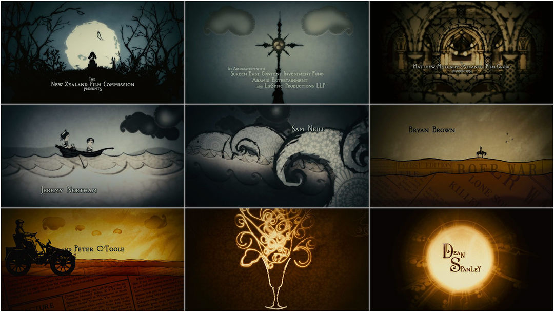
Spires and moons outfit hidden worlds
with a depth of bells and the sea scored with bombast,
coruscating glyphs infuse a chalice
and the souls of men spill forth.

Oana Elisei of UK-based Lipsync Post:

“The brief for the project was to produce opening film titles reflecting the quirky quality of the movie itself which features strong performance from Peter O’Toole and Sam Neil amongst others.

The graphic style draws its influence from Victorian art and crafts, Indian paisley designs and William Morris wood block prints. All of these elements were carefully considered and adapted in order to make this title sequence unique.

After the initial design discussions with Director Toa Fraser and Editor, Chris Plummer, LipSync’s Howard Watkins created the animatic which became the basis of the sequence.

Every element was hand drawn by artist Jason Dickinson, these were then scanned in at a high resolution and prepared in Illustrator in order to be then animated in After Effects by Peter Dickinson. For the typography, a William Morris style font was created and animated by Julia Hall.”

New Zealand/UK | 2008 | Color | 1.85:1 | English

CREDITS

Creative Director: Howard Watkins
Lead Design and Animation: Peter Dickinson
Additional Design: Julia Hall
Storyboard Artist: Jason Dickinson
Graphics Assistant: Oana Elisei
Production Company (titles): Lipsync Post

Atlantic Films
Producer: Matthew Metcalfe, Alan Harris
Director: Toa Fraser
Editor: Chris Plummer

Bookmark and Share

Category: Film, Lipsync Post

Tagged: , ,

  • The beginning of the animation and the boat/waves sequence are totally a copy of the 'A Series of Unfortunate Events' end credits animation!!!
  • serch
    Yes, I see similarities with Lemony Snicket's credits too
  • faderes
    this is awesome and everything but . . .
    http://www.youtube.com/watch?v=NUx8Jf8F7Ks
  • "The graphic style draws its influence from Victorian art and crafts, Indian paisley designs and William Morris wood block prints. All of these elements were carefully considered and adapted in order to make this title sequence unique."

    Nice work, but the graphic style was more influenced by Jamie Caliri's "Lemony Snicket" title than anything else. The scene with the two kids in the boat on sea is almost identical to a similar scene in that sequence.
blog comments powered by Disqus

Interviews

Gareth Smith on Up in the Air
Krystian Morgan on The Thing³
Johnny Kelly on Het Klokhuis
ISO Design on A History of Scotland
Danny Yount on Sherlock Holmes
Gareth Edwards on How We Built Britain
Yellowshed on Cloudy with a Chance of Meatballs
Chic & Artistic on Dan Black's “Symphonies”
Nirvan Mullick on Willard
Sfaustina on Tetro
Kevin Dart, Stephane Coedel and Cyrille Marchesseau on A Kiss From Tokyo
Matteo Manzini on Chéri
Jim Capobianco and Alexander Woo on WALL·E
Edd Kargin on Novaya Zemlya
David Daniels on Freaked
Kyle Cooper on The Incredible Hulk
Garson Yu on Hulk
Zephyr on Wild Style
Howard Nourmand on The Dog Problem
Nina Paley on Sita Sings the Blues
Stephane Coedel on The Amazing Adventures of Kid Cole & Klay
Stefan Bucher on The Fall

Advertising

Browse

Latest Updates via Twitter

Twitter Updates

    follow us on Twitter

    Master Index

    © 2010 The Art of the Title Sequence. All other names and trademarks appearing on ArtoftheTitle.com are the property of their respective owners.