


For our first post in 2010, we revisit the How We Built Britain titles with an interview with their creator Gareth Edwards. Edwards, a truly multi-talented designer/visual effects artist/director who has worked for the BBC on numerous productions including Seven Wonders of the Industrial World and Attila the Hun, this year completes his first feature film, Monsters.
A tangle of utility in both architecture and typography offers a fascinatingly structured title sequence for the BBC’s How We Built Britain that bespeaks an acquisitive England. The artificial monuments of type seem proportionally sound, the final title card an achievement of engineering.
A discussion with Director/Designer GARETH EDWARDS.
Tell us a little bit about where you are with your career.
GE: I kind of got into graphic design by accident. I always grew up wanting to be a filmmaker, but when I went to film school – about 15 years ago – it was very clear that computers were going to be the future of filmmaking. So I bought one, learned the software, and got completely sidetracked in a career doing visual effects and title sequences. Over the last few years I was able to use this skill to convince companies like the BBC into letting me direct TV shows by promising to add lots more production value through creating my own digital effects. I’m currently finishing the post-production on my first feature film called Monsters, a sci-fi road movie set in Central America made for Vertigo Films in the UK.
How did you become involved with How We Built Britain?
I was waiting to begin my next directing project and had a bit of a work gap. I knew the people in BBC Arts through my time doing visual effects with them. The producer called me about the show and it had been a while since I had created a title sequence, so I felt like it could be fun.
A great story will stay with you much longer than a great design.
Take us through the design process. How did you develop the concept for the piece?
I remember going to a meeting with the various people at the BBC where I pitched about eight different ideas, all of which I quite liked. I was trying to find a simple visual metaphor for the show. I could tell they didn’t like any of them and I thought, 'Well, that’s that. I guess I won’t be doing this.' Then, as the meeting was nearly over and I had a better handle on what they wanted, I said, 'Well, we could just do the obvious thing.' 'What’s that?' ... 'We could just do the title, How We Built Britain, as buildings… across Britain.' I was embarrassed as I said it as it felt quite clichéd, but they loved it!
And then how did the development proceed?
Once we had agreed on the concept, everything else fell into place very easily. None of the footage was specifically shot for the titles, so I spent a day sifting through all their helicopter footage, looking for shots where I might be able to add giant letters. I then did a very rough edit and tracked the footage adding a simple Arial font as an example of where each letter would go. They really liked what they saw and didn’t want me to change anything, including the font!
What equipment did you use?
I created the 3D letters in 3D Studio Max. My 3D skills back then were pretty average, so I just modeled and textured as best I could. I used Photoshop for textures – stuff taken from other buildings found in the rushes. Everything was comped in After Effects, which didn’t require much work other than grading, rotoscoping, and so forth. The 3D was tracked using Boujou – just the version where you push a button, as I’m no expert tracker, either!
What we went through a few years back with the birth of digital animation and graphic design was a bit like in the ‘60s with the birth of rock and roll.
What was the most difficult aspect of this piece?
I guess the tracking was hardest. Some of the elements slide around in some of the shots and I had to go in by hand and squash and stretch elements to make it less noticeable. What’s funny is that I think when people know something can’t be real, they are much better at spotting it. But there is a shot in there where I replaced and added an entire mountain range – the first car POV of the 'I' – to help it cut with the following shot. The tracking on that isn’t great either, but because you assume it’s real, nobody ever notices.
And did you learn anything specific while working on this?
That it’s good to be open minded and listen to your producers – sometimes! They know their project much better than you ever will. I think if I had gone with any of my original designs, I might have created something that I would have liked, but would not have been as good for the show. I also learned that some people care a lot more about fonts than me!
What recent work has taken you by surprise?
I haven’t really been following motion graphics as much as I used to. I can’t help feeling that what we went through a few years back with the birth of digital animation and graphic design was a bit like in the ‘60s with the birth of rock n’ roll. There was suddenly this new frontier that everyone dived into and came up with lots of really cool work. I think it’s such a fast-moving, incestuous industry, that it is very hard to create anything timeless. As a result, I don’t really find myself sitting and watching any of my old favourite graphic design DVDs, but I’m always sitting and watching my old favourite films, which I think says a lot. A great story will stay with you much longer than a great design. On very rare occasions something comes along that manages to combine both, and it is those pieces of work that will outlive us all.
So what’s next for you?
Finishing the post production on my first film Monsters, which I need to get much better at explaining in just one sentence. It’s kind of a monster movie, but set years after most monster movies end, when people aren’t running and screaming anymore, but life just goes on as normal with these ‘things’ in part of the world. We shot it all very guerrilla style in Central America. Apart from our two main characters, everyone else in it are real people just going about their real lives, with all the sci-fi elements being added in digitally afterwards. As a result I think we’ve created a very believable world with some really subtle performances. I can’t wait for it to be finished and start showing people… and not an Arial font in sight! Actually, maybe a few on some road signs here and there, but just for realism!
Related
-
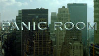
Panic Room
interview
-
Stranger Than Fiction
summary
-
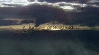
A History of Scotland
summary
-
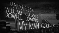
My Man Godfrey
title only
-
Zombieland
summary
-
Moon
summary