The Art of the Title Sequence

Sherlock Holmes (+ Danny Yount interview)

Sherlock Holmes contact sheet

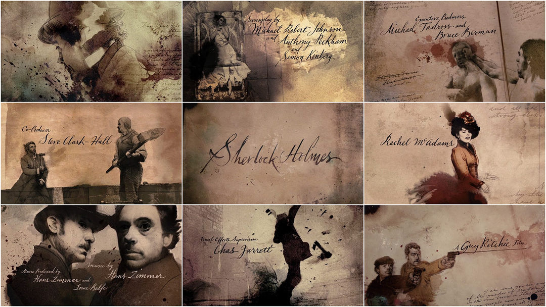
Watery cobblestone logos and longitudinal linotype layer, lace and lash Prologue Films’ opening and end credit work for Guy Ritchie’s “Sherlock Holmes.”

The sequence creative director Danny Yount, a self-taught Emmy-winning designer/director produced main titles for Six Feet Under and The Grid while at Digital Kitchen. He currently resides at Prologue Films and has created titles for Kiss Kiss Bang Bang, Iron Man and RockNRolla.

INTERVIEW
A Q&A with Danny Yount of Prologue Films.

Art of the Title: Take us through your artistic process – how do you begin a project like Sherlock Holmes? What was your approach to the logos and the beginning and end titles?

Danny Yount: I got a call from director Guy Ritchie while he was in the middle stages of principal photography. He liked what we made for RockNRolla and asked us to consider something good for Sherlock Holmes. We were sent a script and got very excited about it after realizing the more edgy and fun interpretation of the classic character of Holmes. So Ilya Abulhanov and myself made a couple of ideas (examples 1a & 1b).

Example 1a: Early concept from Danny Yount (Click to Enlarge)


Example 1b: Early concept from IIya Abulhanov (Click to Enlarge)


I was invited to fly out to present them at one of the sets in London and see some of the film, so I had a very strong sense after that of where they wanted to go visually. The brief I was given was to do a live action shoot that involved a lot of newspaper headlines from the late 1800′s, which would give a little history to the early beginnings of Holmes and Watson and lead into the first scene of the film following the last headline on top of a stack of newspapers laid at the doorstep. We also wanted to show part of the printing process of that time period using the linotype machine and wood block type headline compositions.

After going back and forth a bit we concluded that it be a macro shoot that was very graphic, so we rented some time at a printing museum and set up several still shoots to get all the material we needed for storyboards (example 2a, 2b & 2c). I also shot some test footage with the Canon 5D to do a style test (example 3a & 3b). They liked the presentation and told us they would get back to us.

Example 2a: Printing press concepts (Click to Enlarge)


Example 2b: Printing press concepts (Click to Enlarge)


Example 2c: Printing press concepts (Click to Enlarge)


Several months went by and the film had taken shape more so they decided to lose the headlines sequence. So they went from wanting a full main title to having a short main title and an end credit sequence. They also wanted the end credits to be an anthem to the film – using highlights from the movie. Designers Henry Hobson, Simon Clowes and Lisa Bolan teamed up and made the storyboards (example 4). I decided to go into a different direction with mine (example 5). In retrospect I think they were a little dark though (ha).

Once they approved of the look we had about 4 weeks from start to finish, and we were also given a special effect sequence. It was a lot of work, even for a company our size. But we have a great group of talented and dedicated people who did what it took to get it done.

Example 3a: Printing press motion test (Click to Watch Quicktime)


Example 3b: Printing press motion test (Click to Watch Quicktime)


ATS: How large was the production team, and how closely do you work with them?

DY: We broke up into a 3 separate teams – with a total of about 14 people working around the clock. The end credit sequence required the most people by far, as there was so much detail in the illustration and transition work. The illustration took a long time to make. I’m not sure if Jorge slept very much. The main title and Hallucination VFX team was myself and Brett. The opening logos Jose and Todd.

Example 4: End credit storyboard – Hobson, Clowes and Bolan (Click to Enlarge)


I work very closely with everyone and I am always part of the process. I owe that to the client and I especially owe that to the younger designers who are building their own body of work and careers. I also learn a lot from them – they always bring in new ways of doing things. And they learn from me as I help them to avoid the same mistakes I made when I was their age.

Example 5: End credit storyboard by Danny Yount (Click to Enlarge)


ATS: In the opening logos, is there any part of the cobblestones that are real?

DY: Nope – just well crafted 3D. Jose and Todd are masters. The client originally wanted the logos formed out of pools of water but Chris Sanchez came up with the idea of making them out of the cobblestones, which they loved. Jose made an excellent shading system that nailed the look of the wet gritty surfaces and the weathered stones, which took a lot of love to shape into very uneven bricks.

That’s the trick with making good CG – you have to spend a lot of time modeling the imperfections or it will miss the mark. It will look stiff and look like a video game. Same with the camera work – you have to make cameras that feel heavy and are hard to throw around. The more of a human touch you can bring into CG the better it looks and feels.

They also wanted to have a carriage break frame and cut to the opening shot but I thought it would be more interesting to just wip the camera up to the first shot. Todd used camera projection techniques for it to marry properly. I also wanted leaves to blow across the surface but we just ran out of time.

Opening Studio Logos (Click to Watch Quicktime)


ATS: The Illustrated Paper + Illustrated Times motif that permeates both the opening and closing title sequences – period sketches speckled with patterns in the clues and fine detail in the patterns. What tools did you use to accomplish this?

DY: A lot of human hands, a photocopier, ink footage and a few photoshop filters.

ATS: What is it to push for something more than the audience is used to? Do you wrestle with taking creative risks? How do you balance and/or meld doing something because it strikes you vs. doing something overtly reflective of the body of the film? When do you hold to a vision and when do your experiment?

DY: I always experiment and I always push. That is what client wants and it is what I am being paid to do. But if I ignore the brief then anything I do becomes worthless to them. Or if I design something that is too abstract and self-inflated then it becomes meaningless no matter how beautiful it is. It has to communicate and it has to be interesting and stimulating – in that order. It is funny though that we call these “creative risks” – I think the only risk you take is when you ignore the client. And if you are going to do that then you better also have their version or you may get fired from the assignment. It’s a matter of trust – that’s all. And once that is established most smart clients will give you freedom.

Hallucination VFX (Click to Watch Quicktime)


ATS: What are some of the lessons in title design that you’ve used in your process? Did you learn anything new on Sherlock Holmes?

DY: It has to work perfectly with the film. I’m a guitarist so I like to look at it like a solo break – I get my short time in the spotlight but I have to use it to make the song better. If I play sloppy it makes it worse. If I play too fast and show off it might get interesting but it is inappropriate.

ATS: What gets you thinking differently? What new technologies are you embracing?

DY: Travel and people and nature. I’m interested in some of the newer apps like Houdini and Nuke. I would also like to buy myself a Canon 7D sometime soon.

ATS: What brings you the most satisfaction? Seeing the final piece onscreen? Or is it the process that brings you joy?

DY: Both. I love the process – I get to learn so many things and get to sharpen my skills, but I also get very “locked in” to what I’m doing. There’s a level of commitment to the process that makes you go very deep and explore every aspect – it becomes apparent to you that you are created for that very thing. And when you realize that you pour yourself into every part of the process of exploration. It is only something that those who have been there can understand. We are created to create. When we realize what we are good at and pursue it with all we have it becomes very rewarding intellectually as well as spiritually.

Sherlock Holmes Main Titles (Click to Watch Quicktime)


As far as seeing it on the screen – you forget all the pain you have been through. It is a cliché I know but it is like giving birth. You forget the hardship and long hours and stressed relationships and you walk away with a satisfaction that you did your best. And everyone you worked with is better as a result if you handled the job well.

ATS: Following on from that, how does that satisfaction manifest itself to you?

DY: It makes me grow as an individual by learning from mistakes as well as successes. It is very humbling to be able to do for a living what I love.

ATS: So what excites you outside of the design field?

DY: My family and riding my dirt bike and photography. I also love speaking at conferences – I meet so many cool people and get to see new places.

ATS: What’s next for you?

DY: I’m working on Iron Man 2 and things are looking good so far.

LINKS

Web Extra iconDanny Yount

Web Extra iconPrologue Films

Web Extra iconDanny Yount at Watch The Titles

DETAILS
  • USA
  • 2009
  • Color
  • 1.85:1
  • English
  • Available on DVD or Blu-ray

CREDITS
Creative Director: Danny Yount
Production Company: Prologue Films

Category: Danny Yount, Film, Interviews, Prologue Film

Tagged: , , , ,

26 Responses

  1. Scott Gordon says:

    Beautiful article, thanks!

  2. I did a project back when I was in high school on Danny Yount, who is behind some of my favourite mograph work.
    Also, Guy Ritchie is my favourite director.
    …I’m gonna ‘splode.

  3. BEMiller says:

    Wow. Beautiful. Loved the illustrations. (I haven’t seen the movie.) Thanks for the interview. I love reading on how things are done.

  4. schui says:

    Unbelievably precious piece of information! Thank you very much!

  5. Nicholas says:

    One of my favorite opening/end credit sequences, easily. Thanks for the interview, it was a great read!

  6. Mike says:

    I notice your clip corrects the big booboo that was in the release print, where the newspaper says “Sherlock Holmes aides [sic] police”.

  7. Merethe says:

    Oh you covered it… Awesome:)

    Thank you for that..

  8. Alvin says:

    Great interview and thanks a lot for sharing your process including boards and motion tests.

  9. Marshall says:

    It never gets old seeing all the steps in the creative process. When I do get to see amazing work broken down and the process explained, it’s gives me a sense of encouragement that I, too, could one day be working on something like this. Great interview, and great movie!

  10. Great interview, very very interesting and useful!

  11. MB says:

    Love this interview and thanks, Danny, for sharing the creative process and early storyboards. Reading and seeing the evolution, to experiencing the final screened version, is awesome!

  12. James says:

    Great interview! I’ve haven’t seen the movie yet but that intro looks beautiful.

  13. Vi says:

    Wow, amazing! I was looking for this everywhere. After I left the theaters I couldn’t get the movie, especially the credits, out of my mind. The old-time feel of it and the effects with the watercolor are just brilliant. Thanks for sharing.

  14. another_pilot says:

    Thanks for this interview!

  15. Thomas says:

    A great work, I really like this technique. I don’t know how they animated the ink. Video shots ?

  16. guest says:

    Looks amazing, but come on, we´ve seen the “ink-reveal-effect” for some years now. It’s very well done und beautiful, but it’s far from ground breaking.

  17. designbyone says:

    Great interview! Prologue's work is very good.

  18. shin-ya says:

    It's very beautiful article.

    My heart is shake.

    Thanks much!!

  19. shida says:

    i love this one

  20. very beautiful, i'm happy to see the proccess of this stunning opening sequence, very love it and i envy!!!

  21. Cornelius says:

    It would be great to hear some of the thought behind the end-titles … for example using RDJ’s naked body shot for “costumes”, or Warner Bros. for the big brute crashing through doors. Some of the shots seem “tame” (like using London Bridge for Silver Pictures, but I’m sure there’s a story behind each one.

  22. Daria says:

    thanks so much for the interview – i absolutely loved the credits in Sherlock Holmes!

  23. Great visuals, and I like the post-modern transparency :-) Even though it has become soooooo cliché, it still works for films like this.

    People should also look at the title sequences of previous Sherlock Holmes films, notably The Private Life of Sherlock Holmes (Billy Wilder). That film opening is quite ahead of its time, as it playfully shows SH memorabilia being taken out of a trunk, but also showing new objects that show a different side to Holmes, ie it plays with clichés and pastiche. So, in a way, they did a very similar thing to Guy Ritchie’s SH 30 years earlier.

  24. jamie hurst says:

    Hey, I was wondering if anyone could point me in the right direction at trying to have at go at this style of illustration myself. I loved the movie and especially the end credit sequence, it all blended in with the feel of Old England perfectly. Not to mention the style of it is really stunning. any ideas or help would be appreciated.

  25. Eric MacLeod says:

    No credit to Bonnie Ebbs’ calligraphy? It gives the credits a really engaging feel!

Trackbacks/Pingbacks

  1. [...] This post was mentioned on Twitter by Steve Smothers, nel. nel said: If you're gonna go see Sherlock Holmes, stick around to see the end-credits – amazing http://bit.ly/5rNc0l [...]

  2. [...] Sherlock Holmes End Credit sequence Comments [0]Digg it!Facebook [...]

  3. [...] The art of the title sequence has an interview with Danny Yount, a self-taught award-winning designer/director who in the past has produced main titles for Six Feet Under and The Grid while at Digital Kitchen. He currently resides at Prologue Films and has created titles for Kiss Kiss Bang Bang, Iron Man and RockNRolla. [...]

  4. [...] should definitely read the new Art of the Title interview with Danny Yount of Prologue Films, the studio behind the (much more relevant) main titles of the [...]

  5. [...] Sherlock Holmes end credit sequence [...]

  6. [...] Art of the Tile Sequence features Sherlock Holmes Link to the Article [...]

  7. [...] Läs vidare hos Art of the Title Sequence Av Daniel Feldt Skrivet i Nördigt · Etiketter: Art of the Title Sequence Danny Yount guy ritchie Sherlock Holmes · [...]

  8. [...] Art of the Title Sequence highlights the impressive Sherlock Holmes opening credits, including an interview with the [...]

  9. [...] sequence and it is an amazing work of art. You can read and see more about the guy who did this at The Art of the Title Sequence blog: The sequence creative director Danny Yount, a self-taught Emmy-winning designer/director [...]

  10. [...] sehr ausführlicher Bericht über den Abspann des neuen Sherlock Holmes Film findet man auf Sherlock Holmes end credit sequence | The Art of the Title Sequence. Der Abspann ist wirklich sehr schön und aufwendig gemacht, es lohnt sich also länger im Kino [...]

  11. [...] [Via] Von Joachim Baumann | 28.01.10 | Art & Design, Movies |  Permalink   Trackback Adresse für diesen Eintrag: http://www.smartshoppingblog.de/9201_kreative-pflastersteine-der-weg-zu-sherlock-homes/trackback/   [...]

  12. [...] Fascinating look at the process behind creating the wonderfully graphic end credits for Sherlock Holmes. [...]

  13. [...] If you haven’t seen Sherlock Holmes yet the best thing for me about the film (including the CGI shots of London) is the opening title sequence. It a master piece of illustration and design. Read more about how it was done and by who here – Sherlock Holmes opening title sequence. [...]

  14. [...] and Paper” is how we named the style we saw in the end credit work of Sherlock Holmes by Danny Yount from Digital Kitchen. Here is the result of our attempt to compile different techniques into this unique [...]

  15. [...] Art of the Title Sequence interviews Danny Yount about the design of the title sequence for Guy Ritchie’s ‘Sherlock Holmes’. [...]

  16. [...] Sherlock Holmes end credit sequence – I love this aesthetic. Slightly depressed I don't have the graphic/artistic skills to do it properly on my own design. [...]

  17. [...] film yang baru tayang beberapa waktu lalu di bioskop yaitu Sherlock Holmes ini memeiliki opening tittle yang menarik. salah satu aplikasi dari motion grafis di bidang perfilman adalah membuat opening tittle film, dan pembuatan opening film ini menjadi awal mula dimana motion grafis akhirnya ada, dan sampai saat ini fungsinyapun bertambah seperti visual efek pada film. opening tittle film ini sangat menarik, karena menggabungkan antara hasil syuting dengan motion grafis yang saling berkesinambungan/ inline, masih dengan format dan look/ style desain Sherlock Holmes yang terdahulu, hal ini membuktikan bahwa opening tittl ini tidak ingin menghilangkan identitas asli yang sudah ada dan melekat di masyarakat. kalian bisa lihat referensi lengkapnya disini [...]

  18. [...] Really good interview with the sequence creative director. [...]

  19. wildpark 0.1 says:

    [...] http://www.artofthetitle.com/2010/01/21/sherlock-holmes/ Sherlock Holmes title scene secrets. (via Bente) http://www.webdesignerdepot.com/2010/02/20-years-of-adobe-photoshop/ Open a beer: Photoshop is today 20 years old! [...]

  20. [...] The very ambitious and inspiring site Art of the Title had a great talk with Prologue’s creative director Danny Yount about the work and process behind the intro and end titles for Guy Richies latest movie Sherlock Holmes. It’s an interesting and pretty in depth interview guiding you through the whole project, from early ideas up to the finished sequences and packet with great concept images and sketches that never made it into the final product. I’ve had a soft spot for DannyYount every since his days at Digital Kitchen and the Six Feet Deep intro and it’s nice to see him deliver top notch work once again. Read the full Art of the Title Q&A here. [...]

  21. [...] Art of the Title’s inter­view with Yount here and see the evo­lu­tion of his work on this project as well as the full cred­its [...]

  22. [...] Sherlock Holmes by Prologue Films (480p | 720p) [...]

  23. [...] sito potete vedere altre immagini e il video per poterli apprezzare al meglio. Amo letteralmente questo [...]

  24. [...] February 23, 2010 Sherlock Holmes (+ Danny Yount interview). [...]

  25. [...] Posted in Uncategorized by matt on March 2, 2010 I haven’t seen the film, but this article is a fascinating insight into the process of storyboarding and designing credit sequences. above: [...]

  26. [...] Sherlock Holmes End Title Sequence (quicktime required) [...]

  27. [...] Yount talks of his iteration on Sherlock Holmes, a film I thought was quite well acted, and memorable for it´s script and [...]

  28. [...] una web llamada The Art of Title donde hacen una entrevista a Danny Yount, componente de [...]

  29. [...] and I forgot how amazing the titles and end credits were. The Art of The Title Sequence has an interview with Danny Yount, creative director, that goes into some detail about the process (below) of arriving at the final [...]

  30. [...] and I forgot how amazing the titles and end credits were. The Art of The Title Sequence has an interview with Danny Yount, creative director, that goes into some detail about the process (below) of arriving at the final [...]

  31. [...] Sherlock Holmes Designed by Prologue. These end titles have an almost baroque quality, with a dymanic (if eery) continual movement that mimics the spilling of ink. The watercolor-like illustrations, combined with the quill pen handwriting, certainly represent Holmes’ era. Watch the full end titles here. [...]

Leave a Comment

Advertisement

ADS by FUSION

Categories

  • [+] Companies
  • [+] Designers
  • [+] Features
  • [+] Interviews
  • [+] Site
  • [+] SXSW
  • [+] Titles

Referral

Master Index

© 2010 The Art of the Title Sequence. All other names and trademarks appearing on ArtoftheTitle.com are the property of their respective owners.