


Model kits and kilts.
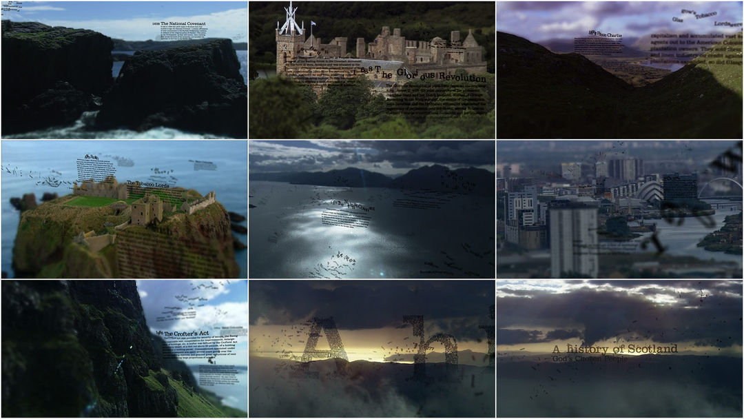
ISO Design’s opening title sequence to A History of Scotland offers a gathering sense of self and of a scaled Scotland. Using a tilt-shift effect that simulates miniature scale model photography where a shallow depth of field is created by blurring areas of the composition either optically or in post, the title technique nicely captures the spirit of the pioneering Picts.
A discussion with DAMIEN SMITH of ISO Design.
Tell us a little bit about ISO Design.
DS: 10 years young Glasgow-based digital design studio. Started out concentrating on personal motion graphics projects for commissioners like OneDotZero and moved into TV in the late 90′s working with the BBC, MTV and Channel 4 in the UK.
We still do a lot of broadcast graphics and have expanded the studio to work on large scale interactive installations for clients like Mercedes Benz and multiplatform projects like the new Sony XMB and the BBC iPlayer.
How did you become involved with the project?
We’ve worked closely with the BBC team responsible for A History of Scotland over many years. This was the largest production ever undertaken by the BBC in this country and we worked closely on early concepts for reconstructions, in programme graphics and the titles.
Take us through the design process, how did you develop the concept for the piece?
The design brief was simple – ” illustrate over 1000 years of Scottish history in a contemporary style”.
After early discussions with the producer and director, we kept coming back to one core idea . . Scotland’s history and it’s people is defined by it’s landscape; from the natural barrier the Highlands form to the rugged west coast and islands down through the central lowlands, this unique land form defined our history.
As with most projects three or four ideas were kicked around with the strongest developed into a storyboard. We all liked the idea of historical dates and type tagged or pinned into the landscape then blowing away in the wind, referencing the elemental nature of Scotland and the passing of time. We then gathered specially shot helicopter footage and added shallow focal planes into shot, that helped to build in a sense of scale and also caused attention to focus in on the type elements.
Describe the development process of the sequence.
After the BBC approved the treatment we created an animatic showing text blowing away over a moving aerial shot with a shift tilt effect on the background footage. This very quickly showed we could not manually key frame the type elements, as there were far to many characters and this also lacked a random natural feel. We then started scripting in After Effects to animate the type from a resting position to a new position off screen. We also split type blocks into words or letters and the scripts randomised the position and rotation parameters as the type as it left screen. The whole thing gave much more of a natural organic feel. Travelling mattes for were then created for all the helicopter shots and the shift tilt effects produced using Mocha, and tracking moving shots in SynthEyes.
What was the most difficult aspect of this piece?
Trying to squeeze it out of a BBC budget!
What recent work has taken you by surprise?
The Radiohead graduation film of Glasgow School of Art student James Houston – Big Ideas (don’t get any). Pleased to say James regularly works out of our studio as a freelance director!
So what’s next for you?
We have recently launched a creative social media platform in partnership with Channel 4, we are completing the titles for Peter Mullans new film NEDS and we are consulting on interactive installations for a new Zaha Hadid Museum.
Related
-
Panic Room
interview
-
Zombieland
summary
-
Moon
summary
-
Bombay Talkie
summary
-
How We Built Britain
interview
-
Dead Man on Campus
title only