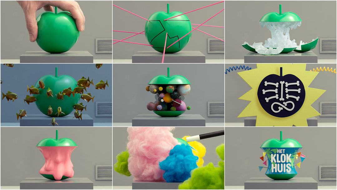


Quick and affordable 3D printing technology applied to classic stop-motion opens Dutch science program Het Klokhuis (The Apple Core) which is Holland’s oldest youth television show, covering everything from the history of dinosaurs to how an iPhone is made. It is a hybrid of hand crafted frame-by-frame animation and cleanly rendered apples with sprouting science experiments encapsulated like the seed of an idea about to be discovered.
A project breakdown with JOHNNY KELLY of Nexus Productions.
JK: This title sequence is unusual in that it was commissioned through an advertising agency, Kesselskramer in Amsterdam. The program Het Klokhuis is dearly beloved to many people in Holland; it has been running for over 20 years. The program primarily covers science but includes lots of other things like culture, history and technology, and is on every day. They wanted to refresh the show with a new logo and titles and approached Nexus to see if I would be interested in making them.
The art director at Kesselskramer, Christian Borstlap, had made a logo graphic, with the idea that we would come up the final logo design in the course of production. They had an idea of how the sequence would work, made up of a series of scientific experiments on a series of apples, but were entirely open about what exactly these scenarios would be. These were mostly based on what could animate in an interesting way, with fun results.

Early apple suggestions
The problem at this point was how to do justice to Christan’s beautiful logo shape. We hadn’t decided yet how the apples would actually be made, and discussed different materials. Something like plasticine wouldn’t have the right accuracy. I had used paper before but it wasn’t very good with curvy objects like an apple. My partner Jenny is a product designer and has used 3D printing quite a bit, and this seemed like a option that could work. This technology, which is still relatively niche, creates a physical object printed up in plastic from a 3D computer file, and is most commonly used by industrial designers to create prototype models. The film Coraline used 3D printing to create facial expressions, using individual models for each mouth shape, etc. Pixar also used it to create the models for their Zoetrope.
Apple prototype model renders
As it was for a public television station (NPS), our budget was very low, and as it turns out, the cost of getting the models produced here in London would have been prohibitively expensive. Then I remembered having come across a website of a company called Shapeways – who offer on-demand 3D printing by mail order and were much better value. The website is a little like YouTube, people upload 3D files, other people can leave comments, rate them, and you can order any of the models in various materials. Using this company – who fortuitously ended up being based in the Netherlands too – we were able to make simple shells for the whole apples, as well as ‘core’ shapes which we would be able to fill up with each apple’s insides.

3D layout in 3DS Max
I contacted Jethro Haynes, a model-maker/sculptor/illustrator whose work I have long been a fan of, to see if he was available and interested in collaborating on the project. Jethro worked incredibly hard in just a few weeks to build everything, with a limited budget. He has an encyclopedic knowledge of materials and is full of ideas, so it was always a pleasure to see what he came up with for the planets, fish and other elements.

Shoal of fish design
Making the models in 3D came with other advantages – we were able to plan the shoot quite precisely. Using 3D software we were able to work out what size plinth we needed to build, what camera lens would offer minimum distortion and how far back it would need to be. We were also shooting at two different scales, and Ben here at Nexus was were able to set it up so that the camera and background wouldn’t need to change when we swapped between these.

Studio layout - virtual vs actual
One of the sequences we had difficulty building was the melting bubblegum apple. We considered plasticine but decided that it would not give the right results, not being glossy enough. In the end we decided on creating a sequence of 25 individual models, one for each stage of the melting apple. These were then painted up by Jethro.

Raw and painted apple models
The animation was shot in 10 days in August at Clapham Road Studios, a film studio in south London which specializes in stop-frame animation. We used Dragon software which allows for very precise stop frame animation. Matthew Day, the DP on the project went to great lengths to create the perfect reflection on it, building up quite an elaborate set and lighting rig to this effect. The final result is quite surreal, looking so close to how the original models looked when rendered on computer. I’m happy with the resulting aesthetic, a sort of blurring between digital and analogue.
The end titles show what is coming up on the following episode of Klokhuis. Christian at Kessleskramer designed some typography for this, and suggested integrating video to show a preview clip. With some episodes there would be three or four of these listed, other times just one, so we designed the animation sequences to be modular. You can also loop the ticking clockwork for as long or short as necessary. The agency supplied us with some placeholder text so we could show how it works. This Dutch text on the sample animation we made reads “Next week on Klokhuis… Farts… Submarines…. Hip Hop” – so it covers pretty much everything you need in a TV show.
Het Klokhuis end titles
Jethro dismantled a large clockwork machine and rebuilt it inside one of the apples, designing it in such a way that it could collapse when hit with a mallet. Amazingly, many of the machine parts were still functional, so we were able to animate these (Example 7).

Apple clock parts
We had an extraordinarily heavy prop mallet that we wanted to use. The problem was that we wanted to rig it up for animation, but weren’t allowed drill holes in it or damage it in any way. Max at the studio arranged a counterweight to the mallet using a sandbag. This allowed us to animate it quite precisely without worrying too much about it falling on top of the apple (Example 8).

The mallet
Ultimately it was a challenging but enjoyable job to work on. Much of it was unknown territory and each sequence posed its own unique difficulties. I had for example planned to use real smoke for the final logo reveal and film this live action, but in the end opted for the stop motion staple, cotton wool. I find it interesting to try and use these old fashioned stop frame animation techniques and blend them with the benefits of new technology. This type of experimentation doesn’t fit every job but it seemed fitting given the show’s subject matter itself, and interestingly the first rebranded episode of Het Klokhuis will be all about the making of the title sequence itself.
Related
-
Brat Bratu
summary
-
The Lego Movie
interview
-
Dr. Goldfoot and the Bikini Machine
summary
-
Freaked
interview
-
Willard
interview
-
The Parent Trap
summary