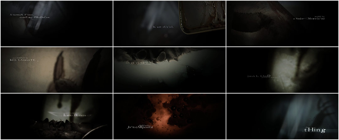


A fine pair of fire-melt title reveals open Howard Hawks' and Christian Nyby's The Thing from Another World and John Carpenter's immutable and Hitchcockian The Thing, respectively. In speaking with Krystian Morgan, a 21-year-old from Wales, we relearned a thing or two about work ethic, humility, and the importance of fresh eyes. Morgan's title sequence, based on Carpenter's vision, was created when Morgan was in his final year of university where he studied motion graphics and compositing. His grave atmospherics veer into different territory, away from the effective simplicity of the originals with mutations rising to the fore, all the while echoing ’90s Romanek/Reznor and involuntary quivers of the Brothers Quay.
Peter Kuran, special optical effects supervisor, discusses the title effect, from the documentary The Thing: Terror Takes Shape:
When I did the effect for the title I used...a fish tank that was about four feet wide by two feet high. I put smoke in the fish tank and on the back of the tank I put the title that was drawn on an animation cel and behind that I had a piece of plastic garbage bag which I stretched over a frame and behind that I had a light pointing through the letters. When I photographed it, I put a flame from a match to the plastic. The plastic would open up and let the light through the letters. That is how the letters look like they form and burn on with the [light] rays. It was a simple process but we went through a lot of takes; one take only formed the letters "N.G."
On a film set, the mark of “N.G.” or “N.F.G.” is taped to any equipment that does not work. No good.
A discussion with Designer KRYSTIAN MORGAN.
Please discuss your inspiration for this piece on an immersive and influential level. What made you go this dark with the material?
KM: When I saw the title sequence for Se7en for the first time, I became aware of how perfect imperfections could be. Up to that point I was so used to the same old ‘perfect’ white titles that seeing this raw and wrong-looking type on screen was just mesmerizing and, more than that, was that it was intentional. I also remember being excited about the style of the opening and closing animation of the 2008 Onesize reel. I am inspired by the thought processes that goes into the work of others. The titles for Dexter for example; I’m a big fan of substance over style.
I tended to trade between dark projects and lighter projects in university. I relate to the darker material a lot more, that side of films – humanity, morality even. I’ve always been fascinated with the power that film and video can have over a person, the idea that people can be taken to places. With that in mind I wanted people to be unsettled by this piece, to want to look away.
I wanted even the thought of such textures near you – on your skin – to be excruciating.
How did you go about animating the type, conceptually, from start to finish?
For me the text is the representation of ‘The Thing’ itself. I wanted it to encapsulate the essence of ‘The Thing’ and what it does in a subconscious way. We know that the creature is made up of all the different forms of life that it has come in contact with, so the text had to have that same mutt characteristic. It’s oddly shaped, it’s made up of different font styles and sizes, it latches on, it changes and morphs. It’s relentless. When it fades away into the background it finds a way back in a different form: the next name. I wanted it to feel organic, alive, and unpredictable in its movement.
It's interesting you didn't try to match the look of the film but managed to get its tone.
It’s always a touchy subject updating something that is so recognizable and loved passionately by so many. John Carpenter’s remake was warranted and worked because he felt he had something to show that the original Howard Hawks film didn’t. But I found it strange that whilst he updated the monster and the film that the titles are almost identical to the original. I like both titles, but personally, I think the original Hawks titles are superior from a visual standpoint and that Carpenter’s titles are better in terms of sound.
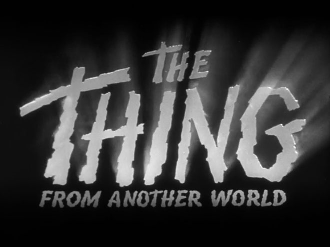
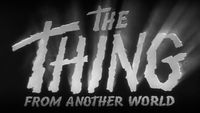
Howard Hawk's The Thing From Another World
The prospect of getting a fishtank and filming the burning of the titles practically was exciting, but I wanted to explore some different ideas, some of which meant taking liberties with perspective and not trying to either repeat or one-up the film's history.
My concept was to both show the creature and not show the creature. I wanted ambiguous shots. The way I see my title sequence is as a precursor to the film; what actually happened to the Norwegians? It was important that I used real footage as I wanted even the thought of such textures near you – on your skin – to be excruciating.
I was worried I’d be savaged by the film’s fans for trying to tamper with something that’s important to them.
The hand is a very effective cap to the sequence. How did budget constraints affect your process?
I had pretty much zero budget on this sequence! I think I ended up spending less than £20 on the entire video. I used a combination of a borrowed HDV camera with my trusty mini DV, a point-and-shoot camera to capture all the footage, and worked almost only in After Effects.
I felt the end needed some reality – something that a viewer could identify with – which would transfer us from the sequence to the film itself. It was suggested to me to watch Jacob’s Ladder for its use of suggestion, which makes the viewer question if what they saw actually happened; the idea that the hand is instantly recognizable as human but the movement is unfamiliar and suggests otherwise. This is one of the areas of the sequence that I would've liked to have taken further. I believe I could have found something more there.
You've said before that you believe your stills are stronger than the video itself. Do you think every frame should seduce the eye?
Well, when I said that, I think I was far too close to the video. It was my life for a while and the way it turned out wasn’t exactly as I pictured it beforehand. Now, of course, I can look at it for what it is and not what it was set out to be. I don’t think every frame of a sequence needs to seduce the eye; I think that idea can be very limiting. Like in films, the in-between shots can be used to make the key frames or plot points more resonant and I think if you skip, frame by frame, through most films or title sequences you can pick out the high points from the low points. Of course, this isn't always the case. The titles for The Island of Dr. Moreau are so saturated with imagery and design that any frame is as good as the last.
When I made the sequence I was still very much trying to find myself – I still am – but it’s a lot clearer now. It's hard to address what didn’t work because at this point it’s a video that’s taken me further than most of my others and I’ve had a lot of great feedback, which was something I was initially scared of. I was worried I’d be savaged by the film’s fans for trying to tamper with something that’s important to them, but this has not been the case. But I have to say I probably wont use the same approach again.
So what were your motivations behind making this? Did you give yourself any requirements or restrictions?
It was my third and final year at university and I was feeling a bit disappointed in myself that I hadn’t worked nearly as hard as I could have in prior projects. This particular project was open so I got to decide what I wanted to do. I really enjoyed doing a title sequence in year one and title sequences are definitely the thing I like most about motion graphics and design in general. I knew I wanted to go dark, and I wanted something “virusy.” My tutor Chris and I were discussing possible ideas, namely thinking of a Cronenberg type of movie. Later on I posted on Twitter asking for suggestions for movies based on my ideas for the video and someone – Rupert – suggested The Thing. He told me that he had stayed with Dean Cundey, the director of photography of The Thing, and had a chance to see a lot of the props from the movie. The next day I told Chris about the prospect of doing The Thing and he thought it was the perfect choice. It worried me a little as the original sequence was shown to us in first year in a compilation of brilliant examples of title sequences. He also told me that he expected a lot from me on this project as he too was a fan of the film and wanted me to do it justice.
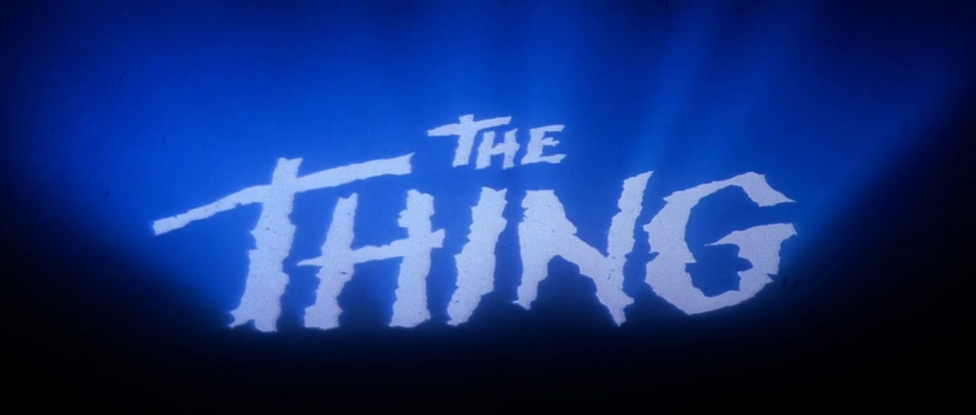
John Carpenter's The Thing opening titles
Up to that point I hadn't seen the film, so I bought a double DVD of both the Hawks and the Carpenter versions and watched in awe. The John Carpenter film seemed like home, like I’d seen it a hundred times before, like Jaws or The Shawshank Redemption. Once I came up with the concept of where I wanted to take the title sequence I couldn’t think of anything else.
How do you view the idea of collaboration after going through this process?
Now, great!
I’ve always been a solitary designer. I come from a small village in Wales and have trouble relating with a lot of people as my interests are so different to what is considered normal there, so I’ve always felt by myself in that sense and even when there were more like-minded people in university I always took my work home and brought it in when it was due. The Thing to me is a movie primarily about isolation – you could watch it with the mindset that there is no creature and everyone’s suspicions fueled the killing and it would still work.
Funnily enough, this sequence is the most collaboration I had ever done on a project. I mean, I listened to someone else’s suggestions and feedback. When I’m solely working on a video, I have a tendency to get tunnel vision so an outsider's perspective is really valuable.
Going from university to working in the creative industry has been a shock; I’ve been able to progress quite a bit because of collaborative environments. If I start being unhappy with an aspect of work or life, I’ll change and am not afraid to be ambitious in the future and follow the dreams I had as a kid. I think I’m a better decisionmaker and idea-generator than a designer at the moment, but I’m having fun working on the latter… I’m currently developing a feature film which I’m going to produce over the next four years.
Related
-
The Thing
summary
-
The Thing from Another World
title only
-
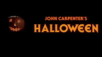
Halloween
summary
-

The Ward
interview
-
David Fincher: A Film Title Retrospective
feature interview
-

Signs
summary