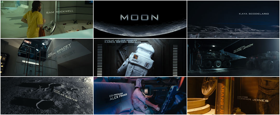


The hypnotic magnificence of Duncan Jones' Moon is the setting of a kind of space-drawn samhain built to support the machines, here harvesters of Helium-3, the latest source of our terrestrial dependency.
Affecting documentary – all of it stock footage – is unveiled as something corporate and cankerous, shortly giving way to the inviting lightness of Clint Mansell's score. The title card features an impressive use of perspective. Placement and persistence of type domineers the narrative as something akin to Kevin Spacey's lilt which plays like HAL 9000 but follows its own heart.
A discussion with SIMON KILROE, title designer and compositor at Molinare.
At what point did you become involved in the project, and how involved were you? Just the titles or more?
SK: We became involved after the edit. We composited all the screen inserts in the film, including the face of the robot. About 120 shots in all.
How did the initial ideas come about? What sorts of things did you reference?
After seeing the cut we immediately decided to track the type into the environments. Duncan Jones came back a day later with the same idea, which made for a very painless creative process. The classic reference for this is the Panic Room titles.
Detail the process of laying the typography into the live action elements.
It was a simple case of choosing a line of perspective. We tracked some of the tricky shots in Boujou. The remainder were tracked in Shake, where all the compositing was done. The type was generated in Photoshop and was given a simple highlight and colour to match its backplate. We had to avoid giving the type any sense of scale, owing to the variety of shots within the sequence. Shadows were applied to add depth as well as reflections of the type within the environment. On some credits camera shake was added to help it sit in.
And what is the typeface used in the sequence?
Bank Gothic!
Related
-

Panic Room
interview
-
My Man Godfrey
title only
-

Alien
summary
-

Contact
summary
-

Soylent Green
interview
-

WALL·E
interview