The Art of the Title Sequence

The Walking Dead – unofficial

"Nothing is original. Steal from anywhere that resonates with inspiration or fuels your imagination. Devour old films, new films, music, books, paintings, photographs, poems, dreams, random conversations, architecture, bridges, street signs, trees, clouds, bodies of water, light and shadows. Select only things to steal from that speak directly to your soul. If you do this, your work (and theft) will be authentic."
- Jim Jarmusch

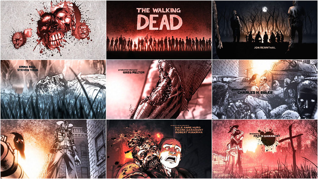
Bringing fresh energy to motion comics -animating panels as vibrantly dead as any Romero classic- Daniel Kanemoto's fan-made title sequence for AMC's new series "The Walking Dead" gives new form and perspective to the work of an impressive string of creatives. The original comic was given life by writer Robert Kirkman and artist Tony Moore, and Charlie Adlard from issue #7. "The Walking Dead" debuts on All Hallows Eve with Frank Darabont as writer/director. The infinite regress found in the hunt of our ghoulish selves found in source material this good should allow for deeper exploration into the allure of the walking dead.

Happy Halloween.

PRODUCTION BREAKDOWN
Animator Daniel Kanemoto details the creation of his sequence for us.

Daniel Kanemoto: I began this project after witnessing all the promotion surrounding Frank Darabont's adaptation of "The Walking Dead" at the San Diego Comic-Con. I've followed the show's development for years, ever since Frank optioned Robert Kirkman's groundbreaking comic book. And when I laid eyes on the teaser trailer, I was thrilled, both as a fan and a filmmaker… because what I saw onscreen looked exactly like what I imagined when I first read the comic.
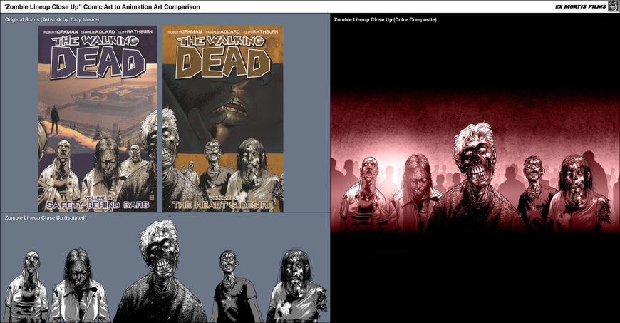
“Zombie Lineup Close Up”
“Zombie Lineup Wide”

I poured all this enthusiasm into a spec title sequence because I recently relocated my animation studio, Ex Mortis Films to Los Angeles after spending the past decade in New York, and I wanted to create a showpiece to help announce my arrival on the West Coast. Since I love creating title sequences, I decided to make one for "The Walking Dead" to demonstrate my skills as a filmmaker.

“Campfire”
"Campfire" progression reel

I set a deadline of 6 weeks to make the titles, working nights because my days were occupied revising scripts (I write just as much as I animate) and delivering some jobs for existing clients.

My first task was to find a great piece of music, something I consider to be the heartbeat behind every great title sequence. I chose "Fresh Blood" by the Eels, and gave it to my longtime editor, Jeff Yorkes, who cut it down to under a minute. The song is a perfect thematic fit for Kirkman's story, which brilliantly illustrates why, in the aftermath of a zombie apocalypse, the undead aren't the only ones who seek "fresh blood"… so do the survivors. To quote one of my favorite lines from the comic, delivered by the main character, Rick Grimes: "We ARE the walking dead!"
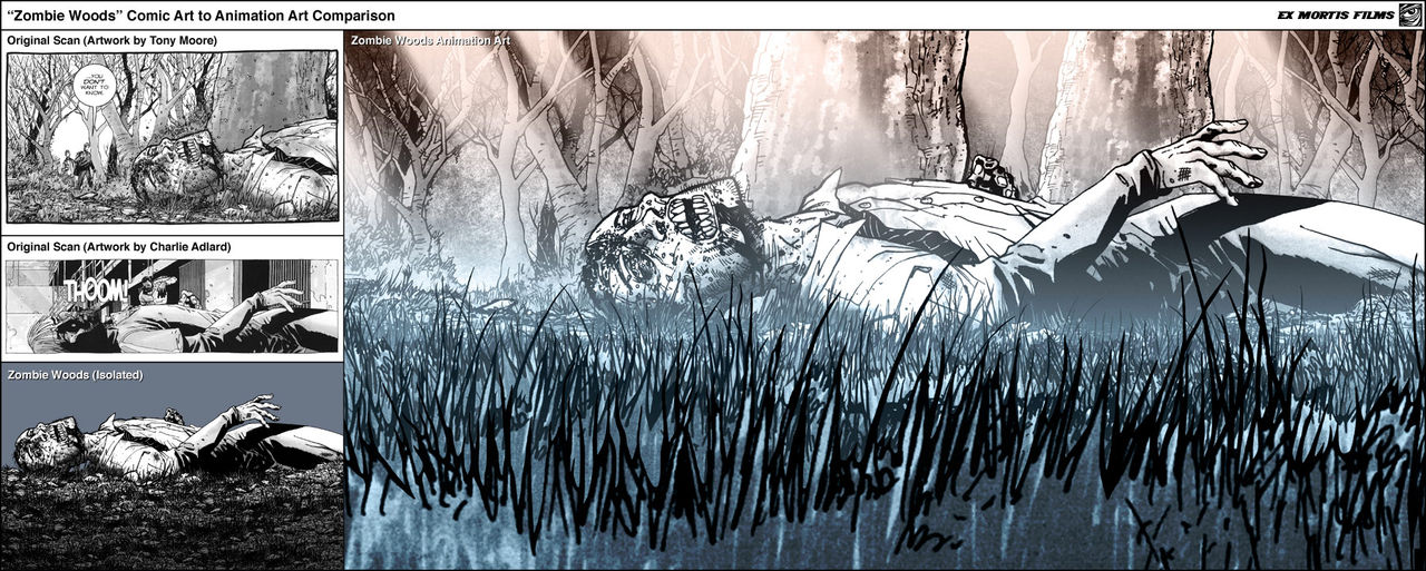
“Zombie Woods”

Once Jeff locked the music, I turned to the pages of the comic for inspiration. Without enough time or money to shoot anything original, the artwork of series artists Tony Moore and Charlie Adlard served as the basis for all my "footage."

My concept was to take the black-and-white art from the comic and expand it into multiple layers using Photoshop. Then I'd add an extra layer of depth to these 2D illustrations by animating a 3D camera in After Effects. My goal was to introduce viewers to the world of "The Walking Dead" by creating a graphic narrative using selected highlights from the comic, all the while staying in sync with my music selection. The sequence needed to transition between survivors and zombies while showcasing classic staples of the genre (such as when one of the unfortunate survivors suffers from a zombie bite.)
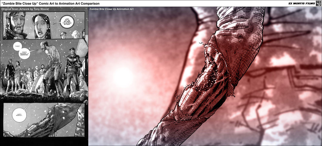
“Zombie Bite Close Up”
“Zombie Bite Wide”

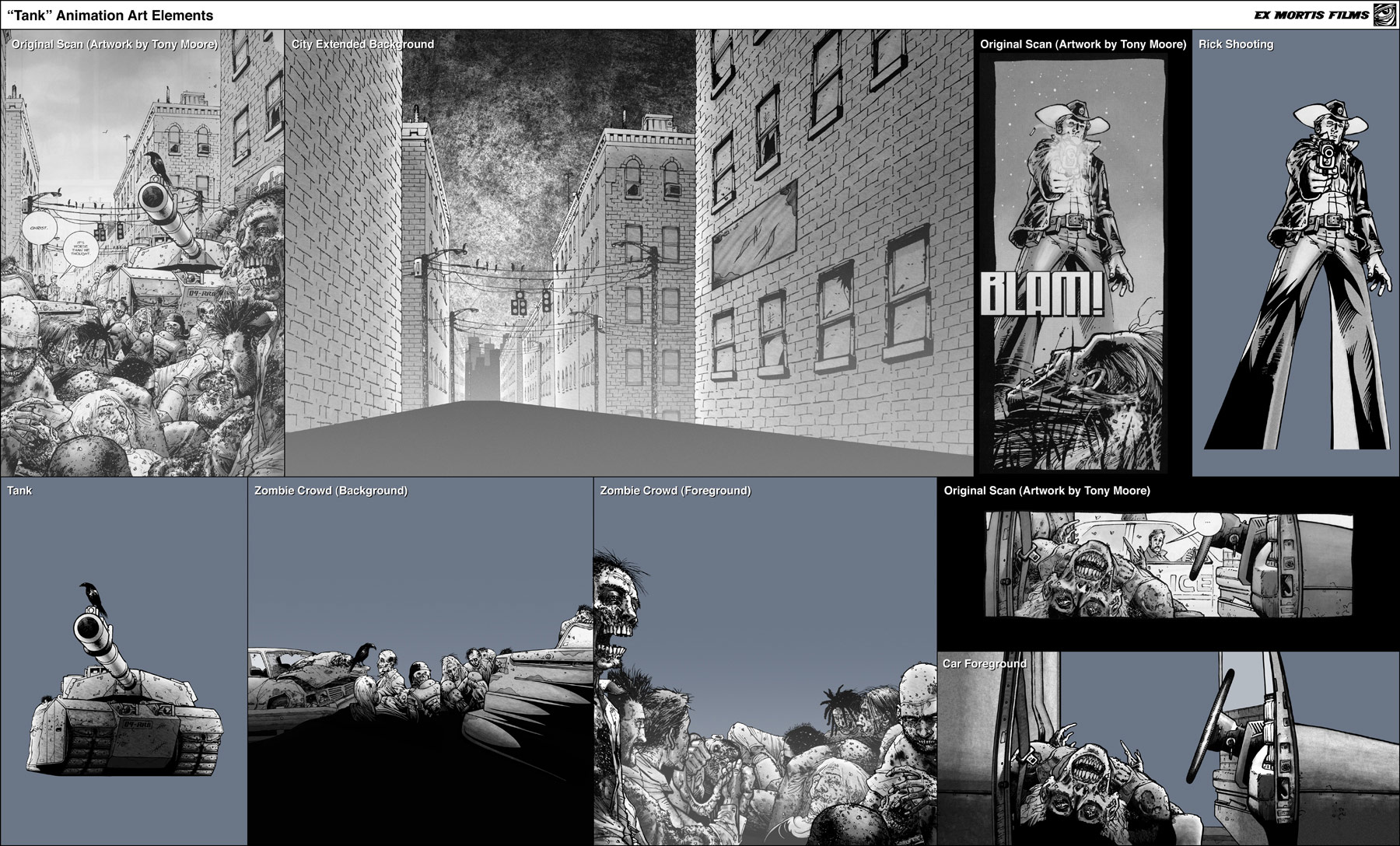
The primary technical challenge in executing this approach came in transforming artwork originally created for the comic book page into animation-ready elements. Although every scene began life in the comic, I had to reconstruct and often extend the artwork "past the page" in order to create enough layers to achieve the cinematic, "multi-plane on steroids" effect that defines this particular style of animation. In some cases I created elements from scratch to blend everything together, while trying as hard as possible to maintain the graphic style pioneered by original artists Tony Moore and Charlie Adlard.

“Tank” elements
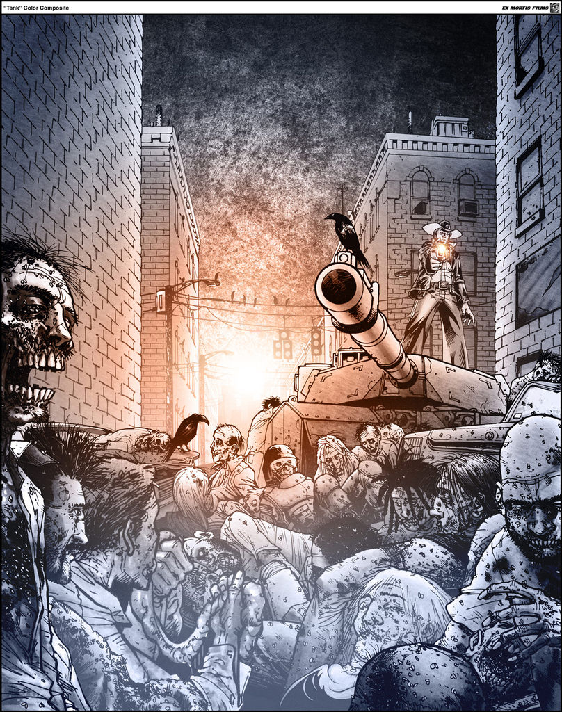
“Tank” color composite

Because I didn't have access to the original drawings, I worked from high resolution, 1200 DPI scans made from pages torn out of the comic books. It took a lot of work inside Photoshop to reduce the printing press artifacts that showed up in my 1080p high definition renders.

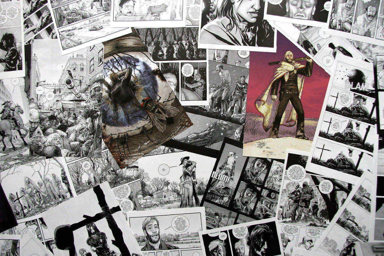
Original comic pages

Color was applied using gradients overlaid on top of the black and white illustrations, working from a color script that called for blood red to wash over the beginning and end of the sequence.

Because I was working with static 2D artwork, I used various lightning effects to add depth to each scene. I created various mattes within After Effects to create a "Kodalith"-style glow to my light sources, which backlit most of my foreground elements. I also sandwiched layers of semi-transparent "mist" (usually just a white gradient) in-between every layer to help with the illusion of depth.

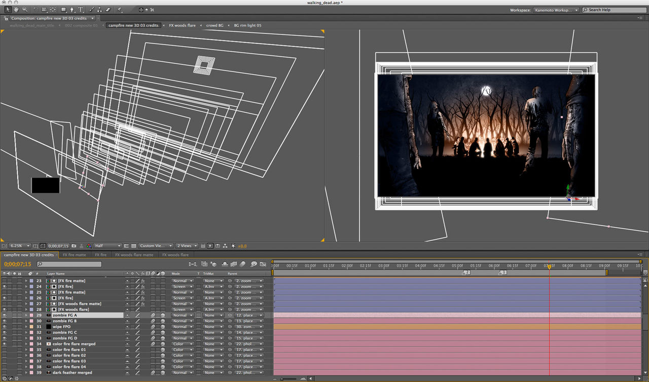
After Effect project screenshot

In addition to animating my 3D camera, I also created isolated effects to punctuate each shot. Blood spatter opens the sequence (these individual droplets started life as brushes in Photoshop, but were scaled up and retouched by hand for HD resolution), leaves drift across the screen, and there's a fly cameo. This buzzing insect was my homage to the clouds of flies that often surround the zombies in the comic, a horrible detail that always gives me the shivers.
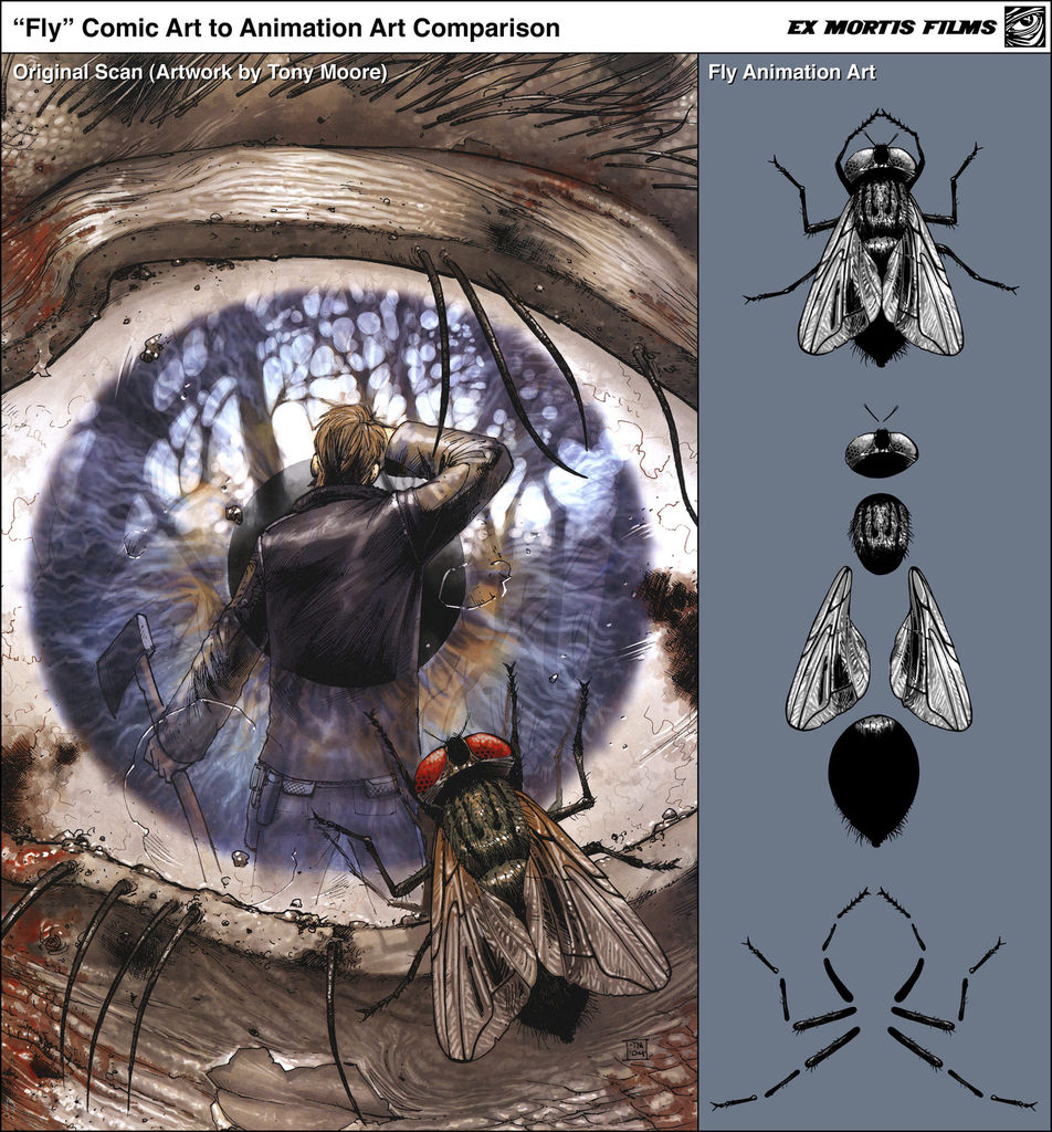
“Fly”

Beyond the technical challenges, the hardest part of making this sequence was not getting a chance to watch the entire pilot beforehand. I hope I was able to capture the spirit of the show, and I'm obviously thrilled that the sequence went "viral" and brought me so much attention, because I'm always on the lookout to pitch my talents.

In the meantime, I know where I'll be on Halloween… camped out in front of the television with the lights turned off, ready to be thrilled and frightened by what Frank Darabont and his talented cast and crew have created!

“Family Hug”

DETAILS
  • USA
  • 2010
  • Color
  • 1.78:1
  • English
  • Available on the AMC network


CREDITS

Animator: Daniel M. Kanemoto
Original Artwork: "The Walking Dead" by Charlie Adlard & Tony Moore
Music: "Fresh Blood" Written & Performed by eels
Music Editing: Jeff Yorkes

RELATED MATERIALS

"The Walking Dead" official opening titles by Prologue Films

LINKS

Ex Mortis Films - Daniel M. Kanemoto's Production Company
Prologue Films - Official opening title sequence

Category: Daniel Kanemoto, Ex Mortis Films, Interviews, News, TV

Tagged: , , ,

  • Pingback: Art of the Title Covers the Unofficial Walking Dead Titles - The Motion Geek

  • http://www.themotiongeek.com Atlanta Video Production

    Dude, I LOVED your title sequence. I’m a huge fan of the comics, and I think you’ve captured the spirit completely. Well done! I’ll be thinking of you as the title sequence plays tonight.

  • Pingback: “The Walking Dead” Fan-Made Animated Title Sequence « (billimarie.com)

  • conrad

    Man I wish this was the real intro for the show!

  • http://vmantaxi.com vman

    Great Stuff!!

  • Pingback: Monday’s Leftovers | TVgasm

  • michela

    What about the gun? Looks like 3D, is that just a 2D layer in After Effects?

    • http://www.exmortisfilms.com Daniel M. Kanemoto

      Hi Michela –

      As you suspected, the gun is made up of several different 2D layers inside AfterEffects.

      -Dan

  • http://www.thelamest.com James Faust

    I love to see the breakdown in process of such polished pieces of work. Very inspiring and really generous to share your process!

  • http://212ths.com 212ths.com

    Brilliant work.

  • Glenn

    This is so much better than the original by far.

  • http://www.stripeyhorsecreative.com graphic

    This animated opening sequence is great! I love it, great to see such a good use of After Effects.

  • Pingback: Steal from Everything!!! | EMPTY KINGDOM You are Here, We are Everywhere

  • Pingback: videos: Motion Illustration and Motion Comics samples pt 2 | Atomic Bear Press

  • http://www.paka-blog.com paka

    Better than original title…

    • http://jotes-studios.de Säbba

      way better :)

  • Pingback: graphic and website design birmingham blog » walking dead. motion graphics

  • Diego Sierra

    I prefer yours. A lot more. Thank you for your great work. Keep it coming.

  • Pingback: Illustration: Night of the Living Profiles | Purvis' Perspective

  • http://maltaannon.com/ Maltaannon

    Fantastic work. Simple and beautiful. It’s always interesting to me to see the AE Projects screenshots and all of the ones I’ve seen so far are terrifying. Somehow I get the feeling that the more layers and the more complex the project looks it’s meant to be more impressive or have bigger influence on the viewer. However for me that’s just not happening. Seeing more than 10-15 layers in one comp tells me that it could probably be done better. Most of the time it’s true. Most of the time.

    Still… I admire the graphics elegance and craft in this sequence. Great work.
    Btw – how did you deal with the camera?

    • http://www.exmortisfilms.com Daniel M. Kanemoto

      Hi Maltaannon –

      Thanks for the kind words. In terms of my own After Effects projects, I do sometimes wind up with multiple layers that could’ve, in the end, been merged together to keep things simpler, but I deliberately keep them separate in order to give myself as many options as possible when it comes to compositing, since I wind up tweaking the final look throughout my production process.

      Not sure if I agree (or understand?) your point about folks intentionally producing complex projects, though — most viewers, I suspect, don’t really care how an AE project is set up when they’re watching work created in AE. In the end, is something ‘better’ because the creation process was more complex than it had to be? Nah, not really. (And the same holds true if it’s simpler, I’d argue).

      Most of the time, I animate my cameras inside AE by parenting it to keyframed null objects, rather than keyframing the actual camera.

      Hope all is well,

      Dan

  • Pingback: Spoiler-free review of the first two episodes of The Walking Dead

  • Pingback: Title sequence research « Phil Gee's Blog

  • http://www.dreampicture.fr/ coyote37

    it was just the BIGGEST kick in my ass EVER! wooow. everything perfect. Moreover i’m a walking dead fan….

    Technically i really would know about how you did the 2.5D gun. And how you give it such a comic look to overlayed it among scans. Man, really.i wish one day get same skill.

    Best regards.
    coyote.

  • irene

    i prefer this one than the official one.

  • Ashley Hills

    Awesome and inspirational.

  • Nino

    Really well done! Your version has more soul than the original imo. The only thing that I dislike is the title and the way the title is written (typeface choice), granted that’s part of the pre established comic series & look. Anyhow, great work.

  • Pingback: The Walking Dead arrasa a la seua estrena « Fessols&naps

  • Pingback: Giographix » Amazing Fan-Made “Walking Dead” Title Sequence

  • Maxwell Broughton

    This is awesome, I was a little dubious at first with the abundance of fan-boy AFX nonsense out there, but this just keeps getting better! Seriously brilliant and a contender to rival the official sequence!

  • Pagurcia

    Have you considered creating a title sequence for Kirkman’s series Invincible? I heard OK Go’s song “Invincible” earlier today and could help but picture youre style intro paying along with it. http://www.youtube.com/watch?v=mItuZ8i4wH8 just a thought. It would be fantastic to see as a fan of the books and an admirer of your work.

  • kRaZy

    better than the real intro

  • http://twitter.com/Martuka84 Marta Serrano Dolado

    Awesome! Great job!

  • Cdscs

    that……is amazing.

Advertisement

Categories

Master Index

© 2011 The Art of the Title Sequence. All other names and trademarks appearing on ArtoftheTitle.com are the property of their respective owners.