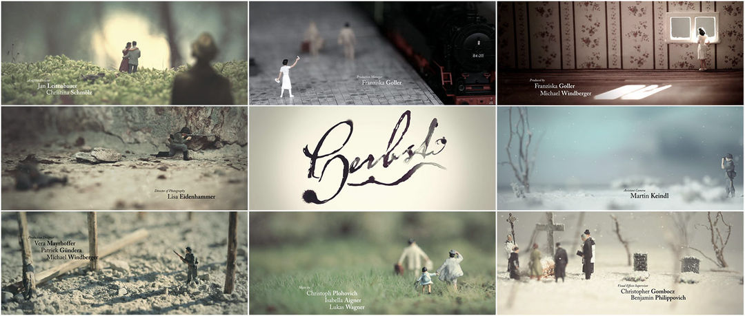


In a beautifully minimalist re-telling of the first World War drama Herbst, Clemens Wirth captures moments in the lives of the characters. A man covetously looks on an idyllic scene from afar, a woman waits alone at a window as the day crawls by, and bombs fall on men frozen in time as the highly saturated world moves around them, all helpless to a great and terrible machine acting upon them. Mixing crisp type with the sensuous ink drawing of the movie’s title and set to the brooding piano of Lukas Wagner, we bear witness to the characters’ call to arms, their tragedy, and the collateral damage borne from their delicate arcs.
With a planned release of Spring 2012 and filmed on location in Vienna and the Austrian Mountains, Herbst (German for “Autumn”) is a work from alumni and students of the University of Applied Sciences Salzburg.
Title design enthusiast and macro photographer CLEMENS WIRTH details the creation of the end credit sequence for us.
CW: The first thing I did was read the script again, to [recapture] the feel of the story. I also watched movies like All Quiet on the Western Front and worked my way through WWI illustrated books to sensitize me more to the topic. I thought of the toy soldiers like the ones in Toy Story and, as I'm a macro enthusiast and because I've gathered some experience in this area, I decided to make the titles on a small scale. After some investigation I found the right figures (pewter figures have limitations and were ruled out).

Model examples
I agglutinated and colored them and they became my actors. Instead of letting the characters move, the idea was that the environment around them should have a slight motion, achieved with various weather effects and also some interaction with light and shadow. For example, the girl at the window was time lapsed so that the sunshine moves on the floor.

Initial photographic tests
I always try to combine and mix several techniques and make most of practical effects, but with this scale it becomes difficult, so I had to add some in post production. I tried to make very “photographic” images, each scene different, minimalistic but detailed. The footage was captured with smooth dolly shots on a DIY slider and my beloved Canon 5D Mark II equipped with a 100mm macro lens, with some camera movements done in post.

Shooting and editing setup
In the film there will be smooth dissolves from real footage to ink drawings. I transferred this element to the titles with the drawings. I have to mention that I was also inspired by the Sherlock Holmes titles from Prologue for this effect, but I didn't want to overstate this transition, because it's just a small part in the actual film and that’s why it's only around the actual title.

Ink lettering tests
The title consists of china ink with each letter captured separately (thanks to Philipp Gstrein for his help) and composited together in After Effects. The various handcrafted miniature sets were built with objects from mother nature and model making materials. It was not always easy to get the detailed look I wanted, but it was fun and gave variety to the working process on the computer.
The music and sound design is Christoph Plohovich and pianist Lukas Wagner. As video and audio kissed the first time something really new emerged... this was the moment in which all efforts paid off.

Example of scale