


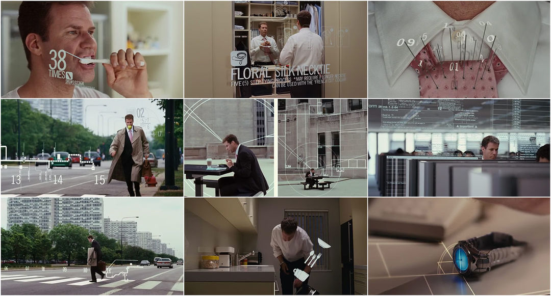
The daily routine, broken down to its extreme. Optimized perfectly – perhaps too perfectly.
SUPPLEMENTAL: MK12's main-on-end credits
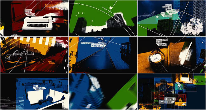
Directed by: MK12
Produced by: The Ebeling Group
Related
-
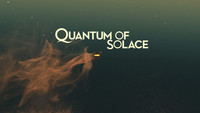
Quantum of Solace
interview
It's not schizophrenia! I just hear a voice in my head.
The daily routine, broken down to its extreme. Optimized perfectly – perhaps too perfectly.
SUPPLEMENTAL: MK12's main-on-end credits
Directed by: MK12
Produced by: The Ebeling Group
interview