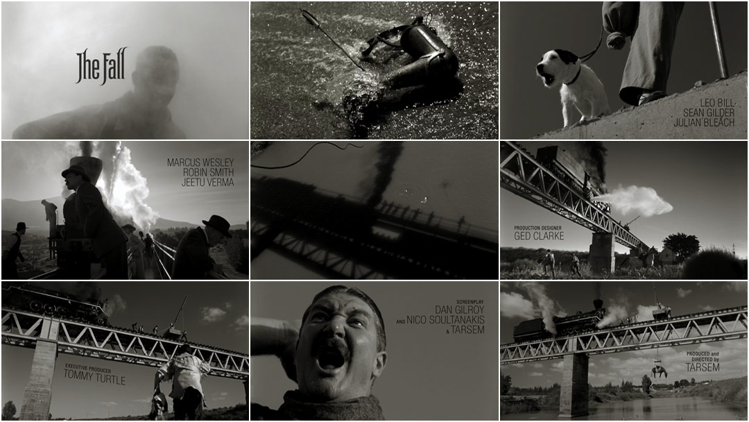


The opening title sequence for Tarsem's The Fall is the perfect example of a director's absolute control over his vision. To view it after seeing the film is a gift; a rare and beautiful thing. Surreal, extravagant, and a world singularly Tarsem. What is it to sense things in such a way?
Scored to Beethoven's Symphony No. 7 In A Major, Op. 92 (2-Allegretto), the visuals hit their money notes in quick succession. The bridge becomes a stage and the caballus curtain rises as the sequence concludes. It is a dream, and we are Dorothy, remembering the players.
From Tarsem Singh's DVD commentary:
"It is hard to define... I wanted chaos without energy."
Audio commentary excerpt with director Singh (contains spoilers):
From the DVD and Blu-ray.
A discussion with the film's logo designer and typographer STEFAN BUCHER at 344 Design.
How did you get into graphic design? How did you know that this was the route you wanted to pursue?
I started as an illustrator. Which is to say I started drawing when I was little and then figured out how to get my work printed as I got older. It's always been about control. With each project I get a tiny slice of the world that I can bend to my will, that's under my complete control. I love that! I've always loved that. Graphic design entered the mix when I figured out that I could control the typographic and the illustrative visuals.
What was it like to work with Tarsem? How did you feel about the film, and how did that influence your design work?
SB: Tarsem is a genius, and The Fall is a masterpiece. That much was clear from the moment I saw the first photos Stephen Berkman had taken on set, and particularly after Tarsem showed me a rough cut. Even in that format it was epic.
Tarsem initially called me in to design a book of photography from the movie which was printed in a very limited edition and sent out as a promotion.

Book sleeve detail with photography by Stephen Berkman, Steven Colover, Ged Clarke, and Tarsem
In the course of that project I designed a logo for The Fall that was intended solely for the book. But of course, I secretly had my eye on the titles! I was very excited when Tarsem decided to use the logo for the film and the collateral materials.
Book logo treatment
This is also how I got involved in the typography for the rest of the titles and end credits. Tarsem had done some rough versions of the type for the opening credits and showed it to me. Less than perfect type is personally upsetting to me, and I felt that the typography for The Fall should be as beautifully considered as the film itself, so I basically pleaded that he let me do the job. Luckily, if there's anybody who understands that sort of urgent artistic need, it's Tarsem.
His brief to me was to make the titles beautiful, elegant, and as close to invisible as possible – which meshes with my own aesthetic for this type of situation. It's always my goal to make the typography feel so organic that you don't even notice it as its own, separate element.
Final logo design
Pablo Ferro's titles were on my mind, and definitely influenced the choice of font. His style of handwriting would've been the wrong tone here, but he's one of the few people who use very light lettering, and that's what I thought would fit The Fall.
We went with Univers Light Condensed. It's just about as simple as you can get, and even though it's a modern font, it soaks up Tarsem's take on Deco and Art Nouveau. It feels much more period-appropriate to my eye than actual fonts from that time, which would come off as clichéd. The same goes for the title itself, which is a heavily modified version of Univers. As for the swooshes, they were inspired by the Indian's sword.

End credit examples
What was the process like for editing the sequence together?
Tarsem was the one who edited the whole opening sequence, and there's not a frame out of place. It's a gorgeous sequence that was perfect – and also entirely sacrosanct. When I started working out the timing with my colleague John R. Waters of Atomic Zoo, who was in charge of the animation, we basically worked backwards.
Legally, each credit has to be on screen for the exact same amount of time. After we determined what images should hold title cards, we had to use the shortest of those edits as our master length. From there it was a question of testing fade durations to make the appearance of short titles feel natural on long shots. It was a puzzle.
We also decided to put some of the type into perspective, letting it nestle under the bridge, in particular. We didn't do it consistently, or as a huge, epic effect as David Fincher had done for Panic Room, but only in the one or two instances where a static title over the stately pans would've been distracting. We always saw the titles as belonging inside the space of the film.
When the pans occurred over open vistas, the type could conceivably float in that space, but the sharp lines of the bridge made it necessary to lock the type to the camera motion and to the perspective of the bridge. I'm always happy when I hear that people didn't even notice we did that.
You've done other projects with Tarsem since, right? Can you tell us about those?
When I finish a project I always hope that people will call me back in on their next one, but I'm not right for everything, so I never assume it. But I was delighted that Tarsem asked me to design the titles and end credits for his next two movies, Immortals and Mirror Mirror.

Main title cards for Immortals and Mirror Mirror
Obviously, those two films couldn't be more different in terms of audience – a swords and sandals ballet of bloody dismemberment and a classic fairy tale – but they're both very much Tarsem. It's his very particular take on both genres.
How did you approach these two projects? What was Tarsem looking for?
In both cases, he wanted a minimalist opening – the main title fades up and fades out. No other credits until the end.
With Immortals, the title lives in the space of the Temple of the Oracles. Originally, we got introduced to the oracles in a long, slow pan as they're walking on a red circular pad. The type was meant to be a massive, somewhat menacing three-dimensional object in this room. I chose a heavy, compressed typeface that I modified to be even heavier and more compressed. Tarsem's brilliant production designer Tom Foden suggested I give it the gold brick texture of the jail of the Titans that appears early in the movie.
We were at the point of approval when Tarsem decided to reshoot the opening with a completely different set! The temple had been an Eastern design of black and white tiles, and then it became a much more medieval space – a dark cathedral with golden accents. To match this, Tarsem wanted much lighter type.
I built the final logotype on Garda Titling II by Mário Feliciano. I kept the I, L, and S unchanged, and lengthened the tail of the R. I rebuilt the M, O, and A entirely. The curve of the M parallels the curve of the temple alcove, which is also where the O and the top of the A get their shape. I added a bit of a granite texture, some gold leaf, and a tasteful light swipe. For the end credits I just used Garda Titling II straight out of the can – with judicious letterspacing and a gold effect. As a bonus, I got to create a condensed version of the logotype for the French Canadian release, so that we could fit an extra three letters into the cathedral space without losing any height.
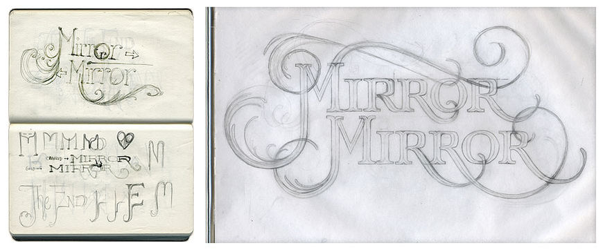
Sketches and final design of the main title card for Mirror Mirror
And for Mirror Mirror?
With Mirror Mirror, the type appears on black as the first thing you see after the production company logos. The type would appear without any prior visual context. I just had to set up a sumptuous fairy-tale feel. I tried a number of different approaches, but quickly fell in love with a swirly slab serif I'd constructed as a an homage to my late friend Doyald Young. Initially, Tarsem and Tom weren't convinced, but I'm grateful that they came around. Of all my projects, the Mirror Mirror type is the lettering I'm most proud of so far.
As a special treat, I also got to design a proper "The End" card that appeared over the final sequence leading into the main end credits. Those end credits are set in Home Run Sans by Doyald Young. Doyald was very skeptical about designers adding special effects to his typefaces, but I hope he'd have enjoyed my gilding.

Sketches and final design of the “The End” title card for Mirror Mirror
Who are your heroes in type design? What recent work has impressed you?
I think it's obvious that I'm a great admirer of Margo Chase and Marian Bantjes, whose swirly magnificence is always floating around in my head. Everyone loves Marian Bantjes, and I'm no exception.
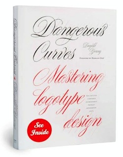
Dangerous Curves: Mastering Logotype Design by Doyald Young
As I mentioned, I love Pablo Ferro and Doyald Young. Mark Farrow is always fantastic. There are a lot of amazing young designers doing motion work and if I try to name any of them, the people I'll fail to mention will make me look foolish. There's just such an abundance of great work coming out right now. So much of it is so beautiful and painterly. It's a golden age for typography, particularly in motion graphics.
What are you working on now? What's next?
I'm working on the titles for Wednesday in Mississippi, a documentary about the women of the Civil Rights Movement. I'm always drawing more Daily Monsters, of course, and I'm in the early stages of developing a TV show around some of my more adult characters. That's a whole other level of craziness.
I'm also just wrapping up a rotoscoped music video for singer-songwriter Wesley Stace. I hesitate to call what I'm doing an animation, but it's a portrait drawing in motion – 1,810 frames done on tracing paper and colored in After Effects. In the process I'm actually thinking about some of Tarsem's comments a lot. He taught me some very basic things about directing the eye from shot to shot. It's very much on my mind.
LIKE THIS FEATURE?
BECOME A PATRON TO ALLOW ART OF THE TITLE TO KEEP SHOWCASING GREAT WORK
Related
-
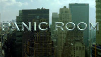
Panic Room
interview
-
Pablo Ferro: A Career Retrospective, Part 1
feature interview
-
My Man Godfrey
title only
-
Stranger Than Fiction
summary
-
Dr. Strangelove or: How I Learned to Stop Worrying and Love the Bomb
interview
-
David Fincher: A Film Title Retrospective
feature interview