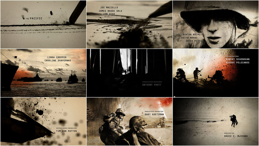


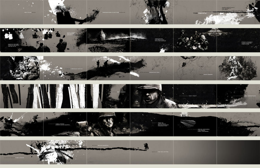
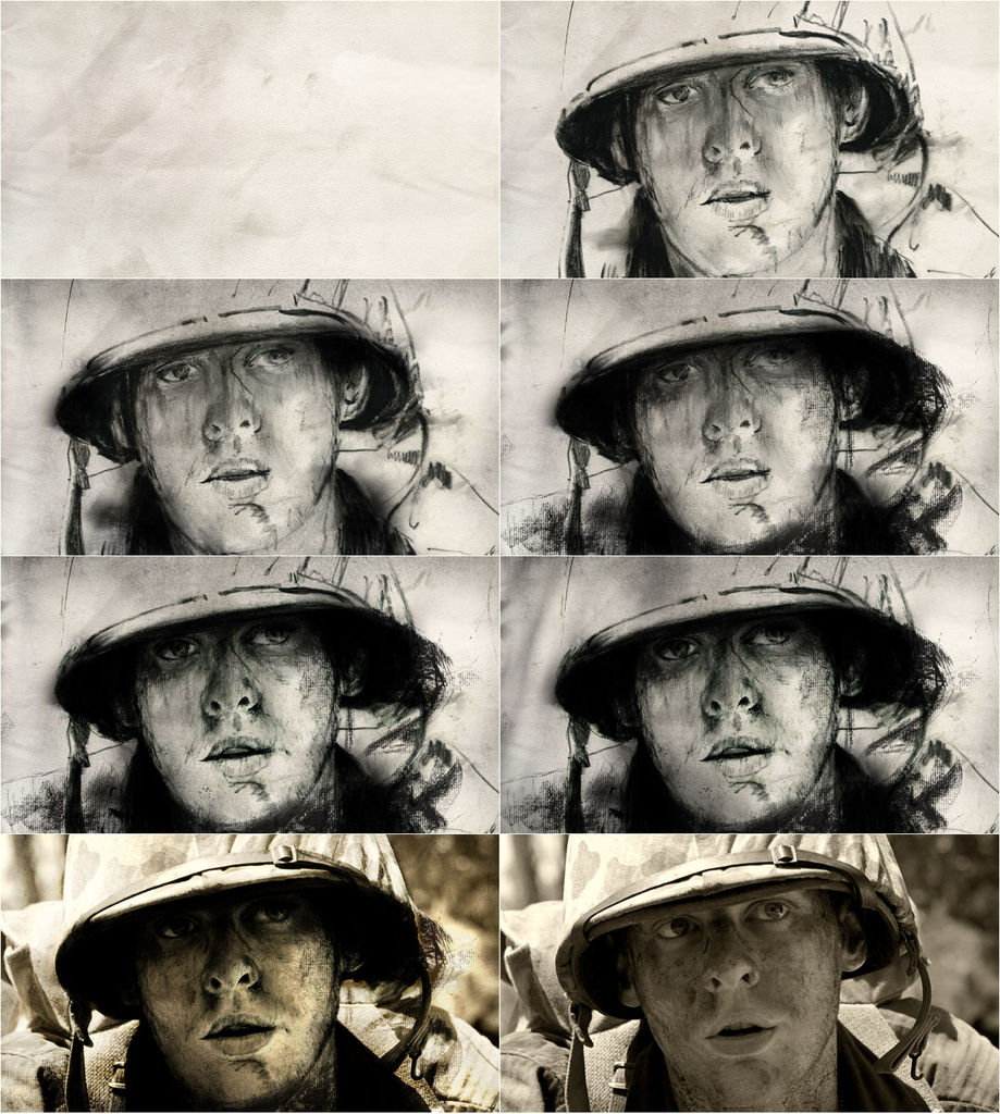
In the main title sequence of The Pacific, the 2010 miniseries produced by HBO, Playtone, and Dreamworks, the faces of men are rendered rough and dark, streaked with war.
Created by studio Imaginary Forces, the opening moves back and forth between rough lines on fine textured paper and footage in black and white with tints of red blotting the scenes. We follow a stick of conté, shards flying off like so much shrapnel, tracing the edges of subjects and their explosive surroundings. Keeping pace during this dance between live-action and hand-drawn moments is a soaring score by Hans Zimmer, lending the components a dignity on par with the elegant opening for To Kill a Mockingbird. Behind the piece are art directors Steve Fuller, Ahmet Ahmet, and Peter Frankfurt, designers Lauren Hartstone and Arisu Kashiwagi, and a host of animators, producers, editors, and others. Nominated for an Outstanding Main Title Design Emmy Award, the resultant piece is a meditation on war from an artist’s point of view, the dust of charcoal sweeping across page and landscape—hard lines in a hard world.
PART ONE: NEW YORK
Art Director, Designer and Illustrator STEVE FULLER details the work done at the New York office of Imaginary Forces.
What were your first steps on this project?
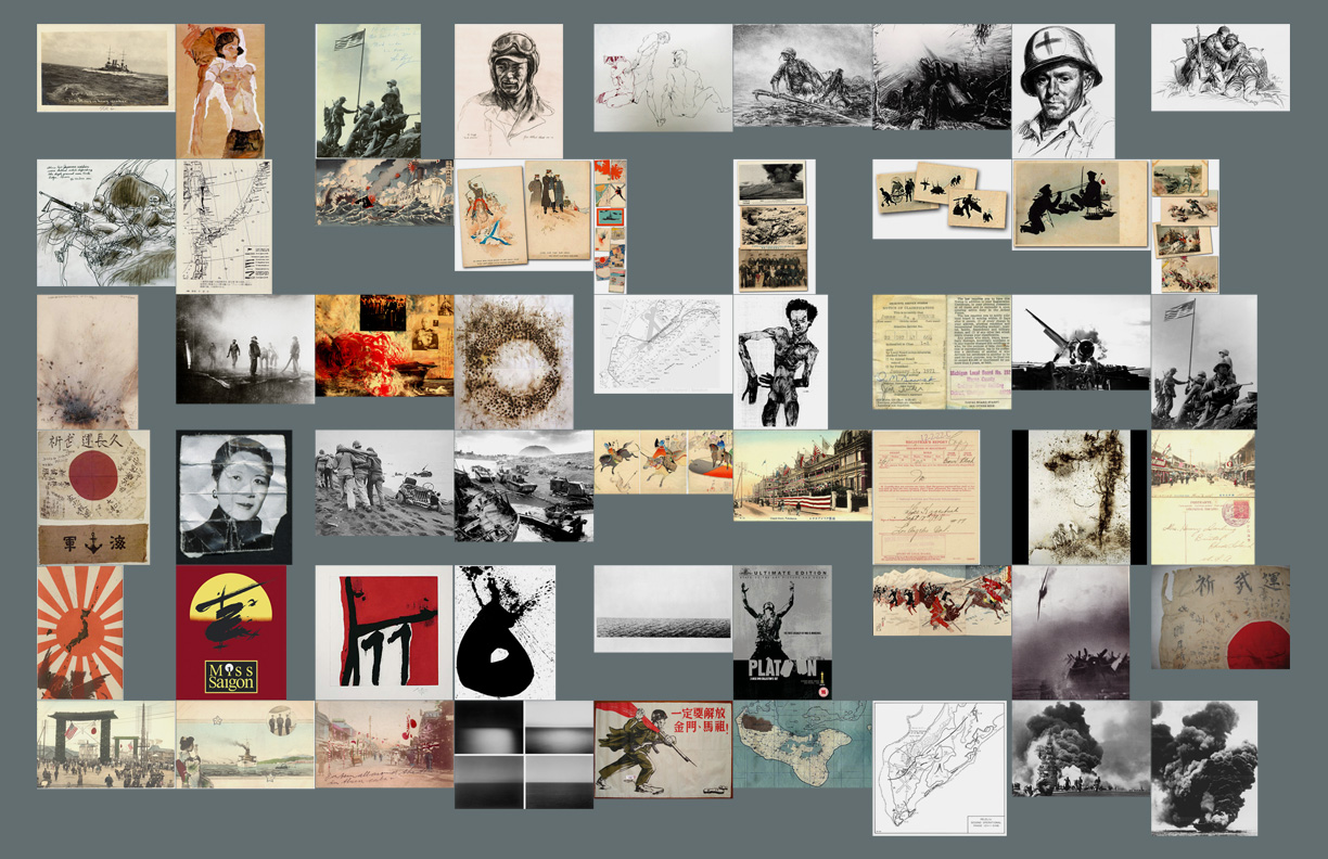
SF: We did a lot of research before we started – everything from drawings made by US soldiers to Japanese postcards… Egon Schiele, Cai Guo-Qiang’s gunpowder paintings, war posters, etc. War maps and military documents-influenced typography. You can also see where the color scheme comes from. I wanted to hint at the Japanese element so we looked at ink drawings and woodblock prints.
Inspiration sheet
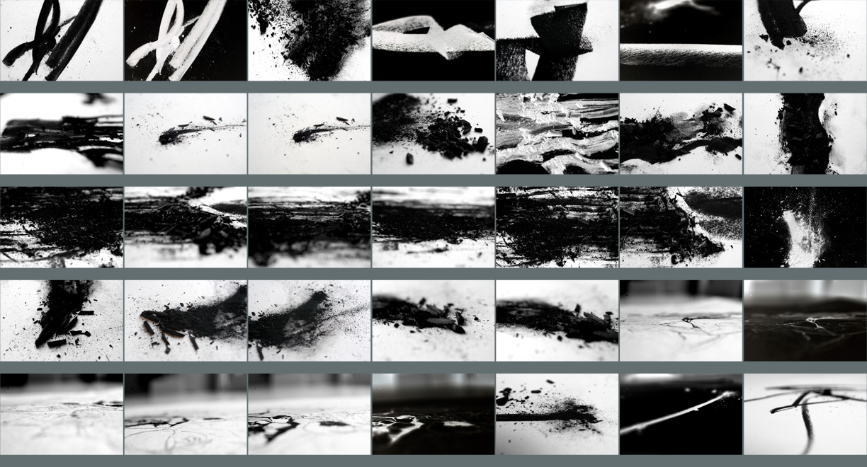
The next step was experimenting with the charcoal and graphite. This contact sheet shows a few of our crushed charcoal “paintings.” I think we took around 300 photos in all. We tried everything: stomping on it, scraping it across paper with a metal cylinder, blowing it across the surface. We were looking at paintings by Franz Kline and Robert Motherwell, trying to capture that abstract expressionist feel. We tried to make the charcoal feel explosive and to capture the violence of war. We also tried to connect the charcoal dust to the black sand found on the islands in the South Pacific.
Charcoal and graphite experiments
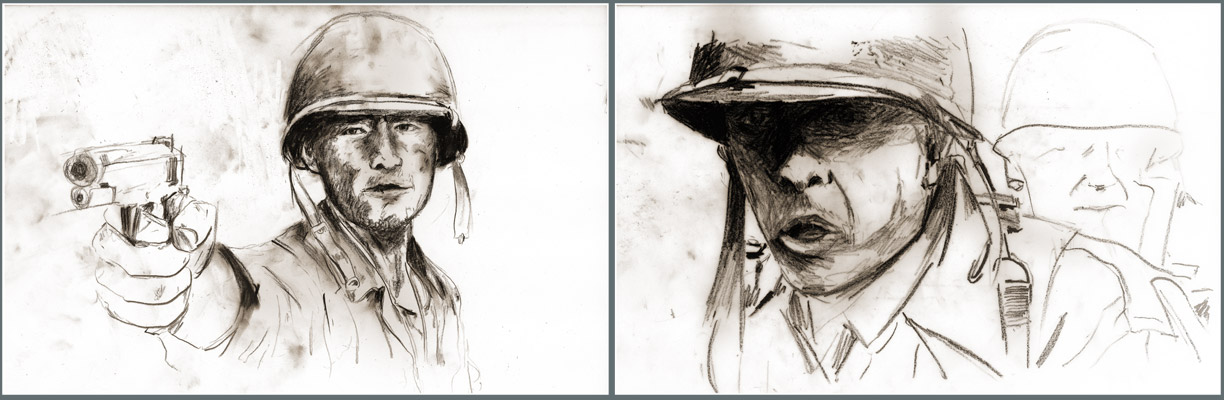
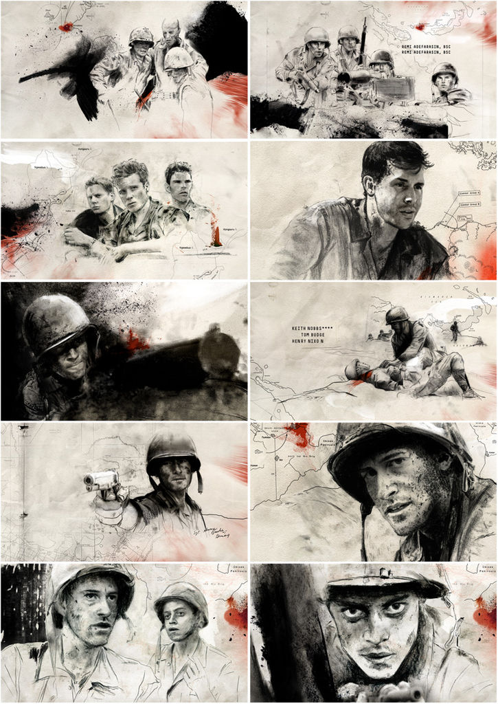
At the same time, we were experimenting with the abstract charcoal paintings, drawing some of the characters in the mini-series to hone in on the right style. It was harder than we thought it would be! You really have to know how to draw to make it believable. Here are a few of the raw drawings. It’s a combination of pencil, charcoal, and grease pencils. We considered making these drawings into 3D sculptures that the camera would fly around, but we felt it would have been way too flashy.
At this point, they were shooting the episodes so we only had a few shots to work with. The drawing on the right was actually made from a grab of Saving Private Ryan.
Raw drawings
I did so many drawings – and there are more that didn’t make it in than did – that I got better over the year. I had to make sure they didn’t get too fussy or detailed. They needed to look a bit unfinished. Doing the drawings by hand made it a better sequence, and they took some time to get right. My hands were black for more than a few days.
From all of that, we put together three different directions. I worked with two great designers – Lauren Hartstone and Arisu Kashiwagi – to turn these ideas into full storyboards.
"In Battle" is the one they liked best. "Line of Duty" was a variation that used black and white chalk. "Torn" was the most unique to me – all about torn paper. I knew it was probably pushing it too much but it was so beautiful that we just had to execute the idea. It was actually inspired by the poster for Bunny Lake is Missing.
Storyboard explorations
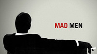
The filmmakers didn’t ask for posters but halfway through working on boards I decided to take a break and try to create a single iconic, poster-like image that would create a memorable ending to the sequence. It was a good exercise and led us to the idea of one soldier carrying another on his shoulders – a memorable image. The ending of our sequence for Mad Men worked so nicely as an iconic image... I wanted a powerful ending here too.
Another thing to come from the poster experimentation was the sequence being bookended with this single horizon line or path. It then branches into three paths at the beginning, one for each of the main characters. At the end of the sequence, we come back to the line where we find two soldiers – the ones who made it out the other side.
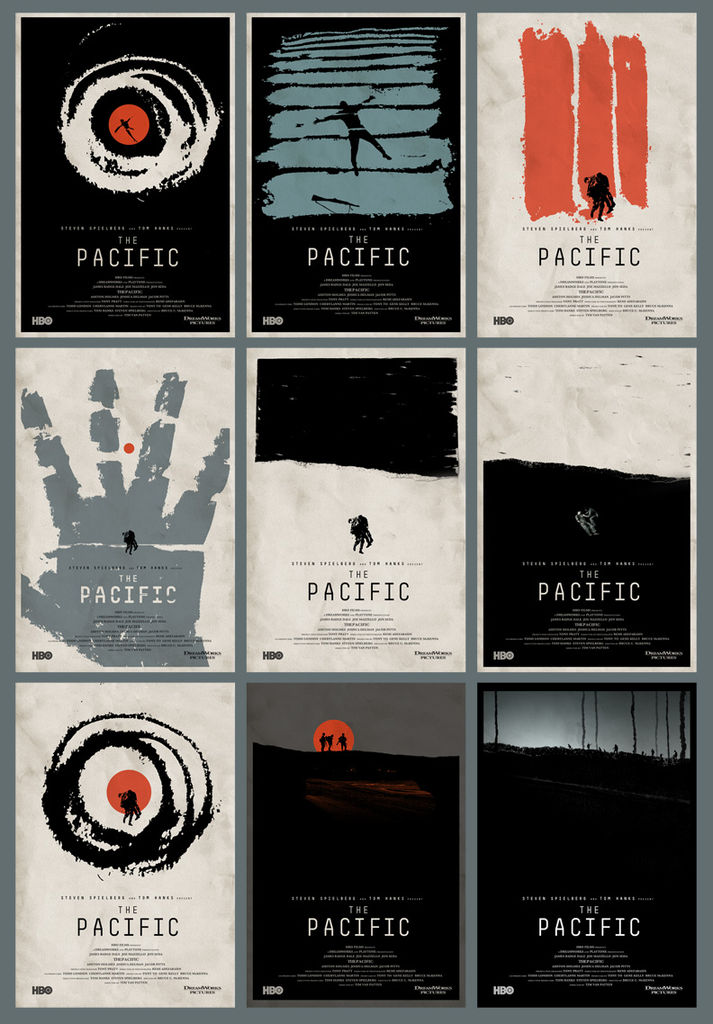
Poster designs
When did the use of live action footage come into play? Did you always plan to blend from one medium to another?
Yeah, we planned that from the start. We thought it would be a missed opportunity if we never saw a drawing come to life. At one point, we thought about having the drawings live in three-dimensional space and have the camera fly through them, but quickly decided against it. It would have been too effects-y for this show.
The charcoal drawing footage was shot over about five different sessions with the Panasonic HVX and a high-speed Casio camera. We shot in our studio and outside in the park.
Here are some of the processed drawings. Some of these were in the sequence, removed, placed back in, etc. There were roughly 33 drawings in all. This is after they went through a bit of a treatment in Photoshop.
Processed drawings
How did you work with the music? Was the Hans Zimmer score provided beforehand?
We got the score after we did the boards and our first board-o-matic. Once we got the music and started shooting some test footage of the charcoal, we started merging the two, getting audio and visual more tightly synced as we went. The filmmakers wanted us to hit certain crescendos in the music, which made it better.
How do you approach something as meaningful as the documentation of war? It seems a lot to bear at the outset.
We were very excited when we were asked to pitch. Tom Hanks, Steven Spielberg, Gary Goetzman, and Tony To? Those guys don’t mess around! Their standards are very high, so we knew this needed the utmost respect and accuracy. My approach was the same as any project: as soon as I hear about it, ideas start swirling around in my head. And this subject matter is so visually dense. If anything, we had to edit some of the elements we wanted to get into the boards. We got to see rough cuts. I thought it was all great! They had three rough trailers that were all emotionally moving. We were very excited to get started.
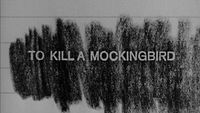
Did the opening for To Kill A Mockingbird have any influence?
Ha, thanks for blowing my cover! [Executive Creative Director] Peter Frankfurt’s father Steve would sometimes drop by the New York office. There are definitely tribute shots in The Pacific. The charcoal rolling shot in particular is based on the marble rolling shot in To Kill a Mockingbird. Difficult to do, actually! I felt like it was “legal” because I worked for his son. We actually showed Steve a rough cut one day and he really loved it. So I took that as his blessing. The main title sequence to To Kill a Mockingbird will always be influential to me – it’s effortlessly beautiful.
How do you work with other members of the production team, in terms of participation?
It’s always a collaboration. I try to steer things but let it drift if it’s going in a positive direction. I had some really talented people around me. Lauren Hartstone and Arisu Kashiwagi worked on boards. Lauren worked alongside me the whole way. Corey Weisz, our editor, was constantly adjusting the edit, helping me shoot. Cara McKenny, our producer, spent countless hours in the edit room with us talking about nerdy design stuff. Lots of freelancers also helped out along the way.
What is life like after Imaginary Forces? What is on the horizon for you?
Life is good. I’m freelancing right now and talking to some production companies about directing more live-action.
PART TWO: LOS ANGELES
Art Director and Illustrator AHMET AHMET details the continuation of the project at Imaginary Forces, Los Angeles.
Can you tell us a little bit about your background?
AA: In London, I had worked as a designer and director at the BBC for 14 years. I moved to the states in 2000 to do more feature work. Kyle Cooper was here at the time and I came to work with him and primarily design main title sequences.
While in London, I worked at CFC Framestore where I headed up their first design department working with filmmakers on their FX. One of the three sequences was with Peter Yates, one of my heroes. I wanted to continue to work with filmmakers and so I came to Imaginary Forces.
Previous to that I did a lot of broadcast, design, and directing work for BBC1 and BBC2. I was working with the promotions department; the burgeoning thing then was self-promotion which started with Lou Reed’s “Perfect Day.” This was a new direction for BBC promotion. I was able to work with a lot of talented commercial directors there. My journey was about working with filmmakers. One of the first projects I worked on in the states was Jet Li’s The One, which was an interesting opportunity to do something totally abstract.
New character sketches
How long have you been at Imaginary Forces?
Almost ten years! I started in June of 2000.
When the project came to LA, at what stage was it? Was there a rough or final edit?
There was a rough edit that had some complications and no one was really on board with it. At one point, there was a danger of it turning into a sequence of turning heads and we talked to Playtone and Gary Goetzman, the producer, and he was very concerned that we make a decent representation of all the characters that would eventually be unfolded through the sequence. That started a slightly different approach to the edit which also meant creating new scenes and creating new drawings so that we had a more fair representation of the characters. So it had a new emphasis then, which was to make it a little bit more engaging and less of a gallery – more emotionally resonant. We went about trying to recreate that kind of energy and bring more emotion to the piece to try to make it stronger and that involved reshooting a lot of elements, re-editing the piece completely, and working with Gary Goetzman and Tom Hanks to address their concerns.
With the project now in LA, what was the size of your team?
We varied between 7 to 9 people and the first thing we did was work with Danielle White, our editor, to get a cut that was locked. After various meetings and getting everyone’s opinions to try to find the way they wanted the piece to develop, and also fill our creative aspirations, we just kept re-cutting it. That process was at least two months long, trying to lock the edit.
And you were meeting both internally at Imaginary Forces and with Playtone?
Yeah. Over the course of the four months at the LA office we were constantly meeting with Playtone and obviously having our own internal creative meetings. We would sometimes post our latest cuts online or we would meet in person as often as we could, depending on people’s schedules. The deadline was fairly tight. Given the circumstances, however, I think it had been extended.
What was something particularly rewarding for you on this project?
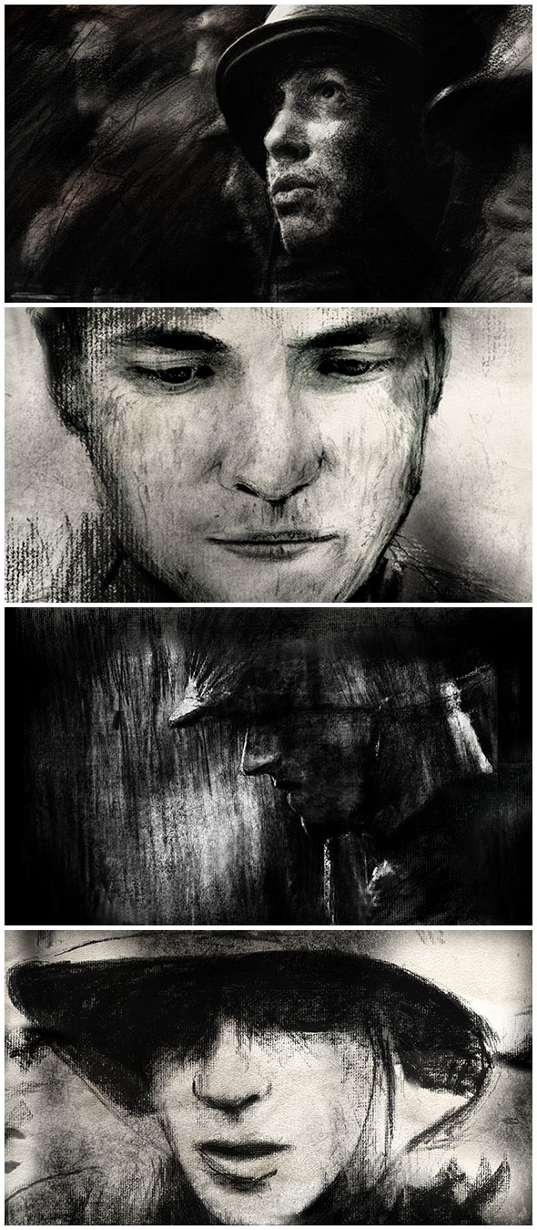
One of the sticking points in the sequence was: “How do we reveal the live action, while moving away from the drawings?” and, “How do we create a subtle type of animation?” The intention was that these were sketches by war artists in the field, so there was a roughness to them which hopefully related the idea that these were ordinary guys stuck in a horrible situation. For me, it was just really nice to get back to drawing – it’s one of the things that we don’t get to do very often. It took a lot of drawing to create something that had that sense of immediacy to it but at the same time, we also had to consider how we could do it. I took the aesthetic that Steve had started and tried to create something a little more immediate – a little more sketched and less finished.
So Steve completed a set of drawings and you began work on another. Were you focused more on the transitions from the drawings to the live action or did both you and Steve do that throughout?
While Steve was looking after [the project], they had tried different things for the transitions and the edit wasn’t locked, so Steve did a lot of drawings to try and create new characters and new elements for the sequence. A lot of that didn’t make it to the final cut. There was a lot of work that was done to try and gel the sequence together with the drawings and live action and transitions. I experimented a lot trying to figure out a way of creating a more fluid and less linear feel, which then ended up being a series of layered dissolves. This, I think, helps keep the integrity in the sequence and it didn’t feel like it was tricked out too much. I just wanted to create something as natural as possible without making it feel too electronic. [At this point] we also began prepping for a high-speed charcoal shoot.
Bill “Hoosier” Smith character transitions
Those elements were already shot. Was the reshoot a result of changes to the edit?
While the material shot by Steve and the team in New York was beautiful and provided inspiration for the look of the elements, much of it was shot at low resolution and would not work for the final HD delivery, but there were some really inspiring elements where the charcoal broke brilliantly. We set up a Phantom shoot on a stage with DP Stacy Toyama to capture the high-res elements of the charcoal breaking, exploding, rolling, and crumbling, as well as new shots of the sketching, all of which were used as shots or as transitional elements in the edit. Before going into the studio with the Phantom I did a lot of experimentation trying to recreate that with different paper types and different thicknesses and weights of charcoal just so we wouldn’t waste time the day of shooting. Inevitably, the morning was spent trying to recreate stuff that would just happen when you’re not on the shoot.
What kind of frame rates were you shooting at?
I think between 300 to 400fps and we did some slight slowing down in post.
And did you enjoy working with that camera?
I did except that we were so macro and we had so many lights that at some point in the evening it just broke down. We were asking a lot of it in that situation! I’d worked with it before – it’s a good camera – and it seems like if you’re going to shoot high speed digitally at those rates and higher then there isn’t really that much choice.
Let’s talk about client challenges. What were some of the typical things that you experienced as a creative director/art director that you’d go back and forth on?
Gary and Tom were really good to work with. We discussed ideas and the way to put the sequence together and how to broaden it to make it feel bigger without it being just an action piece; we needed to relate that these were hero characters. All along, Tom wanted to do something with the sense that these were ordinary people in extraordinary circumstances, without reverting back to clichés or going back to formulaic approaches, which was inspiring. Obviously, however, when people are that invested there’s a lot of different opinions and a lot of talking through and a lot of waiting for people to absorb the material.
There was also a desire on the part of the producers to expand the scope of the sequence. That is when we started to incorporate some of the expansive battle shots, with the destroyers at sea and the airplanes flying overhead. We also worked to create more of a seamless overall aesthetic by bringing in the paper texture and charcoal particle elements to bridge the scenes.
Did you watch cuts of any of the shows or just raw footage from the series?
I had a full set of the shows. They weren’t all completed and had various effects missing, but they were very easy to watch.
New transition treatments
Did that inform what you were then doing for the title sequence?
Yes, because it really helped me understand the emotional level to it, the tone of the characters, and the stories that were unfolding, and that it wasn’t just about the horror. Tom Hanks and Gary Goetzman wanted a certain feel and obviously they’d done this before with Band of Brothers. It was interesting to hear their opinions and try to formulate how we felt about it here in Imaginary Forces and how I felt about trying to cut the piece together, along with Danielle and the other animators that were working with us.
How do you work with the production team on a daily basis?
I spend part of my time reviewing the edits, offering ideas within the cutting room. I do my own hands-on Photoshop work and try to delineate some kind of basic animation and experiment with the ways the transitions could work. We don’t necessarily have team meetings all the time as that can be counterproductive. On a day-to-day basis I work with the animators and the editor. I also make look-frames and drawings and cut them into the edit to post to the client to get as quick a response as possible to keep the process fluid.
Was this the only project that you were working on at the time?
There are always other projects but the emphasis on this one was to free as much of my time as possible to try and solve the problems.
How was it when things started to come together, from rough/final cut to being completed?
Inferno is a high-end system for visual effects creation used primarily for high-speed compositing and effects on feature films and television commercials.
It’s interesting because there are always all sorts of things you want to change so you never really want to lock it in. There are always last minute comments. But once we locked, we tried to get portions of the drawings and the edit and the treatment in our Inferno*. I worked with Rod Basham here to re-composite some of the After Effects elements from the animators and also to explore different texturing.
Once we found a section that was locked, or a drawing that was approved, we would work with it in HD to make sure everything was looking right and lining up.
It was an incremental process.
Yes, it was piece-by-piece. Once the edit was locked, we threw everything back into the Inferno to finish it in-house. We had to rebuild a lot of After Effects comps that were initially sent from New York at a higher resolution, we had to recreate some of the texturing. Once the client was happy with the drawings those would also then go into the Inferno to ensure the high-res scans were lining up. Some scans were 2,000 and some were 4,000, so we could blow into them. We added some selected dissolves between sequences and some dust particles just over the foreground layers for a bit more depth in places.
At the same time, we were also creating the map animations which are used throughout the episodes. For the final episode we created an epilogue, designed in a complementary style, featuring some of the real people portrayed in the series.
What has inspired you recently?
I think ideas and interpretations of ideas, which sounds abstract, but I get a lot of inspiration from watching movies and feeling that there’s a way and a style of storytelling which is interpreted through the visual format. It’s a discipline that’s a part of what we do but obviously there’s the design way of thinking to our work as well. So much is about the right tone and mood with what you’re trying to do, and it’s constantly growing in how we can influence the look of the film.
In my early years here, there was a lot of initial design work done on Minority Report in terms of trying to visualize what the pre-cogs saw and how you could integrate a designed look into the film which at the same time was very grounded in the storytelling. Those are aspects of design and thinking that I try to stick to.
It’s interesting that more and more design companies are working on films like Minority Report and Iron Man in a visual effects capacity. It seems like the the more traditional design side and the FX side are now blurring together.
That’s true, those lines between the disciplines are blurring as technology makes us react in different ways. The more tools we have to try and integrate our thinking and designs, the more sophisticated we can work and the more realistic things we can render. It’s always refreshing to think of things beyond what you see and or imagine what you can achieve with the technology. I guess that’s what we try to do as designers or directors: figure out the most interesting approach to the project.
Support Art of the TItle
Related
-
Mad Men
interview
-
To Kill A Mockingbird
summary
-
The Number 23
summary
-
Boardwalk Empire
interview
-
Black Sails
interview
-
Gattaca
title only