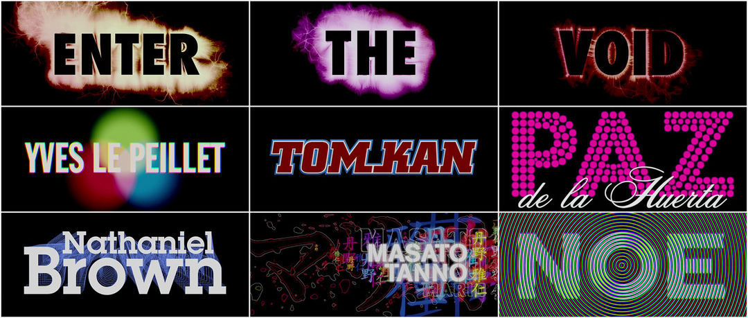


Like sighs from a scythe in a wheat field of psychosis, the opening title sequence for Gaspar Noé’s Enter the Void is a melting onslaught of typographic design foisted upon the senses. This unrelenting visual overdose hacks pleasurably at the viewer, as the tip of a nail does finding its destiny. Names become bright little deaths fired to a machine gun beat; the images encircle your pupils as LFO’s "Freak" drives the nail deeper.
A discussion with Designer TOM KAN, with additional commentary by THORSTEN FLEISCH.
Please describe the first creative discussion you had with director Gaspar Noé.
TK: Pierre Buffin, of BUF, put us in touch. When we first spoke, Gaspar was already in post-production for his film. He was in the picture-editing phase and looking for a graphic designer to work on his title sequence. Gaspar already had an idea for it: he wanted a fast-paced compilation of typefaces, all very different, inspired by films, flyers, and neon signs to announce the tone of the film. It was a peculiar case because the title sequence was in French, English and Japanese... He is very sensitive when it comes to typography – he had already done some himself for movies and posters. He even collects film posters.
The sequence is a typographer's wet dream (or alternatively their nightmare). How were the various fonts and characters chosen?
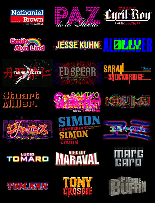
The choice of typefaces came rather naturally. After coming up with a large selection in line with the film's mood, we simply chose the ones that best suited the characters and the personalities of those in the team. Gaspar wanted each title to reflect the person it concerned. It was a beautiful homage and proof of his respect for the members of the team – a way to thank them.
Many typefaces and designs did not get used because the time limit was set – the sound mix was already done and it was impossible to extend. I think we used only 60% of the designs, all in all.
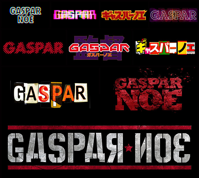
Type variations
Every typeface used in the sequence seems to be a reference to other famous film title or poster fonts. What was the typeface you selected for your own credit and why?
We appropriated different typefaces, but we never wanted to copy the titles from other films in an obvious way since I thought that would be misleading. For my own credit, I went in many different directions: aged typefaces in metal, Kanji and Japanese calligraphy, techno typography... In the end, I let Gaspar choose and he went with the biggest, most legible type!
Were you involved in any way with filmmaker Thorsten Fleisch who handled the electrophotographies of the words "Enter The Void"?
Gaspar was in contact with Fleisch and that typography was already done. His work really impressed me – it imbued my work with a force.
LFO's pounding track, "Freak" also plays an important role in the title sequence. How was the music chosen and did it influence the conception or development of the sequence?
Gaspar explored several musical avenues. This song particularly imposed itself since it’s very energetic – very pushy. Over several weeks, Gaspar and his editor adjusted the typefaces' succession to the rhythm. During that stage, I produced new designs, modified the colours according to the edit. I went to him with several attempts on the sequence, all quite fast-paced, but I think he was very happy with the first run. I worked on the transitions image-by-image, always in fast cuts to give the playback some vibration. I wanted to explore retinal persistence and the limits of readability, which I find the most interesting part of this work. For me, that was the aim. It was very artisanal work. Then for each festival and film screening, we reworked the sequence because the public reception was so enthusiastic.
In many ways the credit sequence prepares the viewer for the subsequent film experience – it's a jarring and grueling onslaught that does more to set the tone of the film than actually show the audience who produced and starred in it.
Yes, it functions as a real gateway. Like a prelude or a prologue, we can explain or complete a part of the story. In our case, the title sequence needed to reflect a colourful and varied universe full of rhythm to prepare the audience for Gaspar's film. Its crescendo rhythm leads you to a euphoric ascension. You feel the visual and auditory onslaught. You don’t need to read, you just experience the typefaces, the names and the music. I find it to be a successful contrast to the really calm first scene.
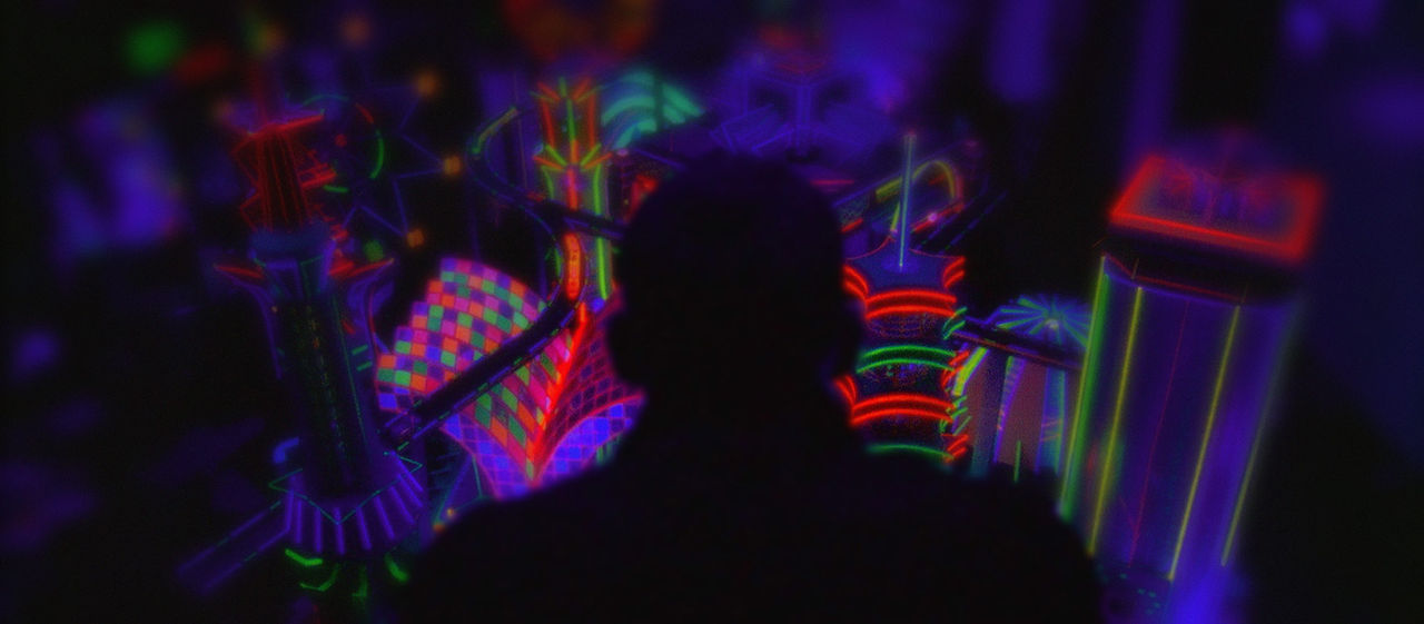
Enter the Void film still
What is the reason for using two sets of credits at the beginning of the film? A full set appears in a strobing style and then directly after are the main typographic treatments you produced. Why both?
Gaspar always begins his films with the end credits – he intends to create a gateway to his story with the titling sequence at the start. In his other film Irreversible with Monica Bellucci and Vincent Cassel, the whole story was a flash-back. The film starts with the end credits to tell the story using an incredible flash-back structure.
The 'opening' end credits
When we discussed these opening titles with Gaspar, he wanted to credit the crew in a radical rhythm in-step with the music. Then he wanted to increase that visual rhythm and dramatize the titles in order to bring the spectator to a visual climax with the names of the actors. And again, it's his way of thanking the whole crew.
How creatively satisfying is it to break with traditional approaches to title design and come away with something as special as this?
There was tremendous satisfaction working the way we did. Gaspar placed a lot of importance on this sequence. It was important to explore and push the graphics and visually, we knew it would have a strong impact.
Gasper type variations
How does one approach working with a provocative genius who understands that his vision must exceed the risk involved?
Gaspar gave me a lot of freedom and I hold dearly the experience of working on this title sequence, because experimentation and research played a huge role. It was a real laboratory. I really believe that Gaspar is among those creators who advance the progress of their field by considering the title sequence as its own whole.
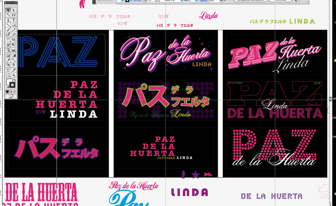
Paz de la Huerta working credit
Talk to us about the influence of Jean-Luc Godard's opening for A Woman Is a Woman, a film that shares a few themes with Enter the Void.
Actually, I had never heard of that sequence before finishing this project. Gaspar didn’t mention it.
I find it very modern for its time; it is very efficient and catchy. The typography over the black background is a bold choice. The titling becomes an essential element to the opening and the presentation. I’m not surprised that this structure and graphic form has already been exploited.
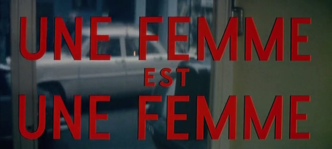
Godard's A Woman is a Woman opening titles
Also, how do you feel about the influence of your sequence on other media? For example, Kanye West's "All Of The Lights" video.
I had mixed feelings when Gaspar sent me the link to the video when it first came out. I was amused that my work was being referenced by a well-known artist, but I was also disappointed that he had not contacted Gaspar nor myself to work on it. Kanye West had sought out artists in the past to illustrate his videos. The first version of his video was very, very – maybe too much – inspired by the graphics and the mood of our title sequence. The similarities were too blatant and I believe plagiarism always devalues the imitator. Even if it's an homage, there must be an added personal touch. It was good for him and his team that they re-worked the designs for a very different second version.
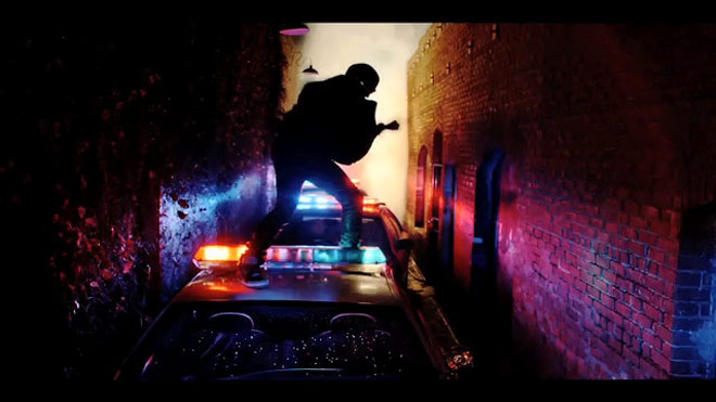
Kanye West "All of the Lights" excerpt
What recent work has taken you by surprise? Who inspires you?
I am pleasantly surprised by the rise and popularity of motion graphics and the richness of its production. In an indie kind of way, a new generation of graphic artists can express themselves through video and audio production at a low cost, which used to be impossible. Blogs and the Internet then relay these creations and allow creators to benefit from this very accessible means of distribution.
As for my sources of inspiration, it varies. Anything that opens my eyes and makes me curious is inspiring. Each day I discover new things.
And what’s next?
I don't know what awaits me. I take on projects in a heartbeat – when it's love at first sight! The motivation must remain and each project is a new adventure.
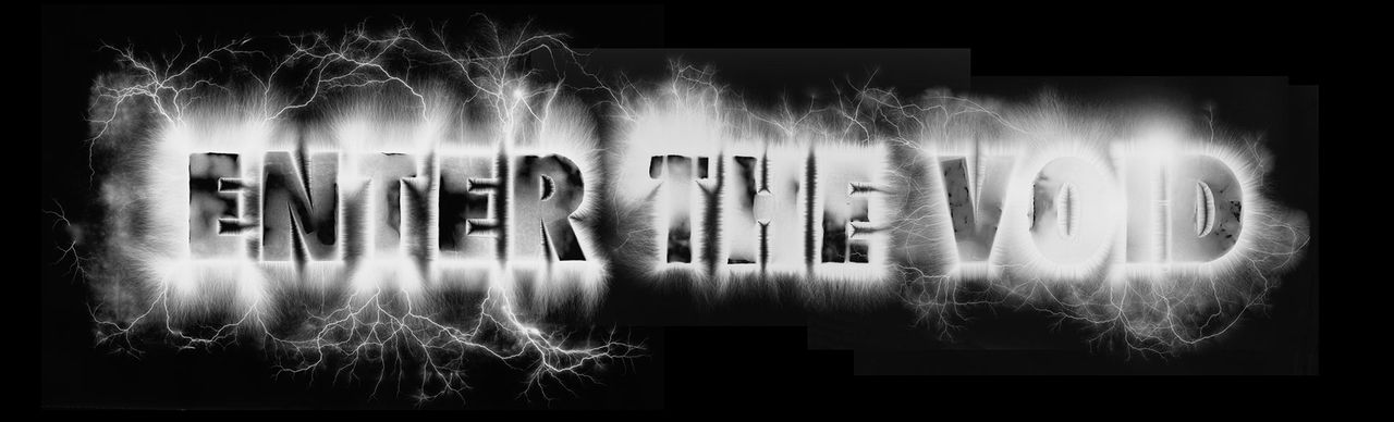
Enter the Void logo type
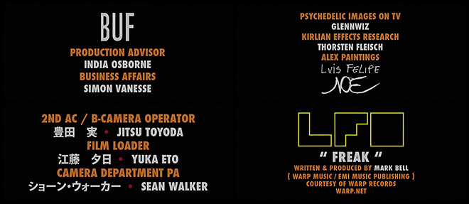
SUPPLEMENTAL: THORSTEN FLEISCH explains the electrophotography process used for the words.
TF: When Gaspar commissioned me to do the electrophotographies he was originally planning to use them for the scene in the love hotel near the end of the movie. He was thinking about having electric sparks or a Kirlian aura effect around people’s genitals while they were copulating, but he ended up going for another, more smoke-like effect. So I mainly did discharges along a circle or a straight line for that which were to be used later by Buf, the special effects team. Gaspar suggested that I try applying this effect for the title too, so he sent it to me in the font he wanted. I cut them out on cardboard, wrapped aluminum foil around them...
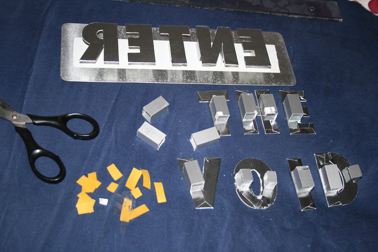
Letter prep
...and shot around 30,000 volts through them. He really liked the result, so I passed it over to Tom for the title animation. Also some of the posters, for example the German one, have them on it.
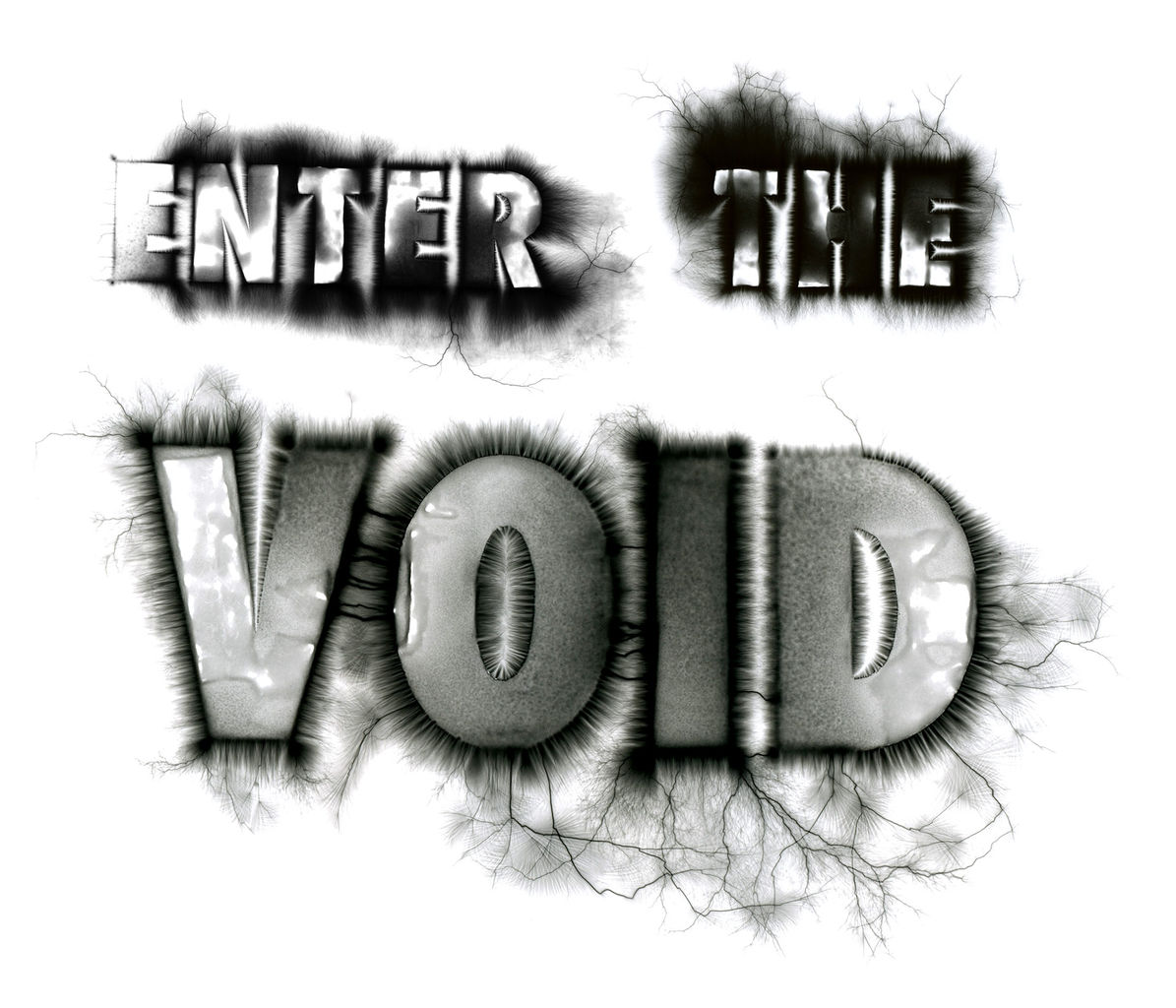
Fleisch's logo treatment
Special thanks to Anita Abbasi for the translation in this article.
Support Art of the TItle
Related
-
24 Hour Party People
interview
-

Smiley Face
summary
-
Se7en
interview
-
Trainspotting
interview
-
The Good, the Bad and the Ugly
summary
-

Sex & Drugs & Rock & Roll
summary