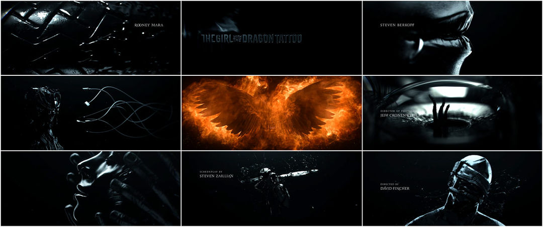


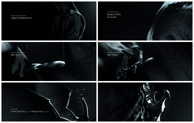
The beat sidles in: a throbbing arrhythmia peppered by desperate, howling vocals, and then that ooze. That viscid, black ooze that seeps into everything, penetrating crevices, dribbling into lips and eyes, suffocating and sensual and silent. Each ebony form is made osmotic – surging and melding, torn apart and punctured, ensnared, set ablaze – thrashing in the deep. Through flashes of embers and murk, sticky vines creep, hands grapple, foul petals unfurl, and sable fists inflict their fury.
In this elegantly violent title sequence, Trent Reznor, Atticus Ross, and Karen O's version of "Immigrant Song" swells when coupled with Blur Studio's monstrous fantasy in David Fincher's newest offering, The Girl with the Dragon Tattoo.
A discussion with Director DAVID FINCHER, Creative Director TIM MILLER at Blur Studio, and Designer NEIL KELLERHOUSE at Kellerhouse, Inc.
Let’s start with the song. How and when did you decide to use “Immigrant Song” for the sequence?
DF: I think it was a year ago, just before we returned to LA, when we were shooting around Stockholm, in the east and north of Sweden.
I had been listening to a big collection of Led Zeppelin stuff. I heard “Immigrant Song” and thought, ‘You know... it’s a little bit crazy, but it might be just the right kind of crazy.’ It’s only 2 minutes 25 seconds long but it has this great drive to it. So I called Trent and said, ‘I have an idea – and don’t hang up – I’m serious. What do you think of doing a cover of “Immigrant Song” and doing it with a woman?’ And he laughed and then wanted confirmation that it was, in fact, me on the phone. And he said, ‘That could be cool. Let me think about it.’
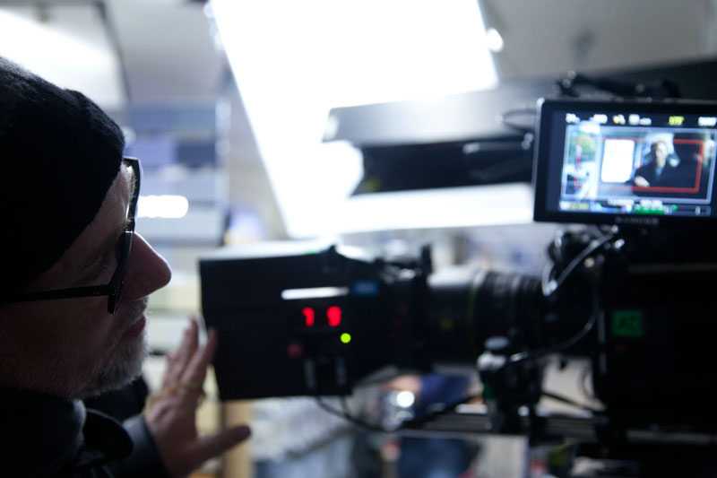
Director David Fincher on location
So he went away to think – and this is kind of what he does – he goes away to think and then he comes back with the finished thing! And he said, ‘Is this what you had in mind?’ I thought, ‘This is perfect.’
Once I heard that I thought, 'Well, that’s pretty obviously going to be the title sequence of the movie.' I emailed Tim Miller at Blur Studio and said, ‘What do you think about this...?’ and he replied, saying, ‘This is really not what we do, but we’d love to give it a shot.’ I said, ‘Just read the books, and let me know what you think.’
TM: When David approached us to create the opening titles for this film, it was intimidating and exciting. I was like, ‘You’ve got Prologue and Psyop and all these other companies that do this for a living and do it beautifully. This is not what we normally do, and we have a very small design team.’
So, how did you know that Blur was the studio you wanted for this sequence?
DF: Well, I knew it was all going to be CG and I had been working with Tim and Blur for two and a half years or so on Heavy Metal so I couldn’t think of anybody better to see this thing through. It was when I got back to LA that he suggested that we sit down and go over the stuff, because he’d been working on some ideas with Jennifer Miller, the graphic design side of the team.
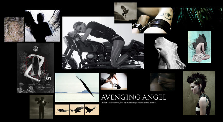
TM: It was an ongoing, very organic process. David’s initial creative brief was frighteningly vague – it said, and I quote: ‘CG, very adult, super dark, leather, skin, blood, snow, breasts, vaginas, needles, piercings, motorcycles, vengeance.’ He said he wanted it to be like a fever dream, with a lot of abstract imagery.
'Immigrant Song' music video by Karen O, Trent Reznor, Atticus Ross
DF: I said, ‘Let's find an artist – our H. R. Giger – that we can use as a jumping-off point.’ Tim found a guy who had been stretched in latex and then he sent me this odd heavy metal music video that was kind of close. I told him to keep playing with ideas.
TM: We just didn’t find anybody that we all liked. So we gathered a giant batch of reference that had the right kind of feel and we sent it to David. He circled in on this black-on-black look with lots of fluids and said, ‘Yes, that’ll work – it’s like a nightmare of Lisbeth’s.’
It seems like the fluids idea would be hard to extract directly from the story. Where did that come from?
TM: In the initial reference imagery we found several pieces that involved liquid in various ways. And one of the artists that we found was a fine artist who would paint himself – pour oil and black paint all over himself and stand in a gallery. There was also this other one who would immerse herself in black liquid and make photos of herself emerging from it. David responded to that and said, ‘Let’s use black ooze as a unifying element throughout the vignettes.’ Everyone’s had a bad dream where they are caught in some molasses-like substance and not able to move. It just fit.
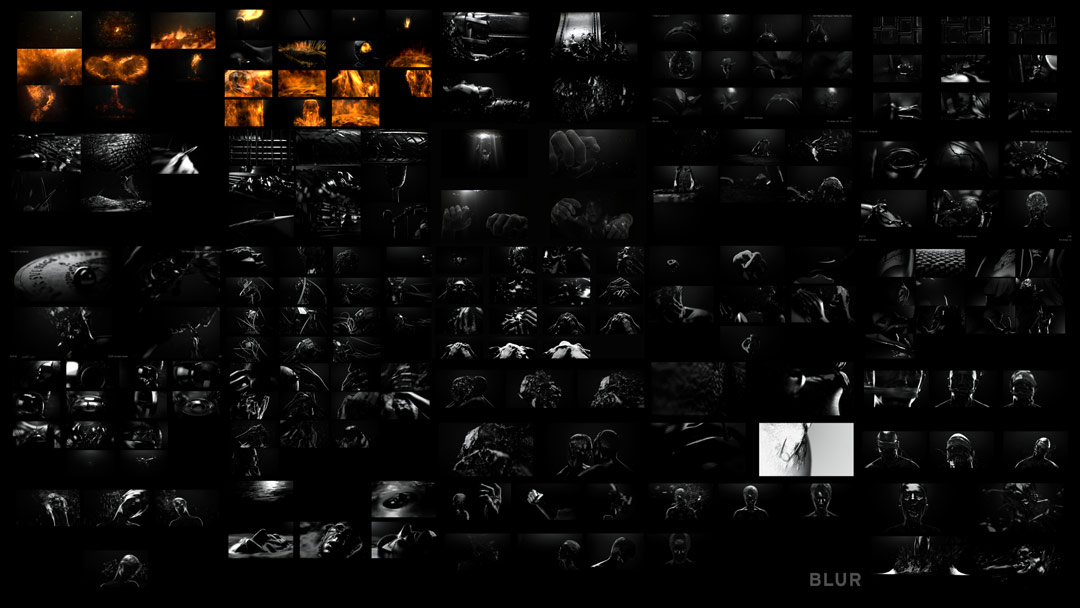
Visual explorations from 05/27/11 & 07/14/11
It also seems like it’s a perfect thing for Blur to do given your experience with photo-real CGI.
TM: Yeah. From the get-go, there wasn’t even a discussion of filming these elements. David wanted the flexibility of CGI. It was perfect for us – not necessarily the fluid part of it because, like most studios, we rarely do it. It’s usually a blood spurt here, a stream there, so it was both liberating and frustrating because the fluids interact with everything. The models and animation had to be done first for the fluid to react to, so you can’t be sure what it’s going to look like until you run the simulations. The tools for fluid dynamics are more robust than ever before, but some simulations take days to run and then you look at it and go, ‘Fuck, that’s not what I wanted!’
What was the next stage after the image reference collection?
TM: I said, ‘Okay, so how abstract do you want it to be?' We talked about which moments of the story to pinpoint and narrowed it down to what David thought were key elements of the trilogy.
DF: I think Tim came up with 50 or 55 different ideas for scenes to create and I said, ‘I don’t think we have time to do that in 2 minutes 25 seconds.’ We started editing and ended up with about 25. They hired illustrators and they would come up with things like, ‘What about time-lapse photographs of flowers, kind of Oxford Scientific shots of flowers opening?’ And I said, ‘Great! That’s great, as long as they can all be dipped or sprayed with this black automobile lacquer. It has to have this.’
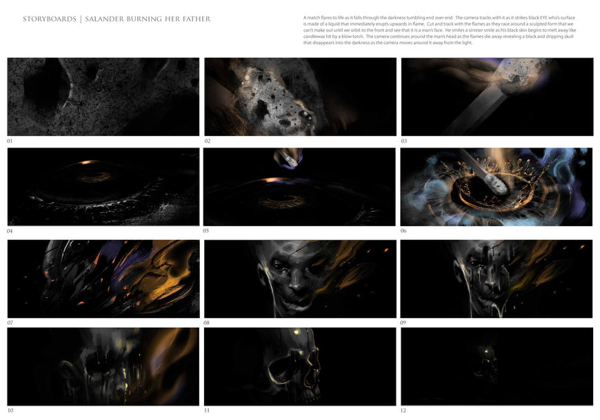
Storyboard vignettes, 08/16/11
TM: From those 25, I wrote up little visual stories that abstracted the ideas. For instance, to convey the idea of Lisbeth as a hacker, I came up with the tsunami-engulfed keyboard. Another one treated the keys as giant obelisks and huge fingers would come in and press them down from the black sky. One had Salander’s face melting off to reveal that her “bones” are computer parts. I wrote a whole bunch of these, thinking David would say, ‘These are good but let’s push it, let’s write more.’ But I just got one word back: ‘Go.’ So we storyboarded the best of the bunch.
DF: Tim just ran with it. I would go down there about every week. They’d post things to me on PIX, our in-house collaboration tool, and we’d look at it and have a couple of conversations a day, but mostly I would just say, ‘Looks good, keep going!’ When I'd go down there, I'd say, ‘Why this and not this? Can we make this next cut happen so I can go from the left side of the screen to the right side?’ and that sort of thing. But the visits were mostly about how to get it done – the logistics.
Final vignettes examples
Prior to Tim presenting those vignettes to you, were you specific about using moments from all three books?
DF: I didn’t get as pedantic as that. The Zala stuff from the second and third books has already happened in the first book – it’s just revealed in the second one. In our conversations, I was saying, ‘When Lisbeth has a bad night of sleep, show me the shit that rages through her mind. Show me the stuff that she has no control over, that she’s trying to sublimate, that’s gonna bubble up from her subconscious – from the ooze.’
Tim, did you storyboard these out in terms of trying to decide what will definitely be in the sequence? Did you have more than you ended up using?
TM: We definitely had more than we used. We created some really beautiful storyboards for everything but never produced a storyboard animatic. We went from the written concepts to the storyboards, but honestly, by that time the clock was ticking so we were doing storyboards and 3D animatics at the same time. Jerome Denjean, our CG supervisor, led the process of early look development.
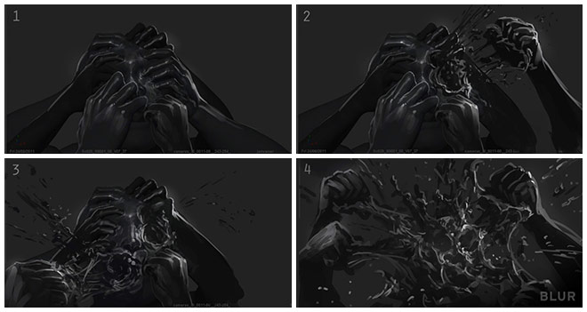
'Hot Hands' storyboard example
So you were moving towards a final render look?
TM: Yeah, just the look. We were exploring things like, ‘How shiny should the skin be? How visceral and uncomfortable can we make it? How abstract can we get? Is that a flower? Is it a vagina?’ – that sort of thing.
During David’s visits to the studio we would brace for impact, because he has a reputation for being incredibly picky. The first time I met him, I asked one of his friends, ‘How picky is David?’ And he said, ‘You’ve heard of pixel fuckers? Well David breaks each pixel down to its separate RGB components and fucks them one at a time.’ So there was some fear every time we would send something in, but 99% of the time we were just told to keep going.
Blur's 'Making of' reel for Dragon Tattoo
DF: Tim’s every bit the artist – he has the discipline and the energy to understand all of the working parts of his projects. He has no pretentions at all. He’s so head and shoulders above just solving problems and he has so much enthusiasm. He kept saying, ‘We can make a CG-animated movie for 8 million dollars!’ And sometimes I’d have to be like, ‘Tim, you gotta stop saying that because someone’s going to take you up on that and you will be well and truly fucked, my friend!’
I always feel that the best things come out of having just enough time to get into some serious trouble and not enough time to navel-gaze endlessly about something. And Tim’s kind of like that, too. He has this incredible eye but it’s always in service of function – it's got to move the heart, or the mind, or the groin. It’s got to engage you on some other part of your being than just your eyes.
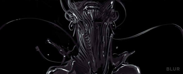
'Cyber-Salander' concept art
TM: The last few reviews were funny because I said, ‘What do you want to see here?’ And he went, ‘I’m just a fan; show me something.’ By then we had an edit that he loved. It was a huge relief to feel that confidence – to explore different approaches and feel that David would approve. Especially with the fluid simulations – there were lots of interesting “accidents” that we could embrace without waiting for approvals at every stage.
Of course we got hung up on a few things, one of which was the “cyber-Salander.” We originally did designs that were a little more sci-fi and high-tech. David’s comment was, ‘Less Cyberdyne, more “Tandy.”’ So I’d try and parse that feedback for the concept artists and we’d do another round. And another… five rounds later we ended up with a design that was basically a bunch of computer parts stuck together in the shape of a head. And it looked great! He was totally right, I just wasn’t seeing it at the time.
In terms of editing, are the shots ordered to portray a narrative, or is it more about tone?
TM: Both. There is a linear progression through the story for some scenes but others don’t relate to a specific timeline. The idea of Salander as a hacker has no particular place in the story arc so we could place those vignettes at any point. But others, like Lisbeth coming out of the ground, shouldn’t be before the fiery parts since that was much earlier in her story. At least that was the theory up front, but I can’t say that we stuck with that all the way through.
Blur's vignette montage
Yeah, there’s an expectation of a linear progression, but here it seems to go back and forth a bit.
TM: You’re right and it’s hard to break out of that linear storytelling mode, especially for me. David makes fun of me for worrying too much about whether the understanding is getting through; I’d whine about something not being clear and he’d say, ‘Oh, I forgot, you’re the STORY guy.’ Like that’s an insult! There was definitely a point at which I had to let go and embrace the abstract.
So we did our best to set up a creative and production process with lots of flexibility. For instance, we created most of the scenes in a sort of void, as “theatre in the round.” An example of that is the “hot hands” vignette where the fingers come up and grab her face and melt it; we didn’t initially plan out exactly where the camera should be for every shot. We put the action together and then watched it from tons of camera views to find the best angles and cuts.
Work in progress edit
How much digitization did you do for the project? Were you only scanning people or was it objects as well?
TM: The film production had scans of Rooney Mara and Daniel Craig already, so we got those, and in addition we scanned the actor for Harriet – whose head is covered in flowers – and her father. We also scanned Lisbeth’s mother, Lisbeth as a young child, and her father as an old man but since they weren’t in the film we just found faces that we liked. Lisbeth as a young girl was the daughter of the producer on the project.
All the other objects we created from scratch. We already had the dragon tattoo and the phoenix tattoo because we did them for David early on.
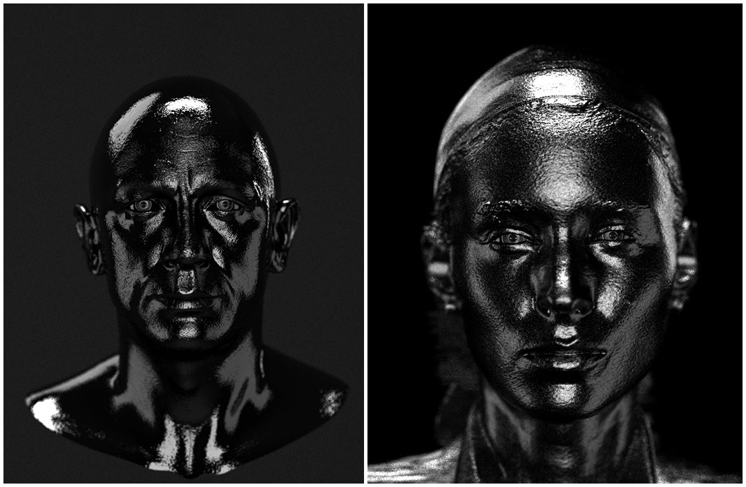
Lead actor head scan render look tests
Were there any major technical hurdles with this sequence?
TM: One scene that posed a technical problem was the one of Daniel Craig being ripped apart – that was just really tricky to do. The things you think are going to be easy, like that fucking dragon – I don’t even know if you can tell it in the shot, but it bursts out of her back – was originally supposed to ooze forth as if the skin and the dragon were both oil and the dragon emerges, but we couldn’t get it to look right. One of our guys suggested we make it look like cloth so that it tears out violently and we add some spray. That was a good solution. Those are the kinds of decisions you make at the end, and we were so lucky by then that David was not going to disapprove.
'White Ink' dragon tear from the final sequence
It really was a smooth process – not the death march it could’ve been considering the complexity, the creative goals, and the schedule. I think that’s a testament to David having a clear vision and the artists at Blur being so incredibly fucking great.
Let’s talk about the fluids now.
TM: It’s all RealFlow. It was a ton of work to get done in a short amount of time so we got some help from a couple of other companies who specialize in CGI fluid work – Spatial Harmonics and Fusion CI Studios.
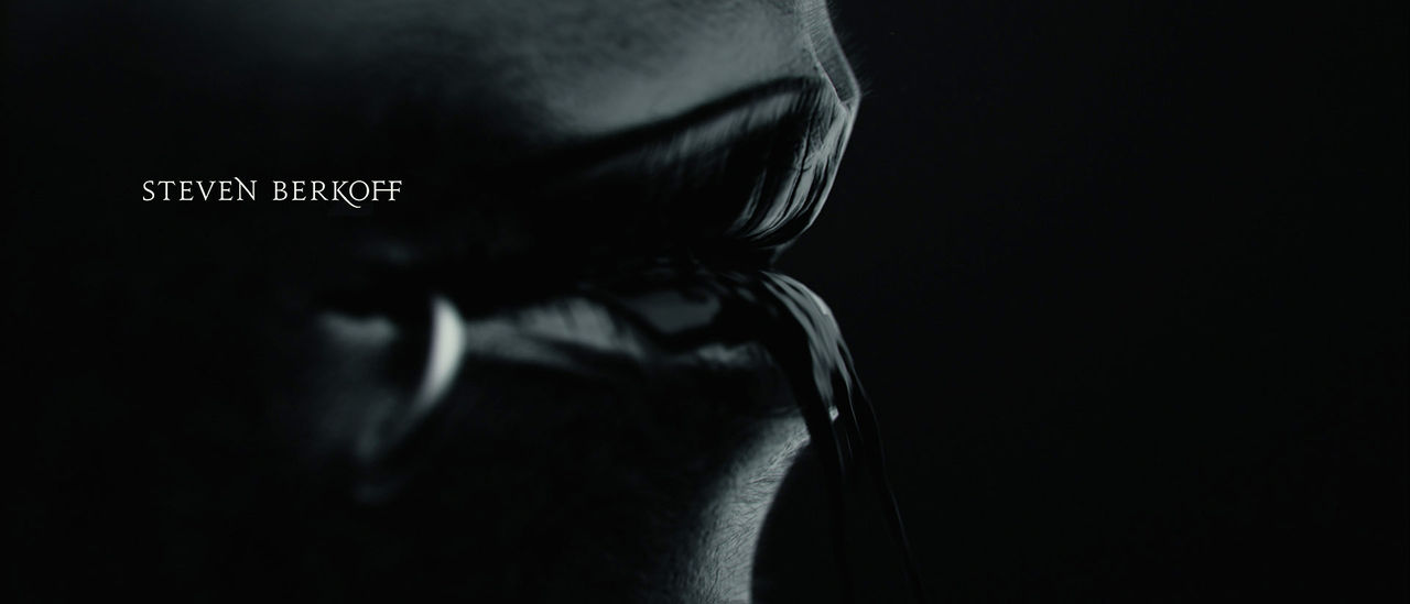
Salander’s lips from the final sequence
The fluids in each vignette were different, some were very complex and liquid-heavy, and some were simple. For example, there’s a close-up of Salander’s lips with liquid pouring out of them which was relatively simple, almost an afterthought.
But in others the liquid is more integral to the concept, like the “hot hands” that melt her face or the head being ripped apart or the last one, the vignette where she digs herself out of the ground. We wanted dirt to be floating on top of liquid and then have Lisbeth covered in it. All of those stacked elements get pretty complicated from a fluid simulation standpoint.
For the flowers growing over Harriet’s face, it was primarily about the flowers and the cycle of life and death, but we needed a subtle use of fluid to connect it with everything else. We wondered, ‘Can we just have some liquid dripping over the skin? Can we have a little spray of liquid as the leaf unfolds?’ The mandate was to integrate liquid into every shot; for some, the liquid was part of the concept, for others it was just icing.
Fusion CI Studios - Dragon Tattoo fluid simulations (Click for full case study)
So with the liquid, you’ve got all these different things like viscosity and density and ripples. Did you make adjustments by hand or did you have to experiment with it?
TM: Well, the beautiful thing about the way simulation software works these days is that you can have a strict adherence to reality and physics or you can bypass some of those rules. It’s hard to control the really chaotic computations at a fine level though, so the FX guys have a direction to go in but there’s a lot of guess work on the parameters. They run the simulations, we review, and I’ll give a comment like, ‘I wish it didn’t slide across the surface so much. What if it was stickier?’ Then they adjust some values and run the sim again and in the meantime there’s a lot of web browsing. I’d go past the team and I’d say, ‘Fuck, we’ve got a lot to do. Why are you guys browsing the web?’ And they’d go, ‘We’re running a simulation!’ (laughs).
How big was the production team? And how long did the whole project take?
TM: It was very fluid (pun intended) as it moved through the production pipeline and the different departments. As the animators were finishing, the lighters were starting, etc. so it’s hard to put exact numbers on it.
DF: As for the timeline, I think there were probably 9 or 10 weeks and I went a week and a half over. Maybe twelve weeks in total.
And the technical question: what hardware and software did you use?
TM: We model and render in 3D Studio Max and rig and animate in Softimage. Some of the simulations like fire and smoke were Fume and then RayFire was used for hard-body dynamics like the ground breaking as Salander emerges. RealFlow for the fluid stuff and then we render in V-Ray. For editing, we use Sony Vegas and compositing is done with Digital Fusion and After Effects.
Were you also involved in the typographic elements?
TM: Yes and no. The film's logo and typographic design was created by the brilliant Neil Kellerhouse. We brought his beautiful aesthetic into our titles, bringing the same fonts and sensibilities to letter spacing and layout. Jennifer Miller, our graphic designer, handled the kerning and leading and all of that. Neil would check in as we progressed and consult on the feel of the typographic elements as we handled the animation and placement. We wanted a delicate approach to the type animation to contrast the powerful imagery.
Main titles fluids progression
Early on, David had said to integrate some of the titles into the fluids and we did several international versions with the fluid in the title. But we decided that the type should just be clean and simple and separate. The type placement was key to creating interesting compositions and it really wove into the driving edit nicely.
Neil, when did you first become involved?
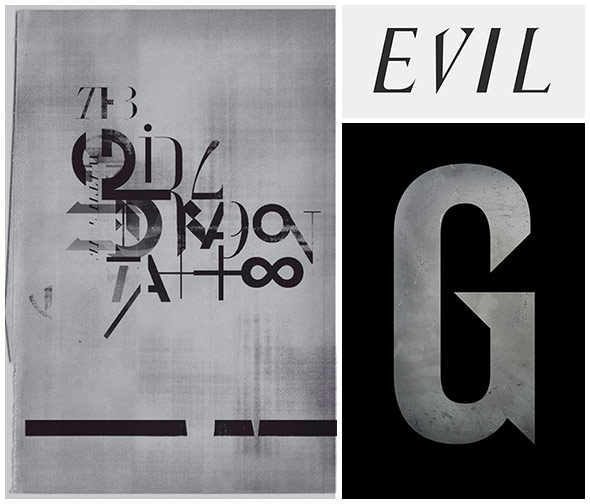
NK: After The Social Network. David had an eloquent way of describing what he wanted with the title treatment – very specific. We had a little time so I just went off and experimented. In the beginning, I was looking for symmetry, a balance between the polarities: good/evil, male/female, etc. And there were concerns with altering it for different territories and languages. We didn‘t even use a title treatment on the teaser poster! The photograph functioned as the title. Nobody seemed bothered by that.
The main task with the title treatment was to try and tee up the franchise. Not just the film, but the entire franchise.
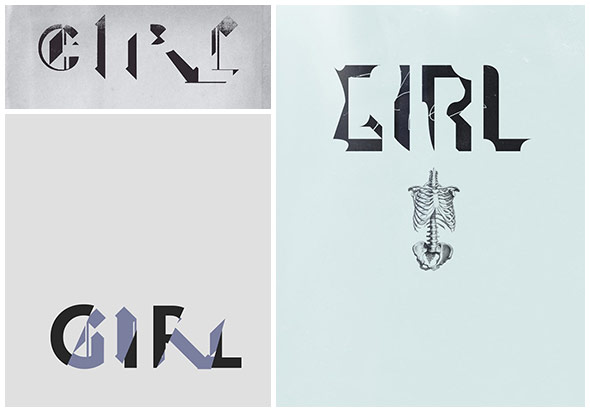
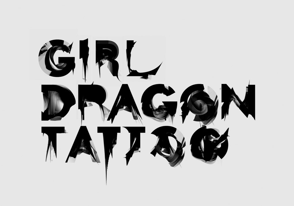
Single word type explorations
So you were always thinking about the bigger picture?
NK: Yes. I was trying to get a huge chunk of meaning into it. It took me a while to realize it's not really a title, it's more like a sentence. It’s a mouthful. So it was a long process. We wanted the materials to mean something to people who didn’t already know the story. A lot of people know the title but have no idea what the story is, and it's a difficult story to convey in a sentence.
So, how did you start? How do you approach doing that?
NK: I start generating ideas and then see how those might translate typographically. There were other things that were tangential and totally foreign to the final, but you’ve got to hit all of those dead ends in order to find something different. You’ve got to go down that road and fail – a lot.
So how many initial concepts did you end up doing?
NK: A lot! I mean, a lot of iterations, wholly different. I generate a lot of failures, but there’s usually a grain of something interesting when you take a chance, and after a while, all those parts and pieces can add up to something interesting.
Main title exploration
And how much feedback did David give you for each?
NK: It all went through him; he was very involved. It is his vision. I mean, it’s not that difficult to make a pretty picture. It’s much more difficult to do something that’s a little different while remaining perfectly appropriate and authentic, and that’s what we were after.
Main title explorations
So, did you work on the poster designs and the type simultaneously or was it a separate process?
NK: They were created at the same time. The closer you can get to something that’s authentic and appropriate – if you have good reasons for your decisions and can speak about your ideas as solutions – the easier it may be for someone to accept something they’ve never seen before.
How were the posters and other collateral developed?
NK: David worked with the photographer Jean-Baptiste Mondino. You can see from the quality of the photographs that there was a comfortable relationship between Mondino and his subjects. It’s a real luxury to have great photography to work with. I haven’t seen many shoots that have been as comprehensive as this one was. It really gave us a lot of latitude with the marketing materials.
How many concepts did you go through for the poster designs?
NK: Many, many concepts – hundreds.
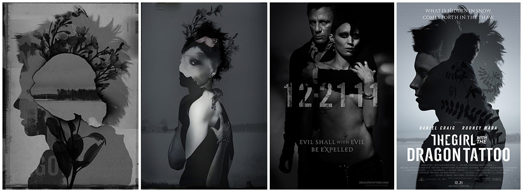
Film poster explorations and final teaser and theatrical film posters
How involved were you with Blur when they were doing the opening title sequence, in terms of the typographic elements?
NK: Oh, not much. We were just finishing up the title treatment at about the same time they needed it to complete their sequence. By then I had finished with everything and they took it and ran with it for the animation.
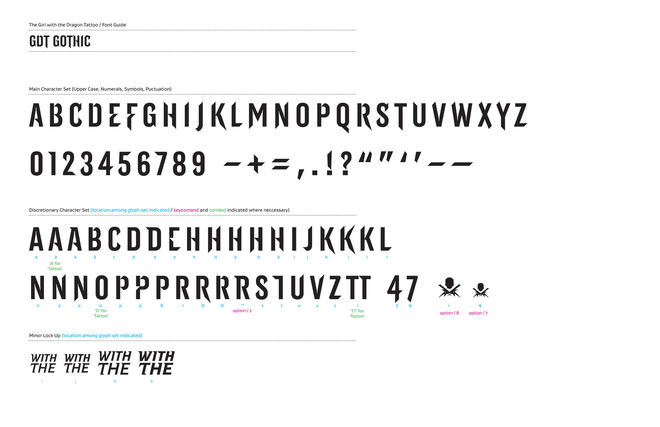
Main title font set
Actually, picking up the secondary font was interesting – the Jupiter font. I would never have thought of doing something like that, but David had something very specific in mind. He described it to me, and I went looking for it and presented him with a number of options and we decided on that one for the “Evil shall with evil be expelled” line. I thought that font was really beautiful. It has a lot of ligatures and multiple character options.
In terms of that line: we were on IM together, firing ideas back and forth, and I sent off some Swedish proverbs. I think David mentioned them to Stellan Skarsgård and Stellan mentioned another one he knew and tried to translate it from Swedish to English. And that was where the “evil” proverb came from. Blur did such a beautiful job of animating it for the cast and crew names in the final sequence. It’s very subtle.
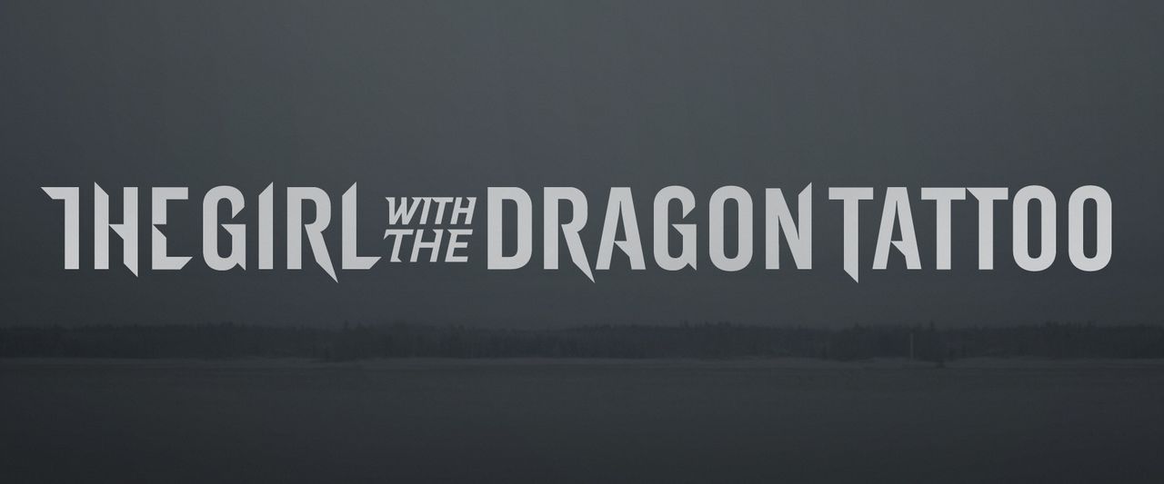
Final main title design
David, we’ve noticed an interesting split in film viewers reacting very favorably to the title sequence or feeling it's out of place, tonally very different from the film. Was that a deliberate choice to push people’s buttons or take creative risks?
DF: Yeah, I think so. It doesn't seem that risky to me. I think it's important that, if you're going to monopolize people's time for 2 hours 40 minutes, you are careful how you do it. If there isn’t anything to be gained from taking another two minutes, then you don't do it. But if I can tee up a mood or prepare people for what we're going to be talking about, then I feel like that’s worth it.
A lot of people were upset by the teaser poster. They were saying, ‘That’s not part of the movie.’ And I don’t have any response to that. To me, that was a really good photograph of the two characters in the movie.
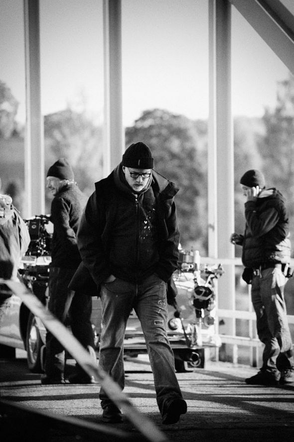
Director David Fincher on location
Were you happy with the final sequence?
DF: Yeah, very much so. I mean, would I have loved another six months to fuck around? You bet! But I was completely happy with the experience of making it and in that respect it was a complete win-win. I don't know if having more time would have made it any better and I don't know that we would have turned the people who thought it was “out of place.” I can honestly say that I would feel the same way that I feel right now.
Tim, do you see Blur doing more film work, specifically effects or title work? It seems like Blur is moving in that direction.
TM: That has always been one of our main goals. We want to make our own films and continue to work with visionary filmmakers. Which is not to say that we want to do any less of our current work; we love doing game cinematics and commercials. It’s really about the creative idea – if it’s interesting and challenging then we want to work on it, no matter the format or venue.
And are you going to work more with David on future projects?
TM: Oh yeah, we love working with him and we’re already discussing several future projects. The best thing about the collaborative process of filmmaking is finding people you like working with and trust; it not only makes the process more enjoyable but it produces the very best results.
LIKE THIS ARTICLE?
SUPPORT THE PRESERVATION AND CELEBRATION OF TITLE DESIGN. BECOME A PATRON TODAY.
Related
-
Se7en
interview
-

Fight Club
summary
-
Panic Room
interview
-
The Game
summary
-
Alien³
summary
-
Zodiac
summary