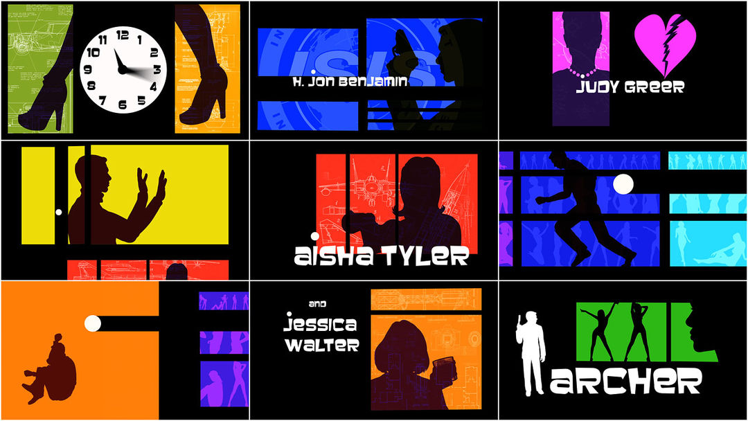


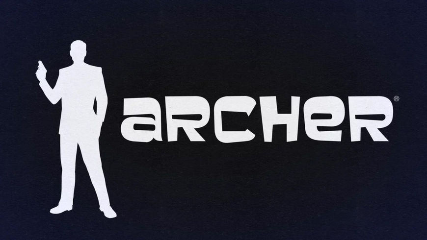
The title sequence of the FX animated series Archer creates the artful illusion of a serious spy-related program. Designed as a direct homage to the Saul Bass cut-out style prevalent in the 1960s, the sequence focuses on a bouncing white dot, fired from main character Sterling Archer’s gun in the first title card. The cast is introduced one by one in a series of connected vignettes that relay character information while propelling the action forward.
Judy Greer’s “heartbreaker” secretary Cheryl Tunt is shown with a heart-shaped locket, Amber Nash as Pam Poovey is operating a dolphin puppet, demonstrating her character’s commitment to anarchic references, Cyril Figgis (Chris Parnell) fiddles impotently with his cell phone, and Lana Kane (Aisha Tyler), Archer’s super-spy sometimes love interest, shoots her gun right at Archer himself. Arms raised and against the wall, the projectile prompts Archer to jump straight into his mother Mallory’s drink. He emerges “cleansed”, striking a James Bond-esque stance and regarding silhouettes of women arranged in provocative poses. The sequence ends with both Archer and the women he’s objectifying literally falling from their positions, as if the ground beneath their feet has given way.
Sterling Archer: The Spy Who Loved Himself
This title sequence tells us that Archer is, among other things, a deadly accurate takedown of entitled white American masculinity. Its satirical target is not so much an individual (or an individual nation), but the swaggering, narcissistic underbelly of white male privilege. His first pose emits quiet authority, but by the end of the sequence he’s literally running for his life, away from the woman he claims to love and towards the most important woman in his life: his rapacious and abusive mother. It’s only through the cleansing rinse of alcohol and maternal neglect that he can emerge at the sequence’s finale, a parody of a “real man”.
The original Archer title sequence (described above) opened the show for its first four seasons. Since then it has evolved along with the show to accommodate changes in theme, setting, and even casting, but the essential style and metaphors have remained. The sequence, in an original and daring way, sums up the tone of the show – serious surroundings with deeply unserious characters – and its most compelling theme: entitled white masculinity. As for Archer himself, his swaggering arrogance provides a perfect satirical target, and the opening sequence drives the point home with admirable visual storytelling economy.
A discussion with Producer/Art Director NEAL HOLMAN and Lead Motion Designer MARK PATERSON.
What was the original concept for the Archer opening title sequence?
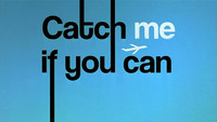
Neal: My plan from the very start was to do an opening using silhouettes in some form or fashion. Saul Bass and some later Bass-esque opens, like Catch Me If You Can and Kiss Kiss Bang Bang, were pretty heavy influences – even the end sequence of The Incredibles. Anything that had that sort of deft blend of fun and action went into the pot.
I saw the mock Saul Bass Star Wars open around the time when we were working on our previous series, The Xtacles, and I loved it. Just the playfulness of it. It was simple, but really fun, so that prompted a lot of research into that style and who had done it before.
So once you had the Bass’s influence as the jumping off point, what were the next steps?
Neal: Originally, I had this idea that the silhouettes would be made of fire, moving over top of a burned or textured background. I loved the end titles of 300 – the depth they achieved by zooming past elements to reveal the next scene in the sequence. The grungy textures in the back would be separated into various elements, so we could move past them or pan off of them, creating a 3D effect. We'd created mock-ups to test that look.

Image set: "Duchess" look test mock-ups
Neal: The mock-ups weren’t perfect, but the idea was there. At this time we were all starting to tire of grunge logos and effects, so ultimately we decided not to go that route. Another approach was to go for a more clean halftone effect. I liked it as a still frame, but it wasn’t translating in motion.
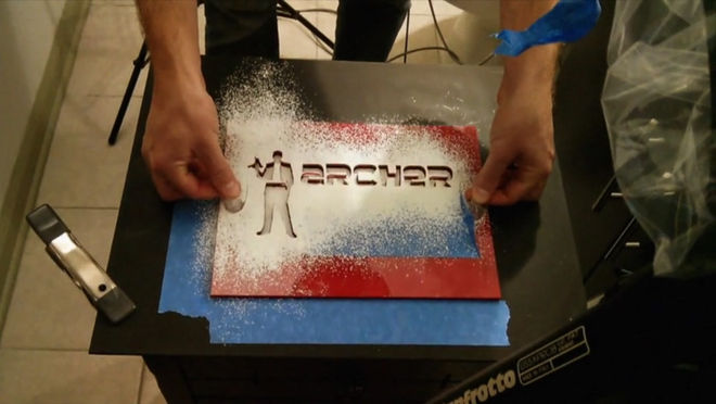
Though it might be hard to tell, the last mock-up was the start of the opening sequence as we know it. Once I’d found the typeface, the rest followed suit. Every time I finished another bit of the sequence, I would show it to the others – there were only nine of us total – and get feedback. Each of them, Archer creator Adam Reed especially, had an important hand in shaping the direction of the sequence.
The challenge was to do this entire opening sequence with as few new drawings as possible. By using silhouettes as our main character pieces, I could reuse every element we created for the pilot. I felt like simple shapes could be doable and effective given the incredibly short time frame we had. Also note that the show was titled Duchess up until around the last day or so of animating the sequence.
How long was production on first version of the opening?
Neal: I animated this sequence in about four days, just as we were wrapping production on the pilot. We added some bells and whistles once the series got the green light, just to finesse some of the background animations and improve some small timing issues. Overall, I’m still pretty happy with it.

Image set: Original Archer title sequence element breakdown
So Mark, Archer’s now been on for seven seasons and the opening titles have evolved with the show. What's been the process for modifying the sequence for recent seasons?
Mark: After we returned to the original titles for season six, following the Archer: Vice switch up, I’m sure only the most eagle-eyed viewer noticed that they weren’t the original titles at all, but a meticulous remake.
So why did we do that? The original title sequence was only intended to be a placeholder for the pilot episode, hastily constructed by Neal in a grueling week long After Effects session just in time for FX’s submission deadline. After the show was picked up, Neal never found the time to go back and fix what he calls his “sloppy mistakes”, so it stayed untouched for four seasons.
Since early in the series I’ve been tasked with creating the shows motion graphics. When Adam Reed decided that Archer: Vice, the shows fifth season, would have an 1980s slant, the task to re-skin the title sequence fell into my lap.
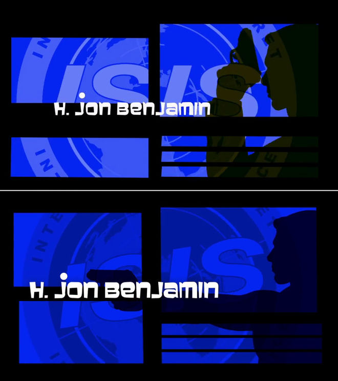
Archer's season one opening (top) versus the season six opening (bottom).
So did you start completely from scratch?
Mark: Rather than go back and patch up the existing sequence, I felt the most prudent path would be a complete do-over, before we even began the Vice treatment. My reasoning was to have something future proof, laying a solid foundation for re-skins and further modifications in the future. We had no idea how long Vice would run for, but I was wagering at some point the show would return to its origins and need the original titles again – which it did for season six.
Neal and the producers were on board, leaping at the opportunity to address a laundry list of small notes we’d all gathered over the years and tackle some bigger ones too – such as replacing all the artwork and redoing the character animation with the latest body rigs. It was no small task.
How involved was Neal in all of this?
Mark: The Archer titles are Neal’s baby, so I was a little anxious about working under his direction to create a brand new, polished up interpretation of his original vision. So with a little trepidation and a deep breath in my lungs, I fired up After Effects and began the reconstruction work from the ground up. Far from being the backseat driver, he was very cool about it and pretty much just let me get on with it. No egos were harmed in the (re)making of this title sequence.
Neal: I'm a hack animator. I can do it, but I'm not Mark. Turning the titles over to he and the After Effects department was the easiest decision in the world. All I had to do was sit back and watch and maybe suggest a colour change here or there.
So structurally the sequence remained the same, but many of the details changed, like the new title card for the Archer: Vice season. Walk us through updating the sequence.
Mark: Once we had solid ground to work on, it became almost trivial to re-skin it year in and year out. The first re-skin was for Archer: Vice, which introduced a more pastel palette. The blocks of colour featured new background schematics, their edges take on a more hand cut feel, and a layer of real airbrush added a texture. Of course, the highlight of the Vice re-skin was the title card blowing away in a puff of cocaine, an inspired suggestion from Chad Hurd.
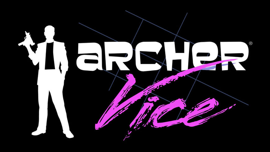
Archer: Vice (2014) title sequence
Mark: I tried to create the cocaine digitally, but it was too synthetic and just didn’t look right. The only way to achieve the look we wanted was to shoot it as a real life practical effect. We got a stencil made, and after some experimentation I settled on double zero pizza flour and an electric air pump from an inflatable bed. Ideally you’d do something that messy outdoors, but Atlanta’s humidity affected the flour. I volunteered to do it in my bathroom at home, and thirty takes later I had a thin coating of flour throughout my entire apartment. I’m pretty sure that’s how you get ants.
Shooting the title card stencil with fake cocaine
Mark: Back in the digital realm, I recoloured the word "Vice", which was shot separately, and went to work on making the practical effects integrate with the digital as seamlessly as possible. All the footage was hidden over the top of the digital artwork, retaining its clean lines until the last possible moment when the air blows across and breaks it apart.
So we’ve talked about seasons five and six, what’s changed in the latest version of the sequence?
Mark: Season seven has seen another re-skin as the series moves to Los Angeles and into the private eye game.
Archer season seven (2016) title sequence
Mark: The blocks of colour shift to hotter LA-inspired hues, and the background schematics are replaced with appropriate P.I. imagery. For the first time we see a textured background, and the whole piece has the feel of a letterpress printed poster. LA landmarks replace New York skyscrapers, and I made use of the decorative Chinese Theater to hide two puzzle pieces for the ongoing Archer Scavenger Hunt. They go by so fast it took fans five episodes before they noticed them!
Is there a particular element of the sequence – either past or present – that you're most happy with?
Mark: I’m really happy with how the Vice cocaine shoot turned out. The beauty of the unexpected is exponentially better than CGI. No matter how much you practice, you have very little say in how real world physics will react. From the way the powder breaks apart in clumps, to the organic motion as it blows away, to the vortex of air that whips it back into shot for a brief moment before we fade to black – there’s nothing like the real thing.
Neal: I love the Archer: Vice titles, with the cocaine blowing away at the end. Chad threw that idea out as a joke, but all of us instantly jumped on it. The new LA titles are just perfect. Really, I'm truly just happy to see the sequence evolve, much like the show has gotten bigger and more cinematic as the seasons have progressed. It still has the same heart, but there is a lot more to the sequence now and I believe it's the better for it.
What are some of your favourite title sequences, either classic or contemporary?
Neal: There are so, so many – and most are on your site! My newest love is the title sequence for The Night Manager. It's just gorgeous and perfect.
By Any Means has a title sequence I adore, even though I've not actually seen the series. Simple as they are, I really love the titles for Samurai Champloo. And I know it was ‘80s schlock, but I have an undying love for the M.A.S.K. title sequence.
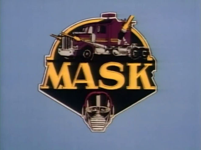
M.A.S.K. (1985) title sequence
Neal: Almost every work by Saul Bass was a heavy influence on Archer. Many people have pointed to the similarities to Cowboy Bebop, but honestly, that was more sub-conscious than conscious.
Mark: I was turned on to Bass in art school, and he’s been an inspiration ever since. He was a true original whose style really defined an era. In Psycho, he set the unsettling tone of the movie using only text and simple lines. Amazing. North by Northwest’s transition from his grid lines into live action windows is right up there with Stanley Kubrick’s famous match cut from 2001: A Space Odyssey. Incredible stuff. The Archer titles are obviously influenced by Bass, and his style continues to endure.
—
SUPPLEMENTARY: Archer season seven (2016) teaser trailer
Art Director CHAD HURD details the creation of the Archer season seven teaser trailer.
What was the genesis of the Magnum, P.I. promo created for the seventh season?
Chad: The Magnum, P.I. promo was a joy to work on… Every year we want to tease our fans with a fun promo to get them excited for the new season. The year before last it was the shot-for-shot remake of the Top Gun music video. This year we wanted to do something similar, but tease some elements we knew would reflect the upcoming season.
Adam Reed wanted to switch things up by moving the gang to Los Angeles where they would open a detective agency. Old cop shows like Starsky & Hutch, Charlie's Angels, and Magnum, P.I. were all referenced. In fact, Adam was such a fan of Magnum, P.I. he planned for Archer to have the same Ferrari. Once we knew the premise of season seven and that Archer would be driving Magnum's Ferrari, the decision to recreate the Magnum P.I. opening was easy, but the process was not.
What kind of challenges does making a shot-for-shot remake of a classic title sequence pose?
Chad: As I'm sure you've seen, the original Magnum, P.I. opening is filled with lots of action and movement, something we normally limit to just a few scenes in Archer. But in order for our Magnum, P.I. trailer to be a true homage it needed to precisely match the movement of the actors. Thankfully our talented animation directors Marcus Rosentrater and Megan Johnson were up to the challenge.
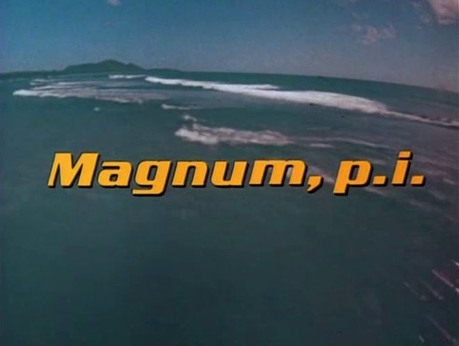
Magnum, P.I. (1980) title sequence
Chad: The animation and illustration teams studied the opening credits frontwards and backwards so we could get our version as close to the original as possible. Our EP's Matt Thompson and Casey Willis guided us towards which of our characters would be funniest replacing the Magnum actors. But really, the humour came from how closely we stayed true to the original title sequence. I'm extremely proud of the work our team put into recreating the opening. Not only does it look gorgeous, but it encapsulates the spirit of Archer season seven and adds a humorous twist to a classic television series.
Do have a favourite moment or shot from the teaser?
Chad: Pam dressed as the rodeo clown makes me laugh every time I see it. It's a great bit of design work and animation.
Was there a particular shot or scene that caused headaches for the team?
Chad: The shots of the helicopter riding along the cliffs was a very tricky thing to get right. Those shots took a lot of trial and error to get the depth we needed. We originally tried to create this totally in 3D, but it didn't look right. We finally settled on a combination of cliffs painted in Photoshop parallaxing with water animated in After Effects and a 3D animated helicopter. It was a challenging scene to create the same motion as the Magnum title sequence and keep it looking like it belonged in the Archer universe.
Support Art of the TItle
Related
-
Cowboy Bebop
summary
-
Catch Me If You Can
interview
-
The Man With The Golden Arm
summary
-
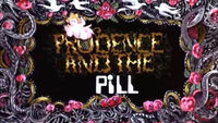
Prudence and the Pill
summary
-
Dr. No
title only
-
James Bond: 50 Years of Main Title Design
feature