


Keeping a sense of scale at arm’s length.
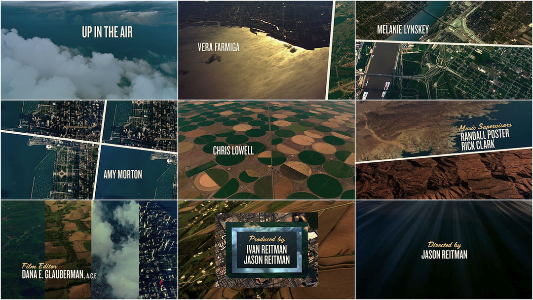
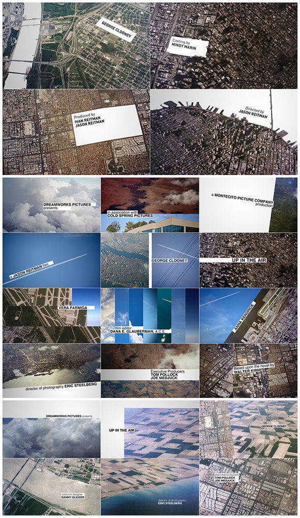
Gareth Smith and Jenny Lee's opening title sequence for director Jason Reitman's Up in the Air intoxicates us with neatly happenstance compositions of a casual topology from a commuter's perspective with music by Sharon Jones & The Dap-Kings that savors common ground. Just below the stratosphere is our gaze and our patterns. We're big, we're small.
A discussion with GARETH SMITH of Smith & Lee Design.
How did you start working on this title sequence? What were the initial design stages like?
GS: The script for Up in the Air was fantastic, and a real inspiration for us. It was different from Jason's other films... more adult, sophisticated, and darker.
A title sequence that incorporated aerial footage was our first thought. We assembled a gallery of interesting aerial photography that had an abstract quality and sent it off to Jason Reitman, the director. We looked at the artwork and photography of Andy Goldsworthy, Ed Ruscha, and Alex MacLean during our research. Our initial thought was to do it by hand somehow – perhaps painting the aerial shots with a subdued color palette. We assumed that there would be no way to actually shoot this footage, given the budget.
My co-designer Jenny Lee and I got married right before shooting started. And then we left for a long honeymoon while the film was in production. We returned from our trip and Jason had captured hours and hours of beautiful aerial footage, shot at a high altitude from a jet! Our jaws dropped when we saw a rough edit of some of the footage in the film. He was planning on using a number of these shots throughout the film for city title cards as well. It was an absolute gift and we were thrilled to have access to such spectacular footage.
Initial styleframes
Jenny loves to fly, and she was super happy that her job was to watch a bunch of this footage and to edit it to music. I, on the other hand, hate to fly, but I'll do it, because it gets you to places where drinks are served in coconuts and where you can see buildings that were built earlier than 1960.
We prepared some simple style frames to show the general look we envisioned. At this point we were thinking that the typography would have a dry, corporate look – Helvetica or Bryant – a reference to the corporate visual theme that surrounds Ryan's character in the film. Some of the styleframes we created were supposed to look like internal corporate brochures – yawn. We thankfully ditched this approach a bit later in the process.
We discovered that the aerial footage did have an issue... because of the camera rig and altitude, it was heavily vignetted and very grainy. The negative, as the colorist described, was "thin," meaning there wasn't a lot of material to work with on the negative.
We decided, therefore, to try to treat the footage – to degrade it further. We experimented with a technique where we printed each frame of the footage on an ink jet printer, then color xeroxed it to give it a vintage quality. At this point the music was going to be "Ramblin' Man" by Hank Williams. It's an old recording and the vintage look was appropriate to the sound of it. We all really loved this look, but Jason ended up changing the music to a modern recording of "This Land is Your Land," so the heavily treated look didn't work quite as well.
Eventually we were invited to see some of the aerial footage in the color timing room, and we were actually really happy with how it looked (this was the first time we saw it projected). It had a real vintage style to it that made it look like it was shot in the 1970s. It looked like it could have been in The Conversation or The French Connection... super funky color that makes you think of jumping and sliding over the hood of a Trans Am. The vignetting and grain accentuated this look, and we decided to go ahead and use the footage as it was, but color correct it to push the vintage look a bit.
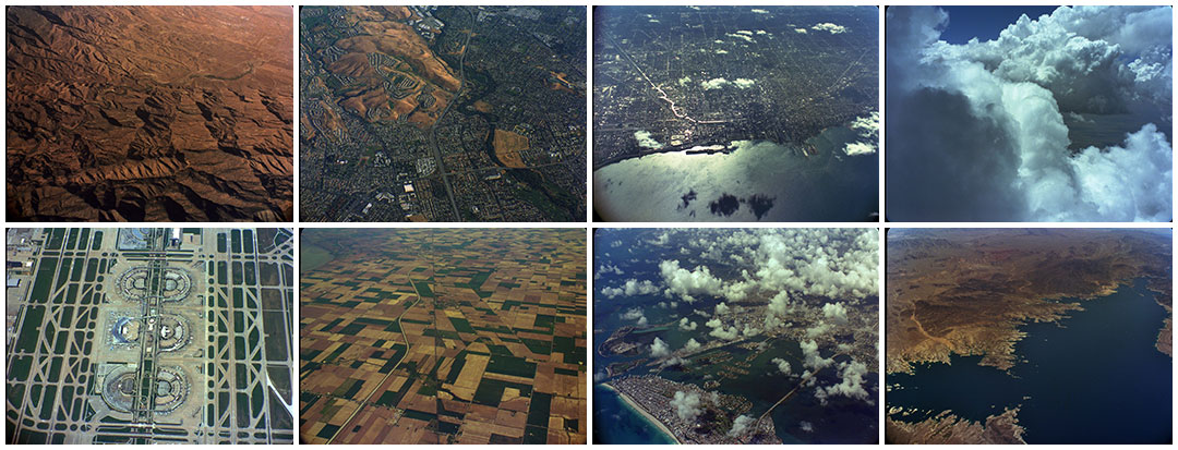
Aerial footage still selection
At this point we were looking a lot at postcards from the ’60s and ’70s, specifically ones that feature incredibly dull locations. One was labeled "SO. DALE MABRY (U.S. 92) AT HENDERSON BLVD." Makes you want to visit, right? Can't wait.
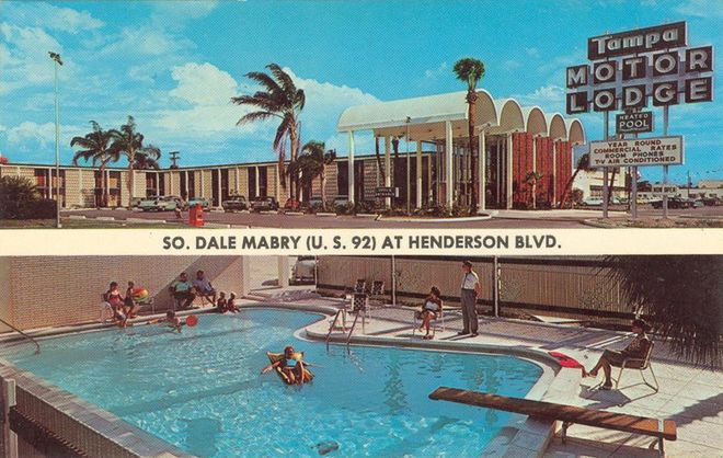
Postcard reference
These inspired the color treatment, the typography, and the simple split screens with white borders throughout the sequence. This look really helped the sequence capture the nostalgia for how commercial flight used to be – romantic and fun... back when people actually wanted to fly, and airlines used to have super cool advertising like this:
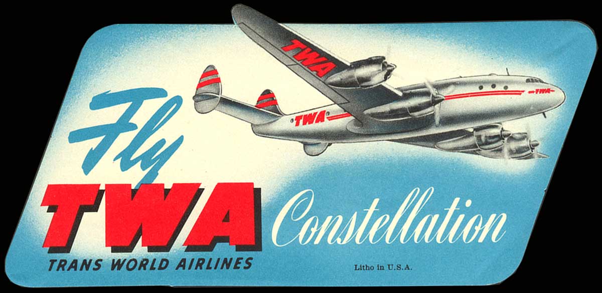
TWA advertisement
The sequence ultimately depicts the world as Ryan (George Clooney) sees it: distant, abstract, and detached. Landmarks (like the St. Louis Arch) are visible in the sequence, but they blend into the scenery because of the high altitude of the photography. I love the aerial photography in this sequence, because it shows the world from a different point of view than we're used to in films. It's the view you see when you're flying in a jet, where the world takes on a bit of an orthographic, Google-Earth-like 2D quality.
How involved were you with the live-action aerial photography?
Most of the footage from the title sequence was shot by Robert Mehnert. He shot the 35mm material. These shots have that slightly vintage, shot-in-the-’70s quality that we loved so much.
Aerial DP, ROBERT MEHNERT:
The film aerials were shot from a LearJet 25 operated by WolfeAir and piloted by Tom McMurtry and Ace Beal, both former NASA test pilots and flight crew on the 747 that transports the space shuttle. The camera system is called VectorVision. It uses an Arriflex 435 looking through a periscope relay lens to a dome on the belly of the airplane. We can pan 360 degrees and tilt down about 56 degrees, so to shoot straight down we either have to sideslip the plane or pitch over, which would constitute a dive. For the straight down shots we sideslipped. Diving in the Lear yields overly exciting results and is unadvisable. We shot 27 cities in five days with the Lear, plus clouds, mountains, and general scenery. The night shots had to be done with the digital HD camera [shot by Dylan Goss] as the Vector Vision is only about a T4 lens speed. Originally we had talked about shooting straight down from 30,000 feet to get a Google Earth type look. But at that altitude the port tends to gather ice and that’s a lot of atmosphere to be shooting through. Even at 12,000 feet we were plagued with haze in most parts of the country except Miami and San Francisco. That’s the price you pay for shooting in June or July.
GS: Dylan Goss shot the high definition material that we used in the sequence, and most of the aerial shots that are used in the film itself. We used his footage for the "George Clooney," "UP IN THE AIR," "Anna Kendrick," credits and the fabulous crop circle shots just before and under "Chris Lowell." This material was much crisper than the film footage (as high definition tends to be), so we actually had to degrade it a bit to match the look of the film. This shoot took place late in the process, so we were able to make several very specific requests for footage from this shoot. We asked for a shot to go with the "ribbon of highway" lyric, and several more cloud shots that we could use for the main title card.
Aerial DP, DYLAN GOSS:
We used a Cessna 337 airplane also known as a Skymaster. Normally I fly in jet helicopters that are much more sophisticated machines with more power and a much higher cost per hour to operate. The plane was chosen for its economy and ability to transit at a higher speed when not filming since we had such a large area to cover. One thing that was probably misunderstood about this choice is that most of the altitudes we worked at – 8,000 or 10,000ft (we maxed out at about 13-15,000ft) – can be done in a helicopter and the plane didn't give a huge advantage there. With the unpressurized cabin, the pilot and I wore oxygen masks at or above 10,000ft. The camera was a hi-def-only system called the Gyron that is housed partially in an 18" ball. The smaller size of this system allows it to be mounted on the aircraft with minimal weight or structural issues. This was a pre-engineered solution that has been used mainly, I believe, for sports broadcasting and such where the plane’s low cost and its endurance – its ability to stay up in the air for a long time before refueling – make it a good choice. The camera ball mounts on a vertical track that sits against the left middle side of the plane and allows the ball to be lowered below the fuselage in flight for a more clear view (360º when aimed somewhat downward). This system is small due to the fact that it only houses the head of a Sony 950 4:4:4 1080p camera while the camera body, controls, and record deck are all remote and located inside the aircraft. The Gyron ball is married to this Sony system and it is a permanent part of it.
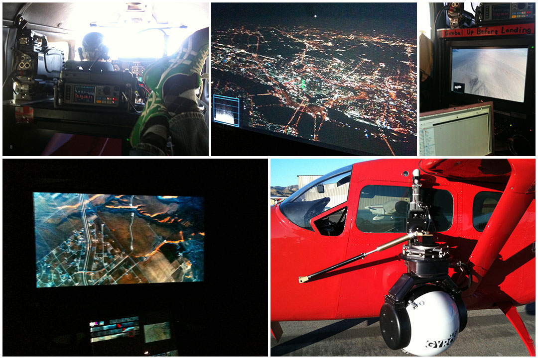
Production photos by Dylan Goss
With the deck being inside the aircraft I can change tapes, etc., without landing. One of the few things we need to land for other than fuel is to wipe the lens if we get anything on it – usually bugs while landing and taking off if the camera is not stowed looking backward. Rain is another issue that is tricky; just a few drops in the wrong spot and it's a long time down and back up to land. Those are "normal" aerial issues though. The basic flight characteristics of an airplane took some getting used to. I was in the rear of this plane with small, high-mounted windows and a poor view. I would use the camera to sight around me. Re-doing things – a second take, for example – was impractical unless the shot was really required because the time to circle back could be prohibitive. Also due to the tight production schedule, I often would have small windows of time to work in, so I’d shoot some city at 2 p.m. in higher light since we needed to get to the next by sundown.
'In Flight' movie
From a schedule standpoint one thing that helped was the long endurance of the plane – we could get up to 4.5 hours of flying between landings. We would sometimes shoot one city on takeoff, fly to another, and film it and land in a third, possibly filming it on the way in. When I had cell coverage I spent a little downtime trying to figure out some local quick food where we were headed. I am crazy about this very polarizing St. Louis pizza and had one ordered before we landed for 45 minutes of downtime for fuel and rest. Wichita meant Steak-N-Shake burgers, I think. Omaha meant a serious steak. All this and GPS-based Facebook updates at each landing kept it an adventure after over 5,000 miles flown and I think at least five hours of usable footage.
What's your favorite part of the process?
GS: We love the collaboration with the director and other creative folks who work on the film. It's such a great vibe working with Jason and his team because everyone just wants to make a great movie. We also loved being able to work with, and edit, the beautiful aerial photography we had access to. Another fun part of this particular title sequence was being able to work with the colorist to create the look of the shots.
How do you stay fresh?
I think it's important to be able to turn work off, outside of work. It's important to let your mind contemplate other things than the specific creative task you're working on. We love to travel and try to get out of the city as often as possible to clear our heads. Jenny and I never planned on becoming title designers – we kind of just stumbled into this career. Because of that, we don't live and breathe title design. That said, we love the work, and especially enjoy meeting and working with such talented creative people.
'Modern Xerox' motion test
You're three for three with Director Jason Reitman. Is title design becoming a career for you?
I think that our title design work, especially the work we've done with Jason, will be what Shadowplay is remembered for. Title design is such a visible form of design, and we're very lucky to be able to do it. And we're lucky to be able to work with Jason, who repeatedly directs high quality films that both critics and audiences enjoy. I hope that we'll be able to continue this collaboration for many years!
How does Jason approach the title sequences to his films? Have you developed a shorthand over the years?
A good opening title sequence is particularly important to Jason – it's one of his signatures.
He brings us in very early in the process. For both Juno and Up in the Air, he sent us the screenplay well before he shot each film so we could have some time to work out concepts for the title sequence, and see if there were any ways to take advantage of the physical production. For Juno, we came up with the simple transition idea of Juno walking behind some sort of vertical element that we could use to wipe into the animated world. I sent him the storyboard while he was shooting the movie, and he ended up getting that shot for us. And we were able to go up to Vancouver to photograph Ellen Page, taking advantage of the live action production to help make a stronger title sequence.
Working with Jason is a true collaboration. He trusts us to do what we do well, and we respect and like him very much. It feels much more like doing work for a friend than our typical client relationship. He leaves us alone to explore concepts and to develop the design. And when he makes comments and criticism, he's spot-on and always takes the sequence in an even better direction.
And just as important, he sticks up for us throughout the post production process and helps us get what we need to do our jobs well. With Up in the Air, we were able to spend a number of hours color correcting the footage with his colorist, Natasha Leonnet, for the opening title sequence – a luxury that we often don't have. Because the title sequence is so important to him, it's important to everyone else in the process.
Now Available

WiggleType by Smith & Lee Design
Created by the team who brought you the JUNO opening title sequence, WiggleType is hand-drawn, animated typography for motion graphics designers, filmmakers and animators.
Use promo code “AOTT” to unlock 20% off!
Related
-
Thank You for Smoking
title only
-
Those Magnificent Men in Their Flying Machines
summary
-
The Ward
interview
-
Juno
summary
-
Dr. Strangelove or: How I Learned to Stop Worrying and Love the Bomb
interview
-
North by Northwest
summary