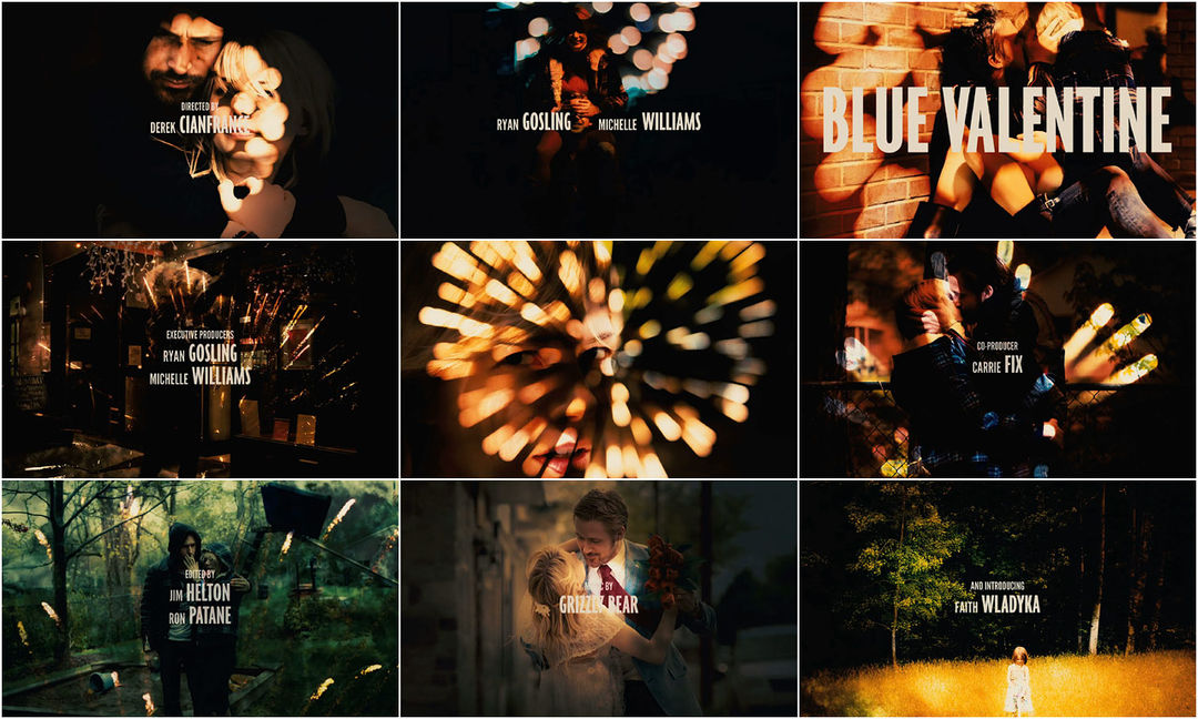


Jim Helton and Charles Christopher Rubino's closing for Derek Cianfrance's Blue Valentine asserts itself as a stunning example of end credits done right.
The combination of intimacy and broad strokes of bokeh with Grizzly Bear's "Alligator" is celestial, a hypnotic warmth spreading down to your toes. This magnificent sequence instills a poignant sense of closure as well as the notion that a firework, a film, a love, or a life are all just sparks in time.
Film editor and end title designer JIM HELTON details the process for us.
JH: Let me first start off by saying that I have known [director] Derek Cianfrance for a very long time. My friend Steve Hidinger and I actually created the title sequence for his first film, Brother Tied, back in 1998. That title sequence was all done on a dual gate 16mm optical printer at the University of Colorado in a closet inside a condemned archaeology building that no longer exists. We learned from a true master of that machine, experimental filmmaker Phil Solomon. He taught us about combining elemental and abstract images such as fire and water with more representational images through a process that he called “bi-packing” which involves placing two strips of film on top of each other and re-photographing them to create quite a different effect than a standard super-imposition. It is a tedious frame-by-frame process, but it can create pure magic. If you like the Blue Valentine title sequence, everything about it starts with Phil Solomon and his work, so check that out. Solomon’s sound was also a huge influence – nostalgic, distant, reverberating.
Other giant inspirations for me that are a bit more obvious are Saul Bass and Maurice Binder as well as the Goldfinger titles by Robert Brownjohn. I collected their work as a college student and would sit around and watch them with my friends Joey Curtis (co-writer of Blue Valentine) and Derek Cianfrance. That was our idea of a party back then! That and some cheap Paisano wine, wonderful food, and long pink summer sunsets in Boulder.
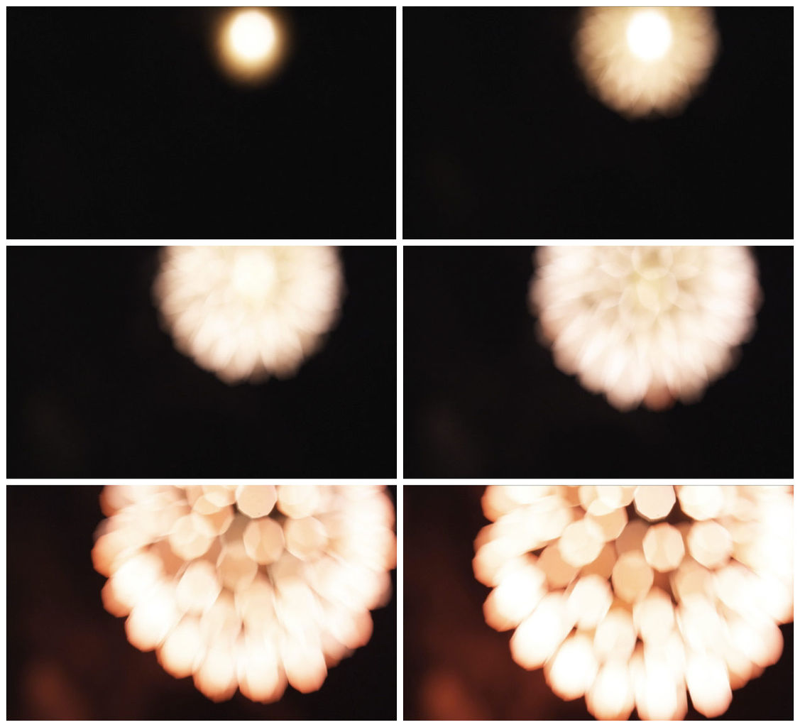
Fireworks frames
The thing I loved about those filmmakers’ title sequences was their ability to tell an abstract story and embed images within the abstractions. The abstractions seemed to create something less logical and more emotional or even poetic while at the same time leaving space for the titles and even highlighting them. Those qualities are very central to the creation of the Blue Valentine title sequence.
I’ll start with the first layer – the fireworks. I was editing Blue Valentine alongside Ron Patane and we were just trying to get it done for screenings so we were very focused on the narrative flow of the film. However, on a late night or two, I made some room for abstraction and delved into [cinematographer] Andrij Parekh’s beautiful fireworks footage and discovered rhythms in his camera work and the exploding light. He and Derek shot fireworks somewhere near Scranton, PA on July 4th of 2009. They threw images out of focus and sometimes even took the lens off. The film ends with a fireworks scene so it was always going to be fireworks. In the first rough cuts of the film it was just that – an abstract montage of fireworks. My first passes on that footage were all silent because I believe that if you can make something flow without music it will definitely flow with music and then you will actually have two pieces of “music” playing in harmony together.
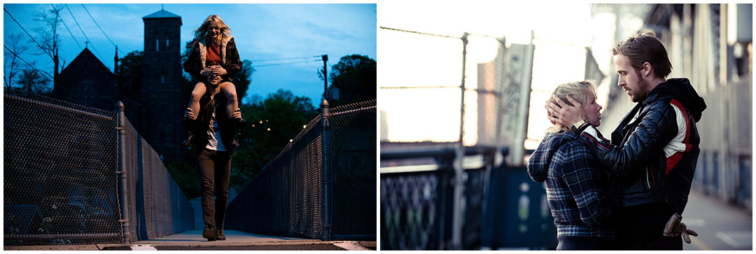
Davi Russo set photography
The second layer was the music by Grizzly Bear. The only parameters I was given in choosing the song is that it had to be by Grizzly Bear. I chose “Alligator” – what can I say? Everything about it was right, from the tone to the lyrics to the cinematic quality it lends to the sequence. I love it. Of course, I could’ve been overruled by Derek in that choice, but he loved it right away. Ironically, after the last day of shooting on the way back to New York, I rode in a car with Derek, Andrij, and still photographer Davi Russo. They told me that the final song should be a pop remix of “Two Weeks” and proceeded to play it very loudly and to drive very fast. Well, the “Two Weeks” remix is a good song, but to me it wasn’t right for the end of the film. I knew that then, but I bit my tongue because everyone was riding high after wrapping the shoot... sometimes it’s better to show people rather than to argue with them.
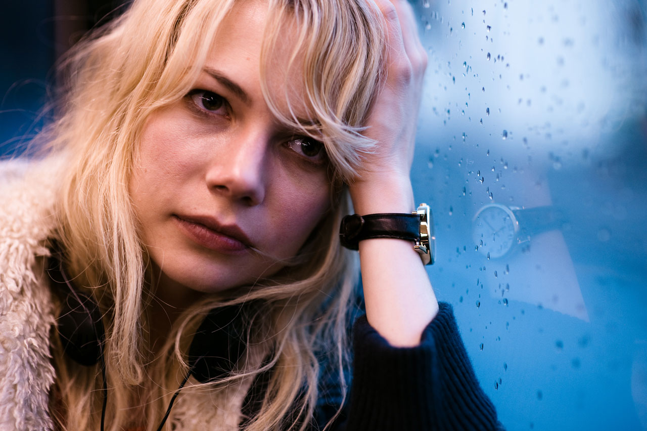
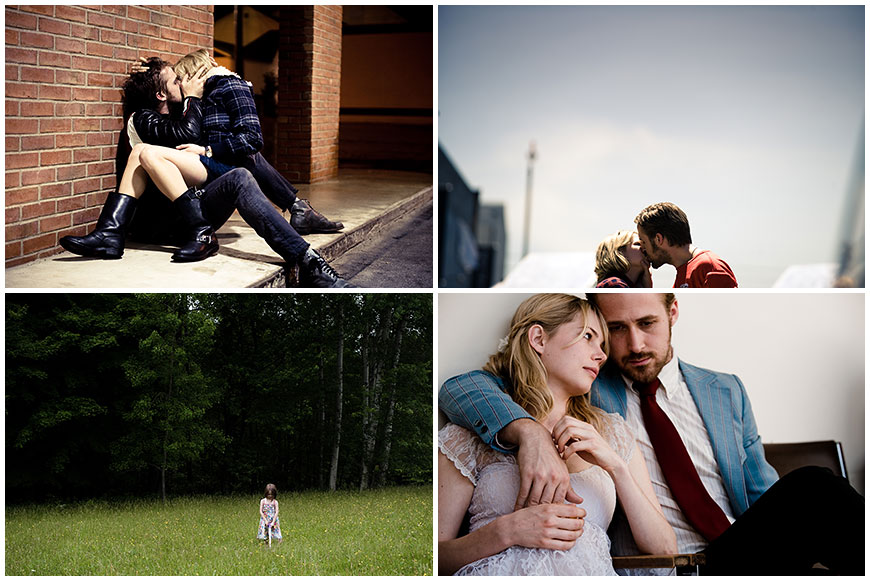
Davi Russo set photography - Michelle Williams
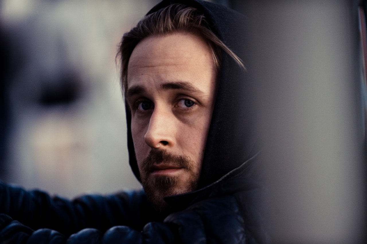
Davi Russo set photography - Ryan Gosling
The third layer was the amazing iconic photography that Davi Russo captured on set. Derek and I have been working with Davi for a long time now – since 2004 – and his still photography played a huge role in the documentary work we made prior to Blue Valentine, so right from the beginning Derek insisted that Davi be involved. I believe this was not only for his photography, but also his presence on set. Derek greatly values Davi’s “bullshit meter” and his eye. For a long time in the edit, Derek and I asked each other, “Where do the photos fit in?” It was not until the second or third rough cut screening that it hit me... I literally saw them inside of those fireworks – like memories. As these things usually happen, the ideas were in the ether because Derek and Cami Delavigne (co-writer of Blue Valentine) both walked up to me at separate times after the screening and said that something was missing in the end titles. I just grinned and said, “I got it.”
Davi Russo set photography
The next night I stayed late and put the images “inside” the fireworks. I knew the images by heart and it happened very quickly because we had it narrowed down to our favorites. I wanted to create a sort of ode to the film: a story of togetherness, apartness, and love, ending with the wedding and ultimately, Frankie alone in the field. I looked for images that fit within the firework explosions, re-framed images, and at times even cut them up into details. I also looked for the proper amount of negative space within the images to make the titles really pop out so the image and the title could share time together without conflict. This was all done in Final Cut Pro. Of course, we kicked it up a notch in the color correct stage with the help of Technicolor ace colorist Tim Stipan, but the original was all created in Final Cut Pro using the composite feature and a lot of tweaking. I honestly can’t tell you exactly what I did but I discovered these techniques by trying to mimic some of the things I had learned while using the optical printer in film school. You can see examples of this discovery and exploration in my own films.
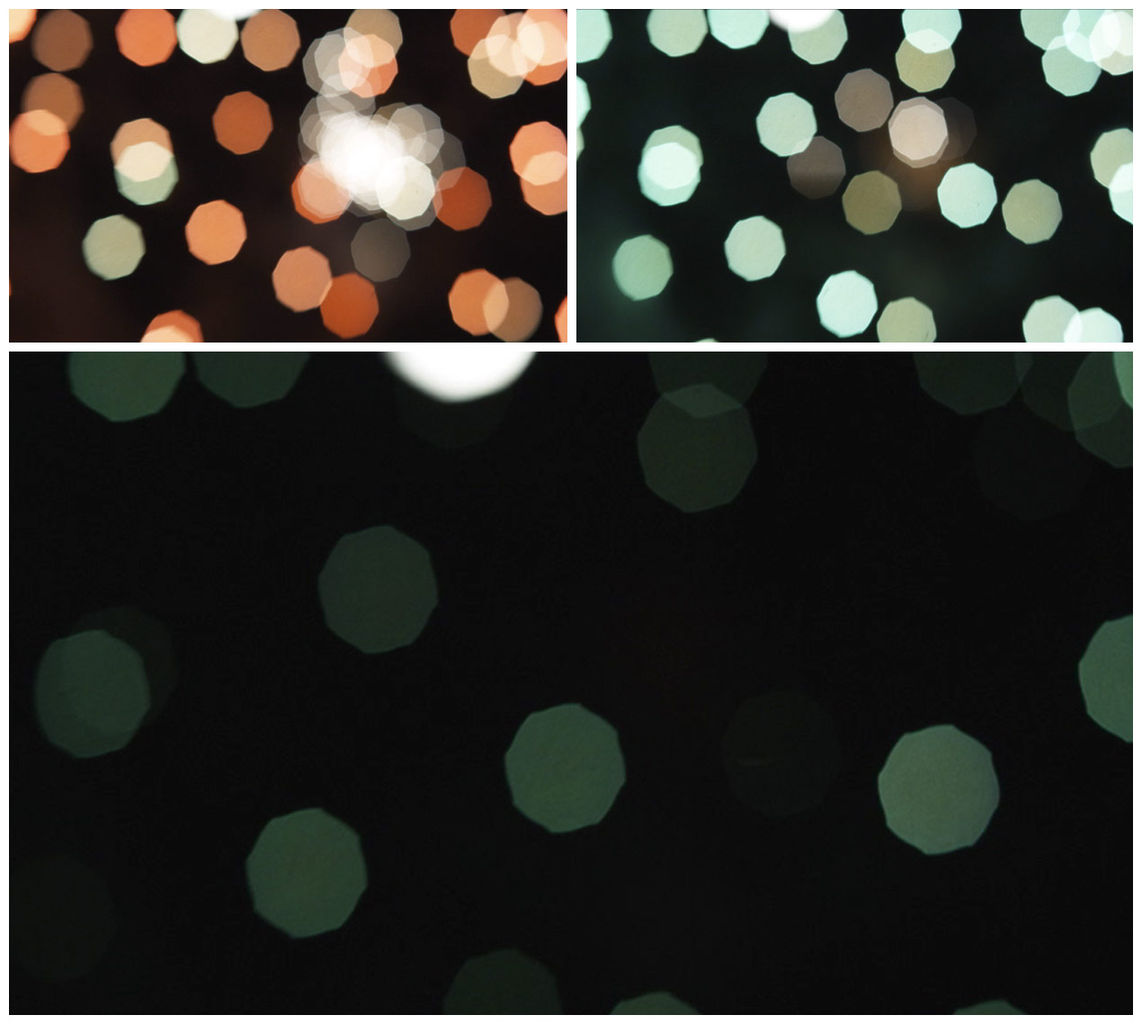
Fireworks frames
The fourth layer was the typeface created by artist and designer Chris Rubino, an amazing artist. Of course, I’m biased because Chris and I have collaborated on a film series called Love Kills Demons. We went through a serious exploration of typefaces, both curated and created by Chris. His interpretation of words is inspiring. A variation of the typeface that Derek, Chris, and I settled on is also used in the screen-printed limited edition pink Blue Valentine posters that Chris created for the Sundance Film Festival in 2010. Derek loved what he called the “like a Russian film” character of the small and large fonts. I love the boldness of the main title. Incorporating them into the picture was pretty simple... short fade in and long fade out, like exploding and disappearing light. The only title that cuts straight in is the main title, super bold with a long, long fade out.
Custom typeface by Chris Rubino
The fifth and final layer was the sound design created by Dan Flosdorf and mixed by Corey Melious over at Sound Lounge. Fireworks streaking into the sky and crackling in the distance, muted booms, children laughing, shouting, and screaming... they all help tie the title sequence to the last shot of the film and, in effect, create an interplay between the nostalgic past and the present that reflects the structure of the film itself.
Dan recorded his own fireworks and what he calls “the air of the night” in surround sound and we layered them in so that they worked with the rhythm of the images and tone of the song – echoing and abstract, lost in nostalgia, sometimes slightly out of sync, sometimes absent and allowing the music to completely take over.
There you have it! A great collaboration between Derek, Andrij, Davi, Chris, Dan, Tim, Corey, and myself as well as some sources of inspiration. That’s what this whole filmmaking thing is all about.
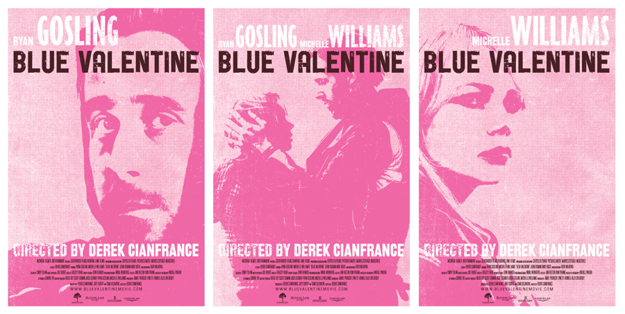
Limited edition pink Blue Valentine posters for Sundance
LIKE THIS FEATURE?
HELP US KEEP DOING WHAT WE DO BY BECOMING A PATRON THROUGH PATREON
Related
-
Charade
summary
-
Freaked
interview
-
Auntie Mame
interview
-
24 Hour Party People
interview
-
Scott Pilgrim vs the World
interview
-
La Belle et la Bête
summary